Testing for sufficient contrast
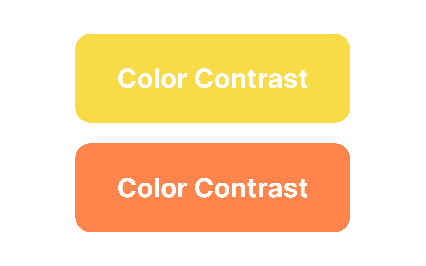
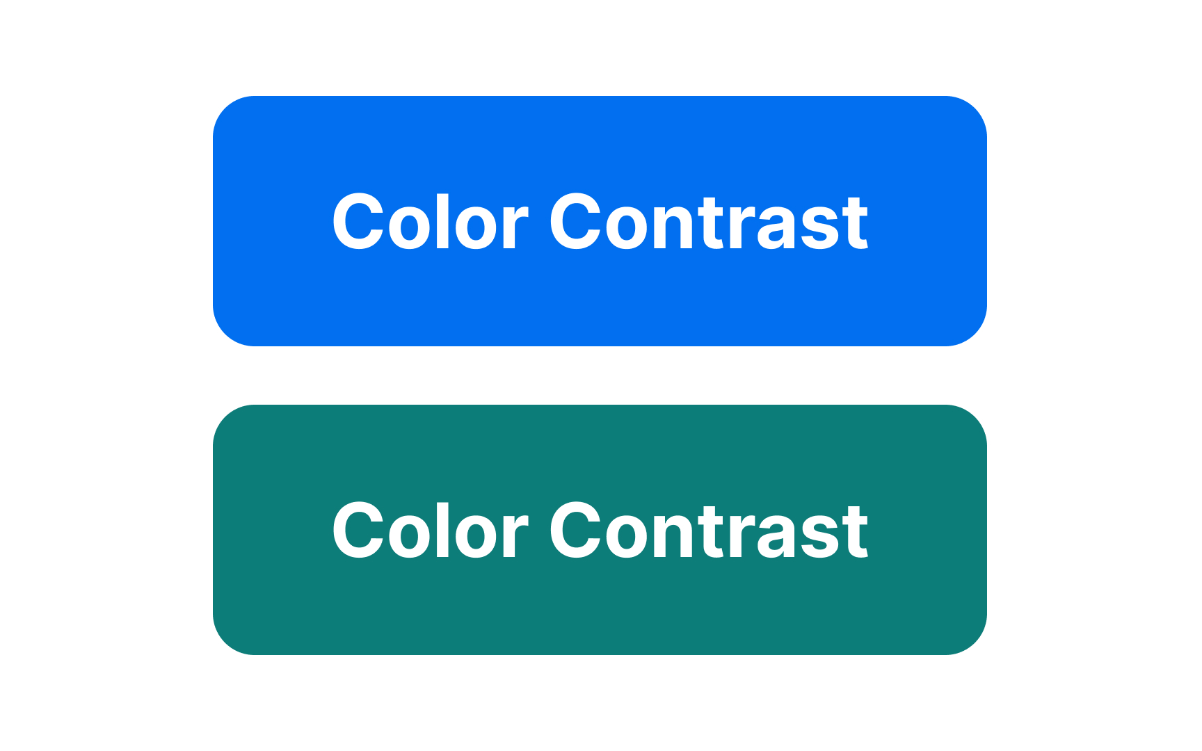
Color vision deficiency affects about 1 in 12 men (8%) and 1 in 200 women globally.[1] If users struggle to see your content, they’re unlikely to engage with your product. Ensuring accessible color contrast not only aids those with vision deficiencies but also improves legibility for all users. Before starting UI testing, make sure your colors comply with web accessibility guidelines.
WCAG 2.2 level AA requires a contrast ratio of at least 4.5:1 for normal-sized text. Similar requirements apply to large text, icons, input borders, and other elements.
There are several accessibility testing tools to help you check color contrast:
- The Stark plugin has a free version and works in Figma, Sketch, Adobe XD, and Google Chrome to measure accessibility color contrast.
- Tools like Colorable can help you choose a suitable text/background contrast.
- Google Lighthouse in Chrome helps measure the contrast between elements on a web page.
