How to Test Color Combinations
Learn how to assess color combinations for readability, accessibility standards, and intended effect
Testing colors within your design allows you to determine if your users respond positively to the palette, if your brand colors convey your brand values, if the color choices help users achieve their tasks, and if the design results in conversions.
Different types of testing are suitable for each goal, but the most common methods are testing color perceptions, ensuring sufficient contrast, optimizing conversions, and more general usability testing. Even if you don't have the time or resources to conduct independent color testing, you can implement it within usability testing. When you do have the resources to test color independently, there are a variety of models you can implement, from user interviews to A/B tests.
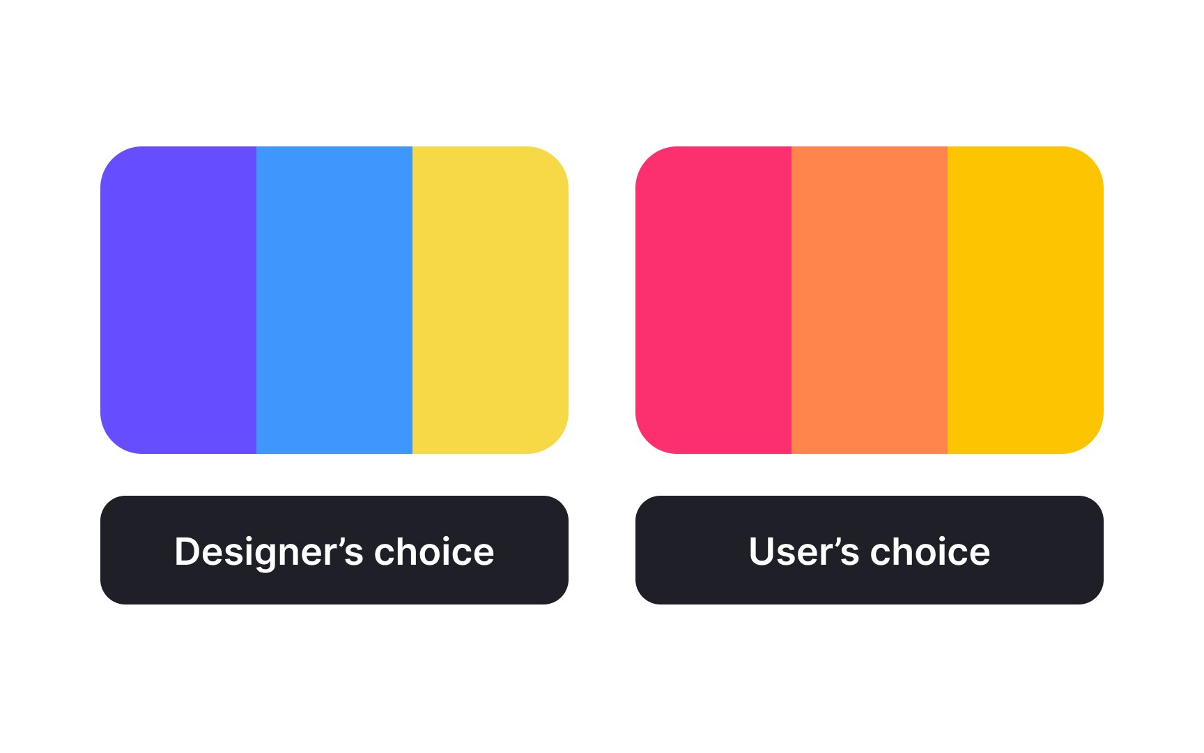
You pick a beautiful color palette for your design, and your team loves it. Should you still test it for
Colors also have different meanings in different cultures, so testing is crucial. Even if you choose colors based on psychology, users might not get the message you intend.
Finally, small color changes can make a big difference. For example, tweaking the shade of a CTA button can significantly impact conversions. Testing helps you make these informed decisions based on real data.
To start testing color palettes, you must first create them. How do you know if your palette is ready for testing?
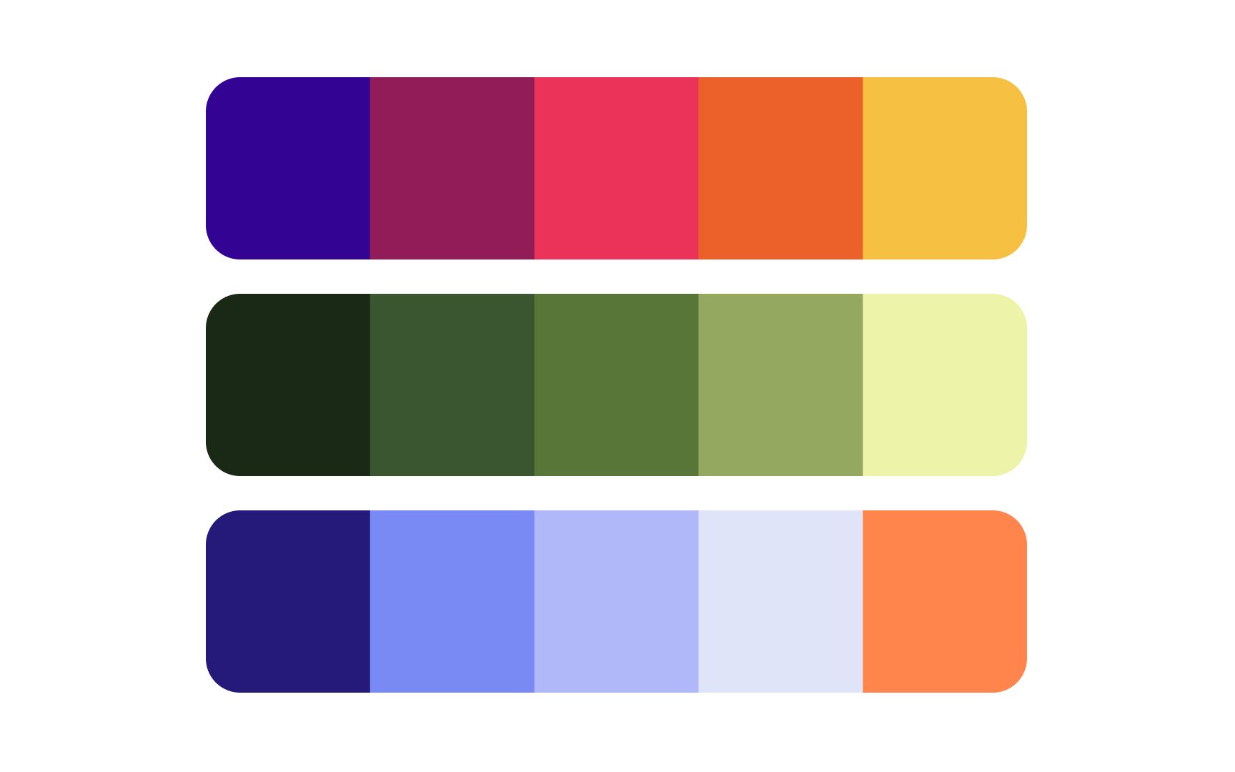
- It's based on color theory. You followed color theory to create a harmonious
color combination. - It fits your brand. The
color palette represents yourbrand values according to colorpsychology . - It's accessible. The palette includes colors with a range of
contrast sufficient to comply with the Web Content Accessibility Guidelines. - It doesn't have any controversial connotations. You took into consideration local color meanings if your product targets a specific country or region.
If these 4 conditions are satisfied, you're ready to move on to the testing stage.
There are several ways to test color palettes. The most common methods include testing
Testing color helps answer these questions:
- Which
color palette do users prefer? - Which color palette best represents
brand values to the target audience? - Do the colors in the interface help users complete their tasks?
- Which color combinations lead to better conversions?
Since color perception is highly individual, all color testing should involve real users — your product's target audience. Methods that rely on personas instead, such as cognitive walkthroughs, heuristic evaluations, or expert reviews, aren't very useful for this purpose.
Testing
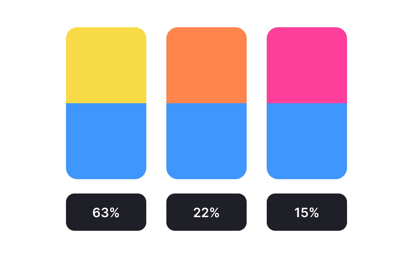
For first impressions, it's best to show the colors briefly. Tests like the 5-second test[2] and the first-click test[3] are useful for capturing initial reactions. To find out what users prefer, present them with multiple color combinations or designs for comparison.
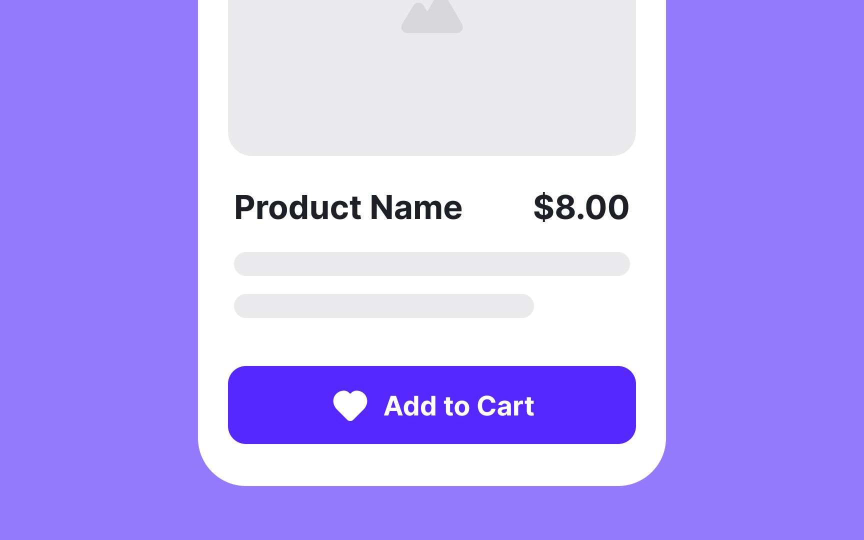
Testing colors in isolation helps you select the right ones. However, user reactions may change when these colors are part of a full design, so test them within the actual UI. Key elements to focus on include CTAs, text, and background. For remote testing, tools like Typeform that allow image display can be effective.
When testing UI elements, assess one element at a time to pinpoint what influences user perceptions. Ensure the differences are clear enough for a non-designer to notice.
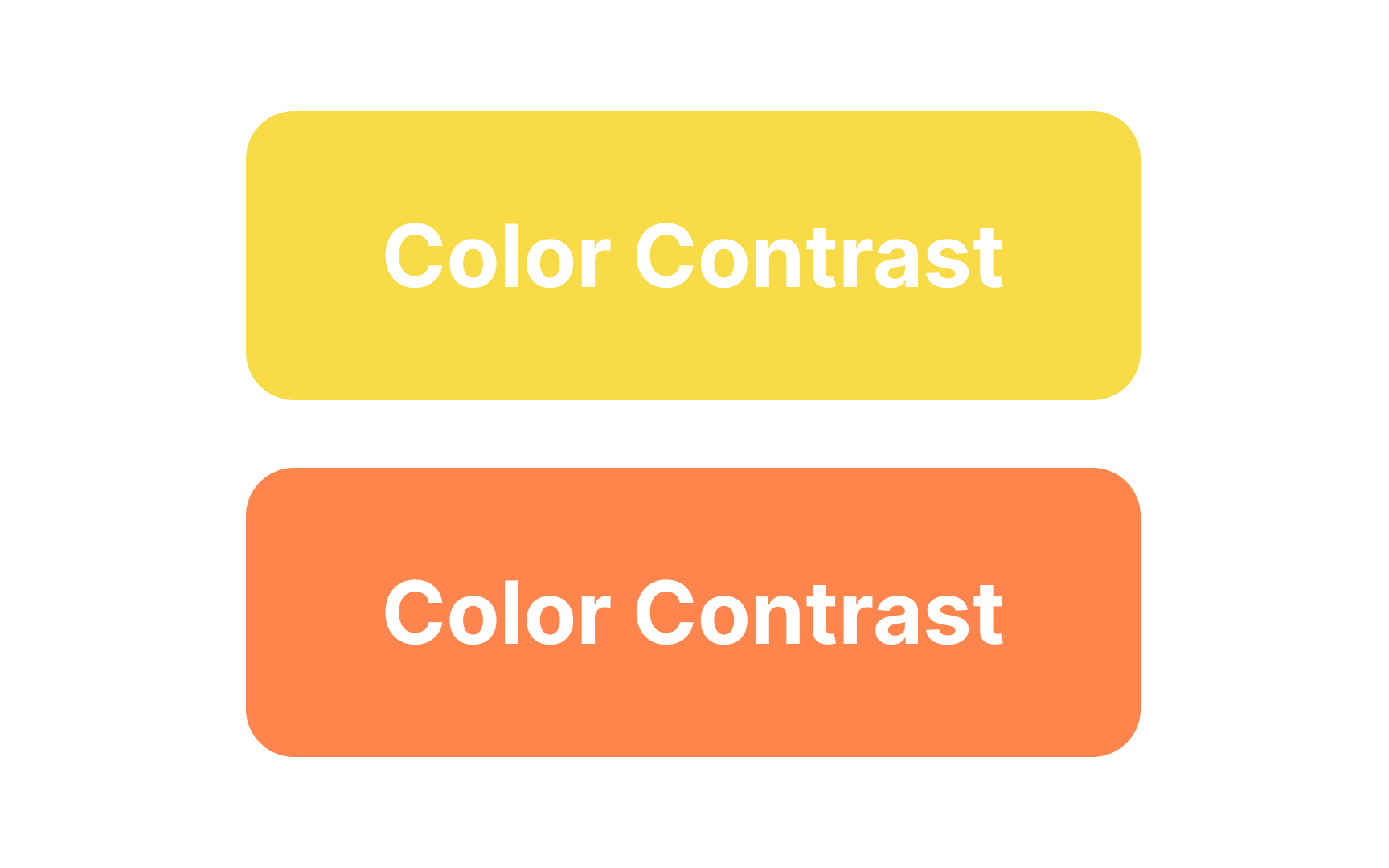
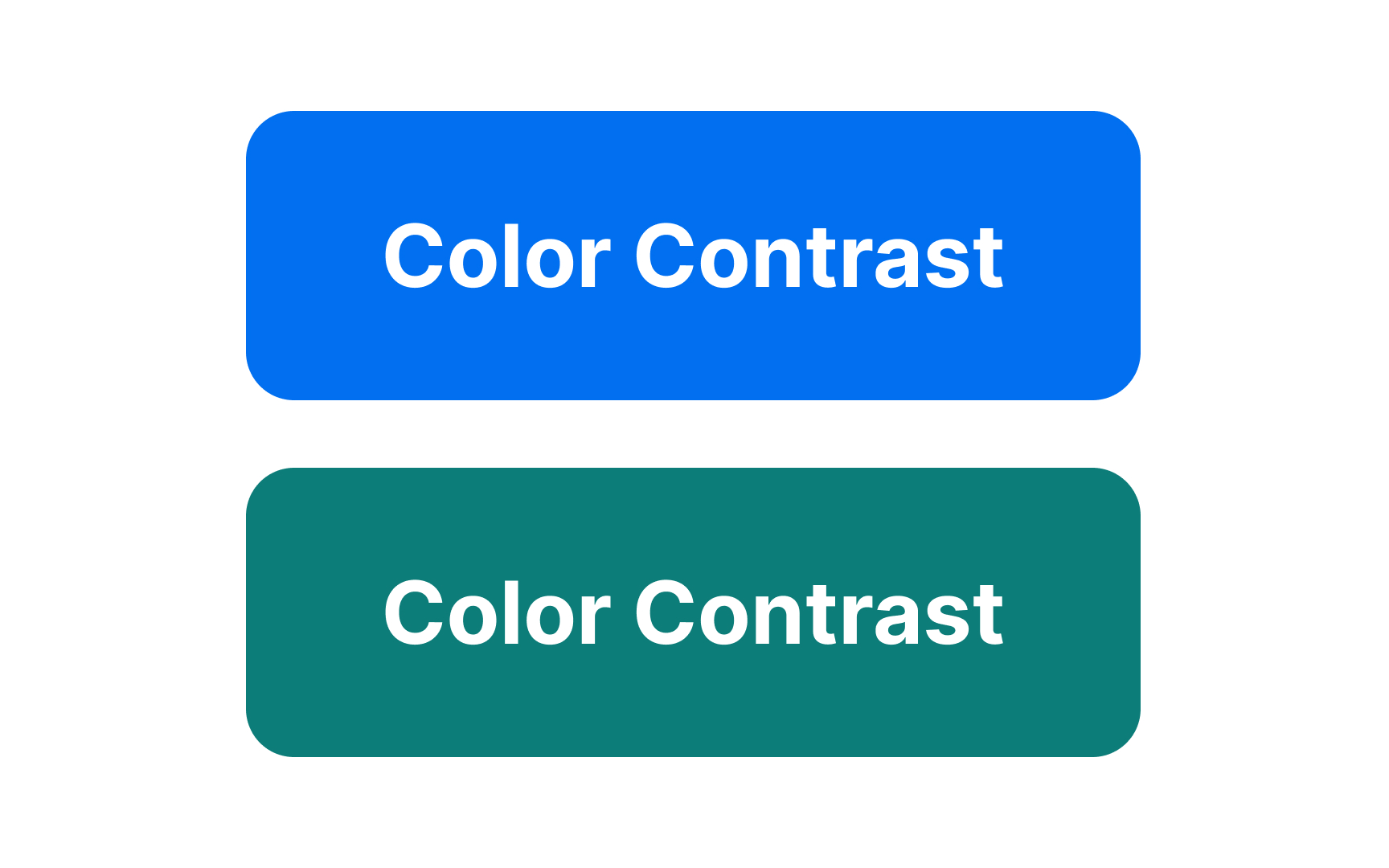
There are several accessibility testing tools to help you check color contrast:
- The Stark plugin has a free version and works in Figma, Sketch, Adobe XD, and Google Chrome to measure accessibility color contrast.
- Tools like Colorable can help you choose a suitable text/background contrast.
- Google Lighthouse in Chrome helps measure the contrast between elements on a web page.
Visual elements like
Colors can significantly affect the usability of
If
Pro Tip: If you only have the time and resources to do one test before launching the product, make it a usability test with added techniques to assess visual design.
Once you've developed your product based on user behavior and feedback, you can use
When testing
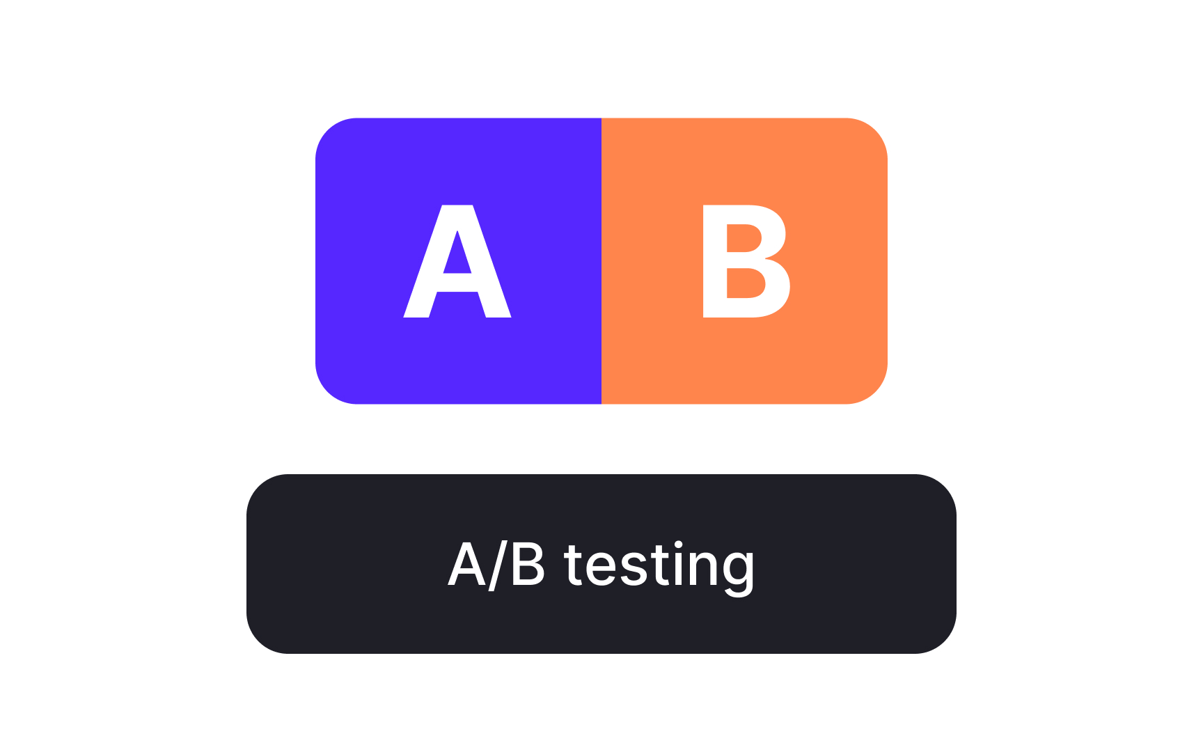
Does this mean red is the best CTA color? It worked for their website, but it doesn't guarantee the same result for yours. A/B testing helps determine which color your audience responds to best.


Test
References
- You Are Not the User: The False-Consensus Effect | Nielsen Norman Group
- First click testing guide | Lyssna
- About Colour Blindness | Colour Blind Awareness
- The Impact of Interaction Design on Brand Perception | Nielsen Norman Group
Top contributors


Topics
From Course

Share


Similar lessons

Intro to Color Theory

Color Properties
