Softening strong colors
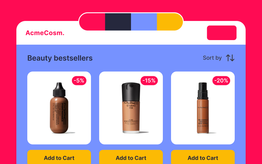
Bright pink is an engaging and vibrant color that is proven to trigger the release of adrenaline. It feels both energetic and dazzling. So how can we soften such a powerful color?
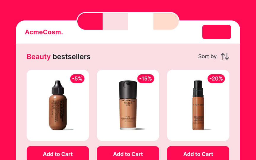
One way is to create monochromatic pastel palettes. To do this, increase the value of the hue and decrease its saturation.[1] In the example, adding soft pink colors of varying intensity to the bright dragonfruit pink creates a calmer and more harmonious palette.


