Spatial typography and text
Text presentation in visionOS adapts classic typographic principles for spatial computing while maintaining familiarity across Apple platforms.
How typography adapts to spatial design:
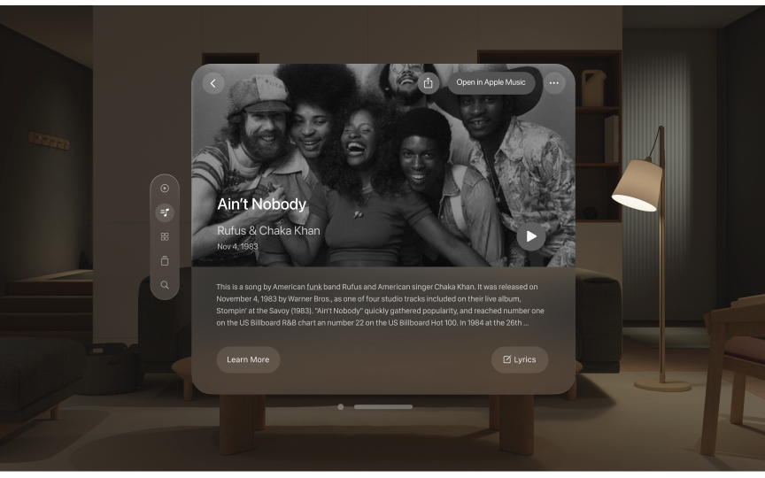
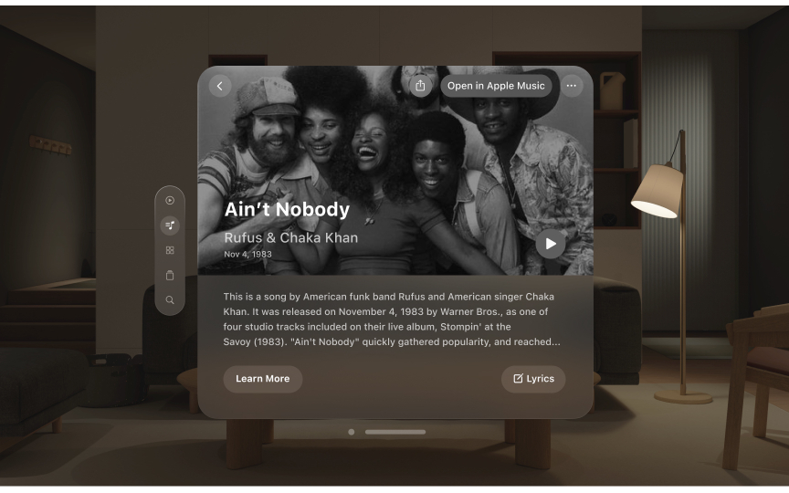
- Weight adjustments: Text uses slightly heavier weights than other platforms. Body text shifts from regular to medium weight, while titles move from semibold to bold for better contrast.
- Spacing optimization: Tracking increases to improve legibility in spatial environments. Letters maintain clear spacing at various viewing distances.
- New editorial styles: Special font styles support wide, editorial-style layouts unique to spatial design, including Extra Large Title options.
What ensures clear text in space:
- Use system fonts optimized for spatial legibility
- Choose appropriate weights for viewing conditions
- Avoid lightweight fonts at large scales
- Maintain consistent semantic styles across platforms
- Test readability at various distances
Pro Tip: Test text readability from different angles and distances, especially for content that requires extended reading.


