Mastering the 60-30-10 Rule in Design
Learn the 60-30-10 color rule to make your designs look great! Follow along to improve your skills.

In design, having a good color balance is important for creating visuals that look great and work well. One effective way to do this is by using the 60-30-10 rule. This simple guideline helps you choose colors that work together nicely. Let’s explore what this rule is, how to use it, and why it’s helpful.
Understanding the 60-30-10 Rule
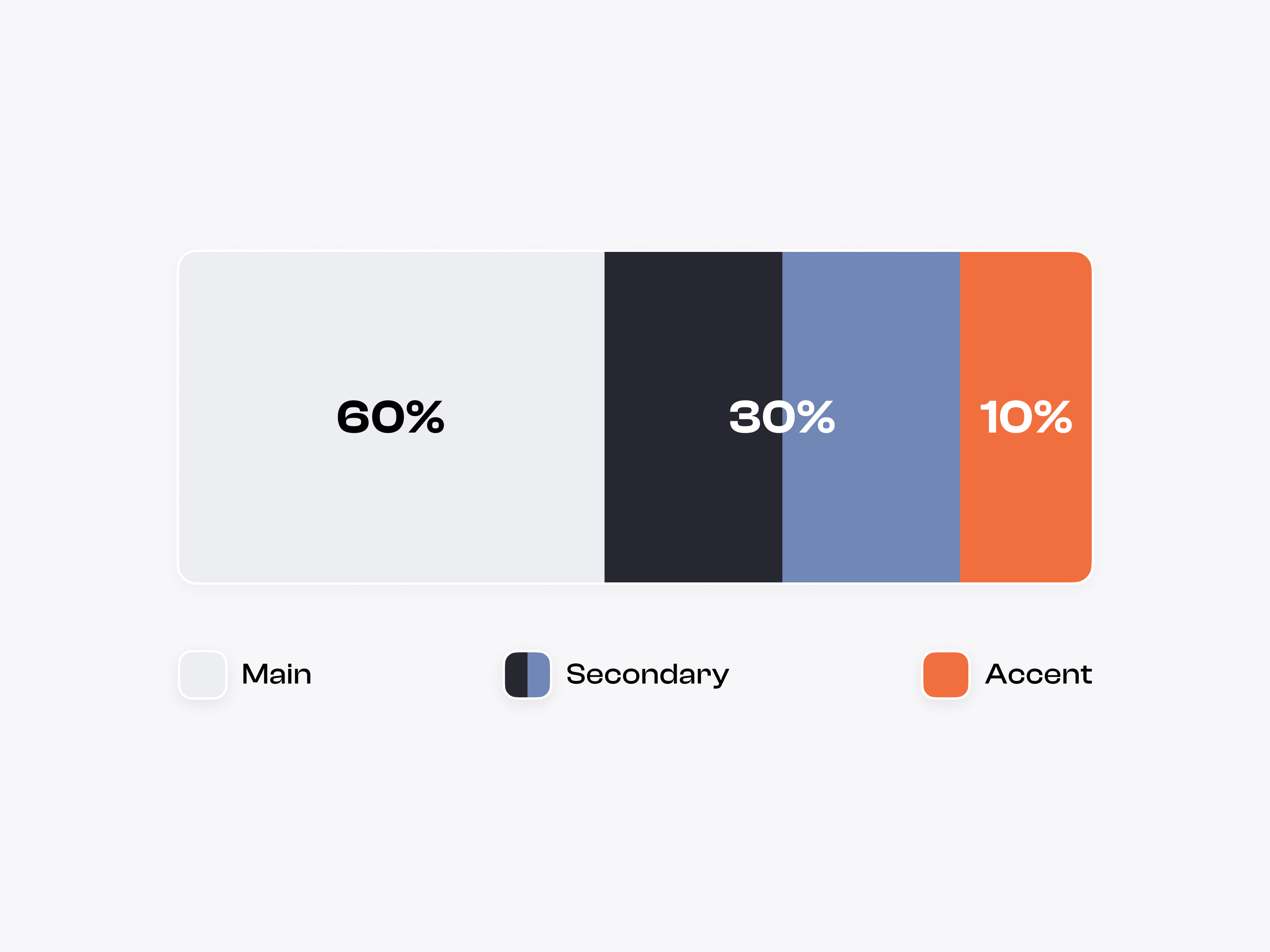
The 60-30-10 rule splits your colors into three parts:
- 60% Dominant Color: This is your main color. It should cover most of your design. This color sets the mood and gives a strong foundation for your project.
- 30% Secondary Color: This color adds depth and supports the main color. It can be used for sections, backgrounds, or buttons to create interest without being too much.
- 10% Accent Color: This color is a highlight that draws attention. It’s great for important buttons or messages that need to stand out.
How to Apply the 60-30-10 Rule
- Choose Your Colors: Start by picking a main color that fits your brand. Use tools like Adobe Color or Coolors to find colors that go well together.
- Create a Color Palette: Once you have your main color, pick a secondary and an accent color. Make sure they match nicely. For example, if your main color is blue, a light gray can be a good secondary color, with a bright orange as the accent.
- Use the Colors in Your Design: Apply the main color to the background or large areas. Use the secondary color for sections that need some difference. Save the accent color for buttons and important highlights.
- Test and Adjust: After applying the colors, see how users react. Gather feedback to check if the color balance works well. Make changes if needed to improve the experience.
Why the 60-30-10 Rule Matters
The 60-30-10 rule helps not just with looks, but also with function:
- Visual Order: By using this color structure, you can guide the viewer’s eyes. This makes it easier for them to find their way around your design.
- Brand Identity: Using consistent colors helps people recognize your brand. The 60-30-10 rule supports this consistency while allowing room for creativity.
- Better User Experience: Good colors can create feelings and influence choices. A balanced color palette leads to a more enjoyable experience, encouraging users to engage with your content.
Visual Examples
Here’s how the 60-30-10 rule can be shown in designs:

Wrapping Up
The 60-30-10 rule can help you improve your design skills. By picking colors wisely, you can make designs that look good and are easy for people to use.
For more simple tutorials and exercises, follow me on Uxcel Let’s get better at design together.
You might also like

Designing for Voice User Interfaces (VUI)


Ethical principles for creating responsible and user-focused UX design

Writing Tips for UX Designers

Popular Courses

UX Design Foundations


Introduction to Figma

Design Terminology