Reviews
1 review
Hey Amar,
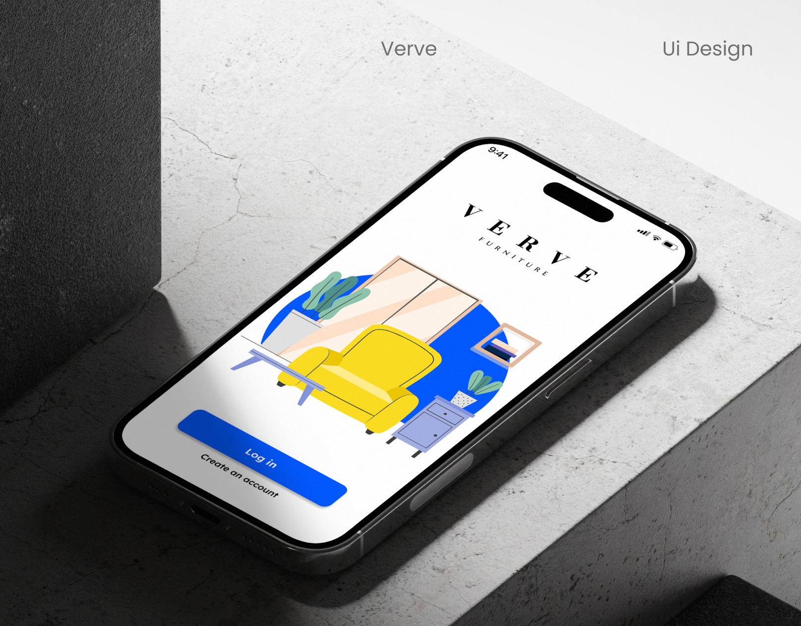
Good job done on the screen designs.
I particularly like how you took the time to wire and prototype most of the flows. This gives it another level of fidelity.
The designs are also clean and modern except for a few drawbacks I found. Here are a few:
- First of the shadows used used throughout the screens are very poor and takes away from the beauty and cleanliness of the screens.
- The CTA buttons and input fields in the signup screens should be the same width generally speaking
- The messaging icon on the top right corner of the screen should be switched for a notification icon instead as the current prototype is only showing notification instead of an actual chat
- The search input on the "track your orders" screens should fill the entire width of the screen taking into consideration padding as well.
- The category label styles are a bit off. consider using a simple label style like in the chair names.
- The black heart icon for favoriting is also a bit off from the clean style of the screen. Maybe opt for white instead.
- Lastly the overall presentation design could be better to match the clean style of the screens. The wavy blue shapes are a bit distracting, the text justification on the paragraphs doesn't work so well, centering the headers while the paragraphs are left aligned is also off.
This really has a lot of potential if you take into consideration some of the concerns I have raised above. Good job done nonetheless.
8 Claps
Average 4.0 by 2 people
You might also like
Project
Ubani Design System
Ubani Design System Includes consistent, accessible, and scalable product foundation across neighborhood social experiences. It includes: a

Project
CJM for Co-Working Space - WeWork
This project presents a customer journey map for WeWork, created to understand the end-to-end experience of a remote professional using a co
Project
Accessible Signup Form for SaaS Platform
🧩 Project OverviewFor the Accessible Signup Form for SaaS Platform challenge, I designed a desktop signup experience for TaskFlow, a projec
Project
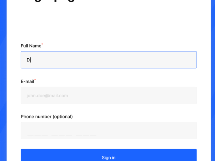
Loginino
The primary goal of this login page was to create a clean, intuitive, and accessible user experience that minimizes friction and guides user
Project
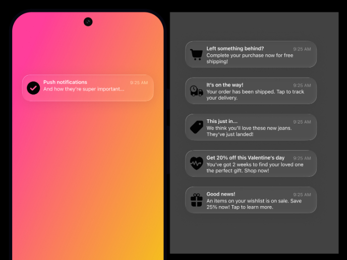
Notification microcopy - Project
This project focuses on writing clear, concise push notification microcopy for a mobile e‑commerce app. The goal is to improve the user expe
Project
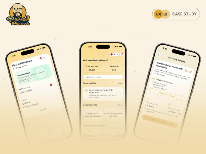
El Mandoub-GovTech App
Mandoob is a Qatar-based, subscription-driven GovTech app that simplifies government procedures for individuals and businesses.The platform
Popular Courses

Course
UX Design Foundations
Learn UX design fundamentals and principles that create better products. Build foundational knowledge in design concepts, visual fundamentals, and workflows.

Course
Color Psychology
Learn how color influences perception, emotion, and behavior. Discover how to apply color psychology to design more impactful and engaging experiences.

Course
Introduction to Figma
Learn essential Figma tools like layers, styling, typography, and images. Master the basics to create clean, user-friendly designs

