The Final State of TCM: A UX Case Study
This project examines the matchmaking experience in The Texas Chain Saw Massacre (TCM), a multiplayer asynchronous horror game that is no longer receiving updates.
Through community research, surveys, and player feedback analysis, I identified key frustrations like long lobby wait times, mismatched skill levels, and map-related disconnects. I proposed design solutions focused on transparency, player agency, and behavioral nudges to improve retention and satisfaction, while working within the constraints of the game’s existing systems.
This case study highlights how thoughtful UX design can enhance player experience, even in games facing systemic limitations.
Reviews
5 reviews
Hello Cathy,
I really enjoyed going through this project; it’s clear how much research, effort, and passion went into it. The case study is well-structured, and the problems you focused on are highly relevant to the player experience.
I think you got it spot on when identifying the core frustrations and tying them back to the actual basics of UX usability heuristics:
*Visibility of System Status*
You highlighted really well how unclear wait times, matchmaking progress, and map selection created unnecessary frustration. Your proposed solutions for making these states more transparent would give players clarity and reduce the uncertainty that makes the experience feel frustrating.
*User Control and Freedom*
You also captured perfectly how players often felt stuck in unwanted lobbies, on undesired maps, or against mismatched opponents. Offering more control over map voting, preference filters, or an easy way to re-queue gives players a greater sense of agency and makes the whole experience more enjoyable.
This is such a STRONG case study. You not only identified the problems clearly but also connected them to actionable design solutions that reflect solid UX thinking.
Kudos on building such a well-researched, insightful, and well-structured project!
I'm sorry, Catherine. I'm only able to skim through the project for now, but I'm just envious that you have the energy to craft all these things 😆 not only the research but also the wireframe. How long did it take you to finish this?
Really impressive work on this case study! You nailed the core player frustrations and did a great job connecting them to solid UX principles. The structure is clear, and your solutions for visibility and user control show you really understand what makes multiplayer experiences enjoyable.
One thing that could make it even stronger: try adding a few visuals or quick mockups to show how your solutions would look in action. Also, consider including some feedback from actual players—maybe a quick survey or quotes—to back up your insights and show real-world impact.
Keep pushing forward! Your attention to detail and user focus really shine here.
Great job! 🎉 Your case study looks super clear and professional — love the effort you put into structuring it, keep it up! 🌟
Cahee, really solid case study — I like how you linked player frustrations to core UX heuristics and offered clear solutions. Adding a quick visual of your ideas (like a lobby screen) could make it even stronger. Great work!
You might also like
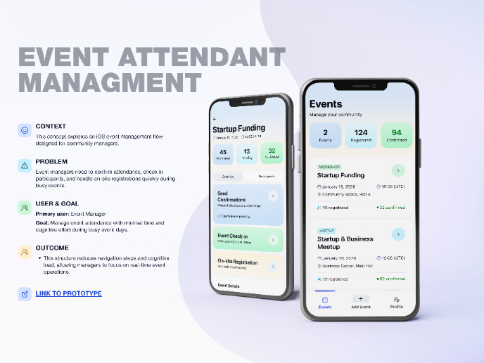
Events Managment App
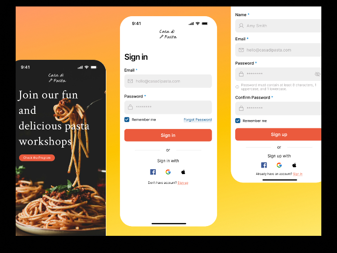
Mobile Onboarding: Casa di Pasta
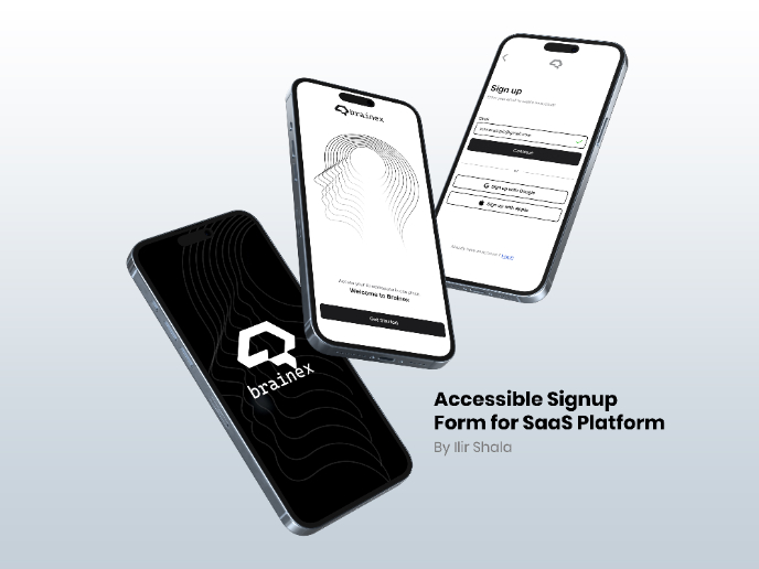
Accessible Signup & Login Experience — Brainex
Accessible Signup Form
Accessible Signup Form
WellNest
Popular Courses

UX Design Foundations

Design Terminology


