Test project 1

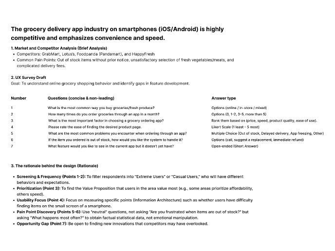
My goal was to create a login experience that feels clean, intuitive, and trustworthy. We've all used clunky forms, and I wanted this to be the opposite of that. The design is inspired by the familiarity and clarity of iOS, focusing on readable text and a simple path forward
The real value is in how the form communicates with you. You get instant feedback as you type your email—a green checkmark for success or a red icon if something's wrong. This removes the guesswork and helps you fix mistakes before you even hit submit
For the signup password, we're showing the rules right up front. As you meet each requirement, like adding a symbol, the list updates in real-time. This turns a potentially frustrating task into a simple checklist
Ultimately, every choice, from the eye icon that lets you double-check your password to the smooth animations, is about building confidence. It’s about making sure the very first screen a user sees is helpful, respectful of their time, and works for everyone
From brief

Share
Reviews
6 reviews

I just went through your Test Project 1 and I actually like how straightforward it feels.
It doesn’t try too hard and that’s a good thing. The structure feels clean, and I can follow what’s happening without second-guessing the flow. Sometimes simplicity is underrated, but here it works in your favor.
If I’d nudge you a bit, I’d say push the personality or depth a little more. Right now it feels solid but safe. What’s the one bold move you could add to make it more memorable? Overall though, nice foundation it feels intentional, not random.

awesome work mate!

The micro animations are so fun, Suren! How did you build this?
It’s probably just me, but I’m not familiar with your hide and unhide password icon. I usually see an eye open or closed, and its diagonal line looks a bit like a pirate eye 🧐
The circle checklist gets slightly cut on the bottom right when it turns green to mark a met requirement. That looks like `overflow: hidden` issue in web term. Matching the circle’s dimensions between states, or giving the container a touch more room with a consistent min-height and a little padding, should prevent the cut.
Looking forward for your Test Project 2!

Great job making the login feel smooth and trustworthy, just watch small UI details like icon clarity and spacing, and keep up this thoughtful, user-friendly approach!

Great first design for the challenge, Suren 👏 I really like that you went beyond the basics and designed all states for the input fields: default, focus, error, and success. That attention to detail shows strong UX thinking.
Disabling the “Create account” button until all required fields are filled is a smart move, and the inline review of password requirements works perfectly to guide the user step by step.
The toggle between Log in and Sign up is also a solid usability choice.
-
A few things to consider refining:
Email validation: Typically, the email field only shows an error state after the user submits the form, not while they’re typing. Right now, it feels a bit premature.
CTA copy style: Using “Create Account” with both words capitalized isn’t the most common convention. Usually, buttons are styled either “Create account” (only first word capitalized) or in ALL CAPS if that’s part of the design system.
Page title consistency: Same note here... “Create Account” looks a bit formal. Following standard capitalization (e.g., Create account) would keep it aligned with common UI language patterns.
This is an excellent first pass at a login/signup flow, clean, usable, and thoughtful. With just a few small tweaks to the copy and validation logic, it would feel even more polished and consistent. 🚀 Great work so far!

Suren Khachatryan designed a clean and intuitive login flow inspired by iOS. The form gives instant feedback with clear icons, making errors easy to fix before submission.
Password rules update in real time like a checklist, turning sign-up into a simple guided process. Every detail, from the eye icon to smooth animations, builds trust and makes the first screen feel easy and respectful of the user’s time.
You might also like
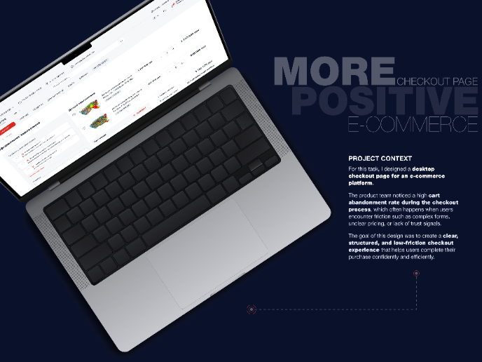
🖥 Desktop Checkout Flow Design

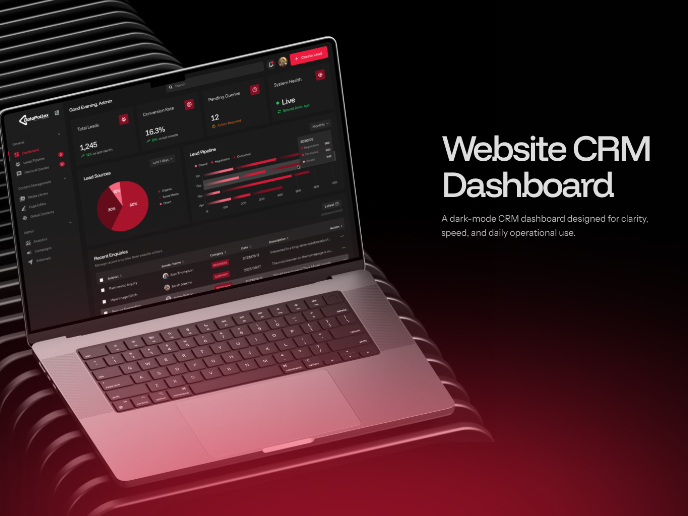
Website CRM Dashboard

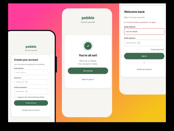
Pebble Accessible SAAS Signup Flow

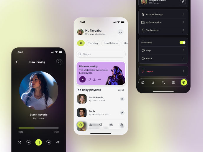
Music Player UI - Light & Dark Mode

Create a UX Research Survey

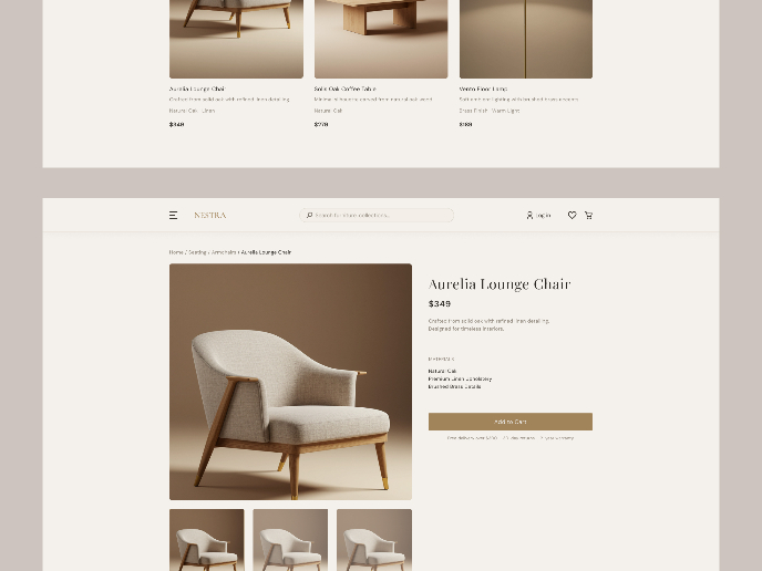
Nestra from homepage to checkout process

Visual Design Courses

UX Design Foundations


Introduction to Figma

Design Terminology
