Tasko Mobile App

Helping the elderly and persons with disabilities preserve their independence.
Reviews
1 review

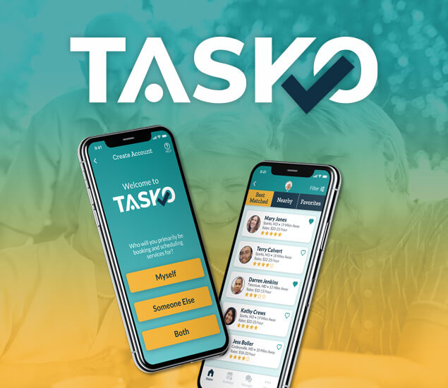
The Tasko App showcases a clean and modern design, emphasizing usability and simplicity. Here are some key observations:
Strengths
- Clean Layout: The interface is uncluttered, making it easy to navigate.
- Consistent Design: Visual consistency across different screens enhances user experience.
- Effective Use of Color: Colors are used effectively to highlight important elements and actions.
Areas for Improvement
- Contrast Issues: Ensure sufficient contrast between text and background for readability.
- Button Design: Some buttons could be more prominent to improve usability.
- Feedback Mechanisms: Enhance feedback for user actions to ensure clarity.
General Recommendations
- Accessibility: Conduct thorough accessibility testing to address contrast and usability issues.
- User Feedback: Implement clear feedback mechanisms for user interactions.
- Consistency: Maintain consistent design elements across all screens to ensure a seamless user experience.
Overall, Tasko App has a strong design foundation with a few areas for improvement to enhance user experience and accessibility.
Much appreciated! Thank you for the feedback.
4 Claps
Average 4.0 by 1 person
You might also like
Project
SiteScope - Progress Tracking App

🧩 Project OverviewThis project showcases the design of a mobile login and sign up experience for a construction progress tracking app. The

Project
FlexPay

The onboarding was designed to reduce financial anxiety, create a sense of instant reward, and encourage early action. Instead of overwhelmi

Project
CJM for Co-Working Space - WeWork

This project presents a customer journey map for WeWork, created to understand the end-to-end experience of a remote professional using a co

Project
Ubani Design System

Ubani Design System Includes consistent, accessible, and scalable product foundation across neighborhood social experiences. It includes: a

Project
Accessible Signup Form for SaaS Platform
🧩 Project OverviewFor the Accessible Signup Form for SaaS Platform challenge, I designed a desktop signup experience for TaskFlow, a projec

Project
Loginino

The primary goal of this login page was to create a clean, intuitive, and accessible user experience that minimizes friction and guides user
Popular Courses

Course
UX Design Foundations

Learn UX design fundamentals and principles that create better products. Build foundational knowledge in design concepts, visual fundamentals, and workflows.

Course
Design Terminology

Learn UX terminology and key UX/UI terms that boost collaboration between designers, developers, and stakeholders for smoother, clearer communication.

Course
Core UI Components

Learn how to design buttons, forms, cards, and other core UI components, and understand the reasoning and best practices behind their usage in every project