Stylisd Landing Page

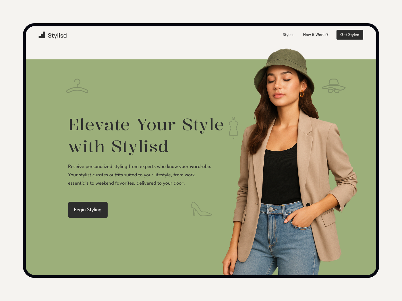
This project is a desktop-first, responsive landing page designed for a modern fashion service that connects users with real, expert stylists. The goal is to establish instant trust and convey the brand’s unique human touch through a minimalist, luxurious interface. The design prominently features authentic team photos, and concise testimonials, making expertise and warmth immediately visible. Spacious layouts, refined typography (serif for headlines, sans-serif for body), and a calming color palette combine to elevate the user experience while keeping the focus on genuine human connection.
Each section is thoughtfully structured to guide visitors from curiosity to active engagement. Intuitive navigation, clear and action-oriented CTAs, and quick access to connect to a stylist ensure a frictionless journey. Responsive techniques ensure seamless adaptability across all devices, maintaining both brand integrity and usability. Overall, the project marries approachability and elegance, helping users feel seen and confident as they embark on their style journey with real experts.
Tools used
From brief

Topics
Share
Reviews
4 reviews

You're truly elevated since the last time I saw your wireframe 😄
I really appreciate that you lead with this: “This project is a desktop-first…” It's solid and communicates your intention really well, allowing me, as a reviewer, to manage my expectations and contain my view so as not to go around or think elsewhere. Another great start, Prabhash!
Right off the bat, I can see what seems to be a concern. I get your idea with the 4D approach (like Deadpool talking to the audience in a movie or a character breaking a comic panel); you made the imagery pop out of the hero section. When the page is scrolled, it works fine, but when I land on it, it creates extra whitespace under the menu, almost like an empty announcement bar. You can explore a bit more if you decide to tackle this one, but I think one quick fix will be making it even more obvious by lowering the top hero green background, perhaps to the level of the hat's brim that the character wears. It'll be more visible and leave no second guessing about what the extra margin is for.
Nice touch with the aesthetic elements and fashion theme you put in the green hero background. What I'm still unsure about is (because you asked, still unsure?) the horizontal gap between cards; it looks a bit cramped. If it's difficult to use 3 columns, you can mix it differently between sections to lessen the tight vibe when users scan the page, such as:
- “Why Choose Stylisd”: 3 columns. The "why" is really important, so you have to make sure the user understands and is convinced to put their trust in Stylisd. The way you do this is by presenting the "why" comfortably.
- “Latest Styles”: 4 columns. Visually easier to scan; I think 4 columns will do.
- “Meet Our Team”: 3 columns. This might weigh second in importance, as these are real humans building Stylisd, adding an extra trust point.
- “Client Testimonials”: 4 columns. Social proof; you might want to display lots of good reviews to convince customers. The more, the merrier, but still use it sparingly.
As always, just a suggestion. See which one you're more vibing with and make some adjustments.

Prabhash, the minimalist and luxurious feel really shines here—the calming palette, spacious layout, and authentic team photos make the brand feel human and trustworthy. I’d just refine spacing, keep column counts consistent, and use a clearer CTA like “Get styled” to make the flow even smoother.

Great work!
The typography, colors, and layouts you used in this landing page effectively convey a minimal and luxurious feel. The sections are well structured and guide users to understand what Stylisd is and how they can receive personalized styling from experts. Each section features a different CTA, which works well; however, I’m not sure why you chose “Begin styling” when users are expecting to receive something from someone. I would suggest replicating the “Get styled” CTA from the header for clarity.
Here are some suggestions from a UI designer’s perspective:
- Maintain consistency with border radius (CTAs, cards, and even team photos should use the same border radius).
- Be consistent with the number of columns across the layout.
- Allow more breathing space in your layouts (increase the gaps between cards or photos, and reduce the number of columns—three would work well here).
- Consider revising the logo, as it doesn’t strongly evoke the concept of styling.
- Include names and titles under the team photos for better context.
Great start Prabhash! The structure and flow of your landing page are solid, it already communicates trust through team photos and testimonials, and the calming palette works well for the brand. That said, a few areas could be refined to elevate the design further:
1. Typography
The serif + sans pairing feels a bit mismatched right now. Headlines look heavy compared to the light body font, and body text has too much spacing which makes it harder to read. Tightening line height and refining the heading scale will improve hierarchy and polish.
2. Grid & Layout
Some sections drift off the grid — for example, “Latest Styles” and “Meet the Team” don’t feel consistently aligned, and spacing varies a lot between sections. A stricter use of a 12-column grid and more consistent vertical rhythm would make the design feel sharper and more intentional.
3. Calls to Action (CTAs)
There are several different CTAs (“Get Styled”, “See All”, “Take Your Style Quiz Now”, “Get Free Advice”), all styled the same way, so it’s not clear which one is the primary action. Defining one main CTA and treating the others as secondary (lighter styling) would give the user a clearer path.
4. Imagery & Icons
The hero photo looks strong, but the rest of the imagery feels inconsistent in quality and direction (different lighting, styles, etc.). Investing in more cohesive visuals — especially lifestyle-focused shots for “Latest Styles” — would boost the aspirational feel. The icons in “Why Choose Stylisd?” look generic; custom or more refined icons could strengthen the brand voice.
5. Color & Branding
The solid green blocks create heavy breaks in the flow, and some text contrast could be improved for accessibility. Also, the dark CTAs don’t stand out enough in some sections. Introducing a more distinct accent color (deep navy, muted gold, etc.) might help create a stronger luxury feel.
6. User Experience
The hero CTA “Get Styled” is a little vague — being more specific (e.g. “Start Your Style Quiz”) would set clearer expectations. The “How it Works” section is quite text-heavy; turning it into a more visual step-by-step journey would make it much easier to scan. Adding credibility markers (press logos, stylist credentials, security seals) could also build even more trust.
Overall, this is a solid foundation, tightening the type, grid, and CTA strategy, plus elevating the imagery, would really help it feel more premium and conversion-focused. Keep going, you’re definitely on the right track. Looking forward to seeing how you refine it! 🙌
You might also like

edX Sign-Up Page Redesign


Beautify Login page WCAG principles


Design Prioritization Workshop


Sanyahawa - Personal Portifolio_login page

Uxcel Halloween Icon Pack

eWallet App Development Project

Content Strategy Courses

UX Writing


Common UX/UI Design Patterns & Flows


Building Content Design Systems
