Spike Admin E-commerce Dashboard Designs

Clean & Minimal Dashboard Design for managing E-commerce Store.

Reviews
1 review

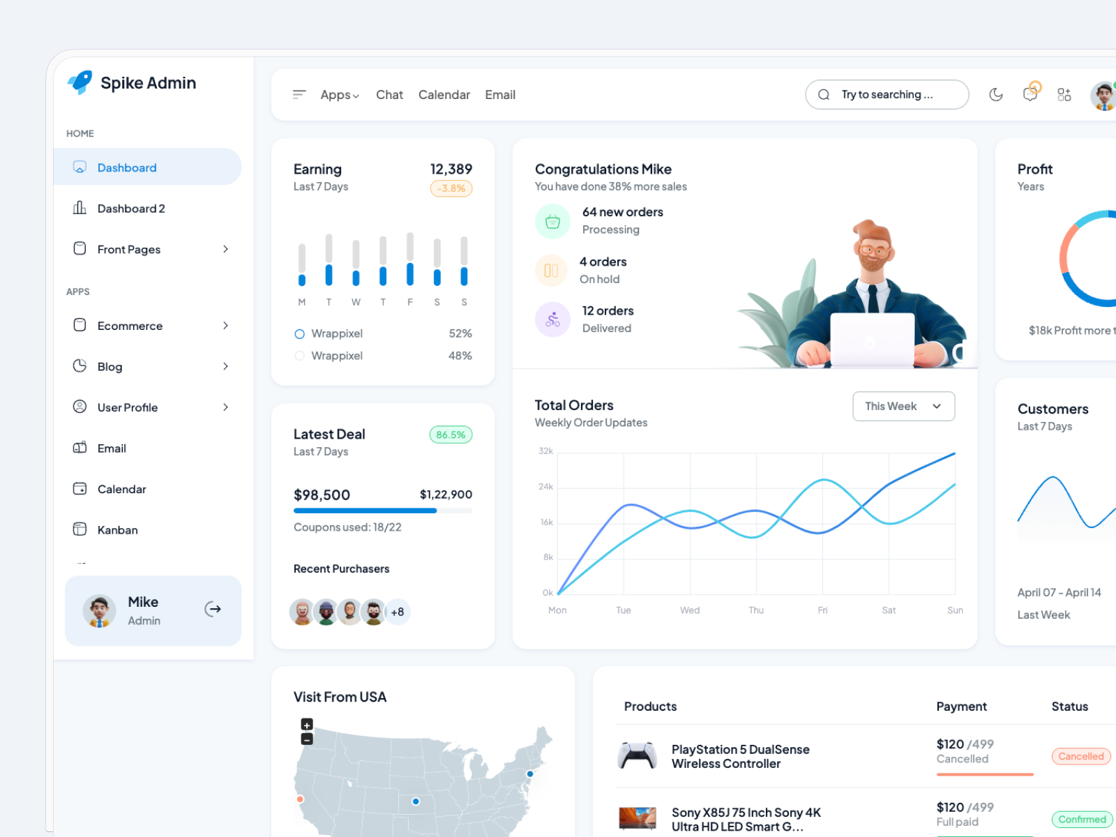
Sanjay, your dashboard design has a solid foundation and includes all the key elements for an admin panel, but there are areas where it could be improved for better usability. The layout is comprehensive, but it feels slightly cluttered, which may make it challenging for users to focus on the most critical information. For example, the "Congratulations Mike" section, while visually engaging, competes for attention with more actionable components like "Total Orders" and "Latest Deal." The color palette is clean and modern, but certain elements, like the charts and map, lack context or labels to make insights more immediately clear. Additionally, while the typography is legible, there’s room to improve the visual hierarchy to guide users more effectively through the information. With some refinement in spacing, prioritization, and contextual labeling, the dashboard can become more intuitive and user-friendly.
You might also like

eWallet App Development Project


🖥 Desktop Checkout Flow Design


Website CRM Dashboard


Helpful 404 Error Page for a Fintech Mobile App

TaskFlow Authentication Flow


Pebble Accessible SAAS Signup Flow

Popular Courses

Design Composition


HTML Foundations


CSS Foundations