Simple Button Design System


🎯 Case Study: Creating an Accessible Button Design System
📌 Overview
Buttons are one of the most used elements in any app or website. They help users take actions like “Submit,” “Buy,” or “Next.” In this project, I created a simple, accessible button system with different types (Primary, Secondary, and Tertiary) and states (like Hover, Pressed, Focus, and Disabled).
This system follows WCAG AA accessibility standards, which means the color contrast is strong enough for people with visual impairments to read easily.
🧩 Button Anatomy
Let’s first break down what makes up a button — its anatomy.
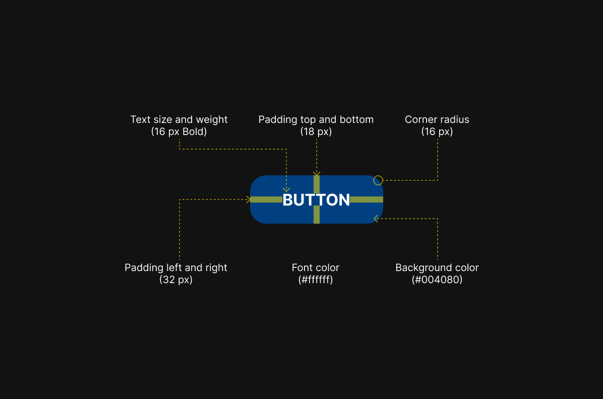
I followed these measurements to keep everything consistent and easy to read:
- Text size and weight: 16 px, Bold — so it’s clear and easy to scan.
- Padding (space inside the button):
- Top and bottom: 18 px
- Left and right: 32 px
- This makes the button big enough to tap or click easily.
- Corner radius: 16 px — gives it soft, rounded edges for a modern look.
- Font color: White (#ffffff) for clear readability.
- Background color (default): Deep blue (#004080) for high contrast.
🎨 Types of Buttons
I created three button types, depending on how strong or subtle the action should feel.
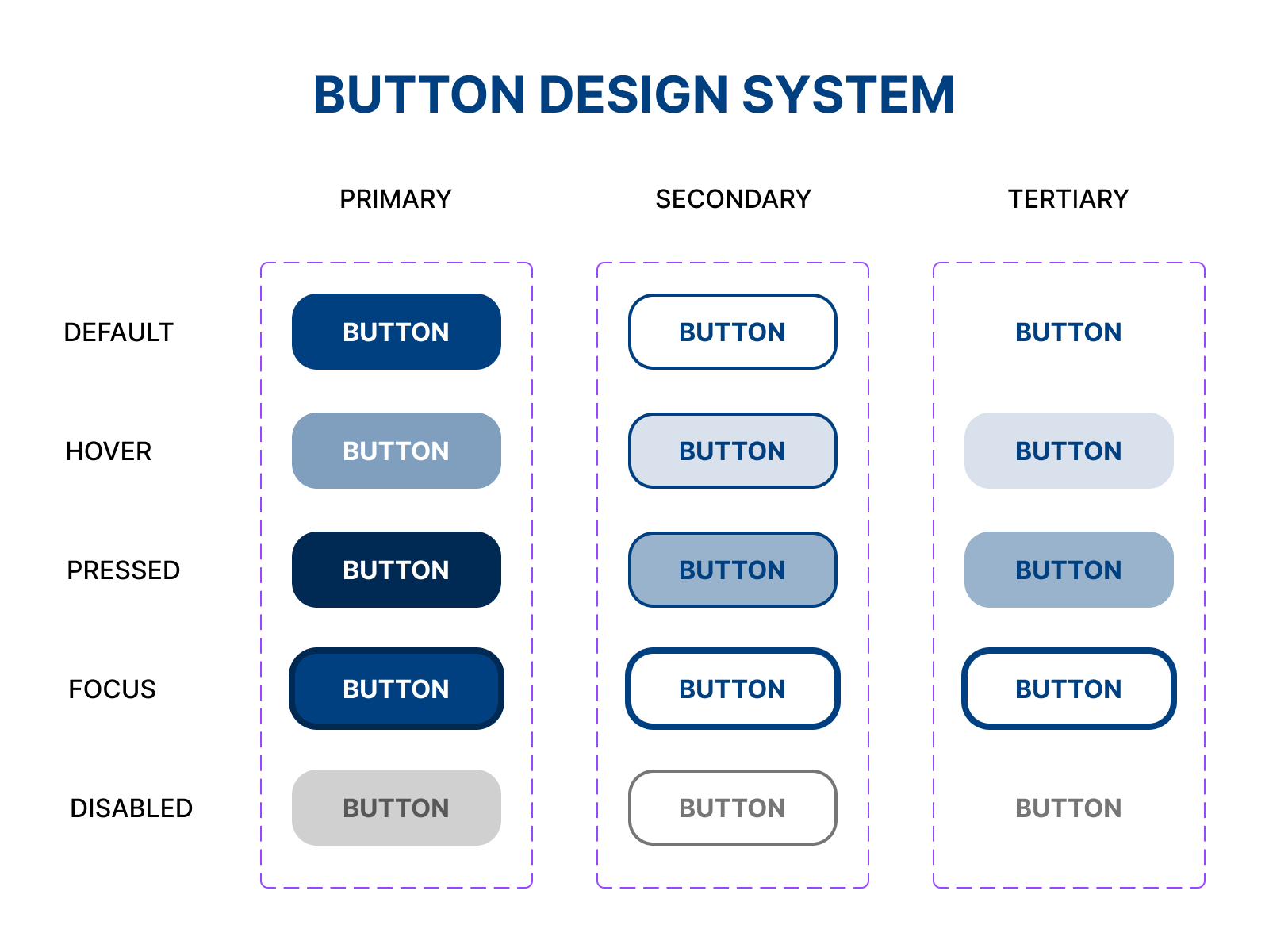
🔵 Primary Button
- This is the main call to action — the button I want users to click first.
- Strong, solid color background with white text.
- Used for things like “Submit,” “Sign Up,” or “Buy Now.”
⚪ Secondary Button
- This is used for secondary actions.
- Has a border with no fill (or a soft background on hover).
- Text is still bold and easy to read.
🔘 Tertiary Button
- This is for subtle actions or less important tasks.
- Looks more like plain text with less visual weight.
- Still accessible with a visible focus ring or outline.
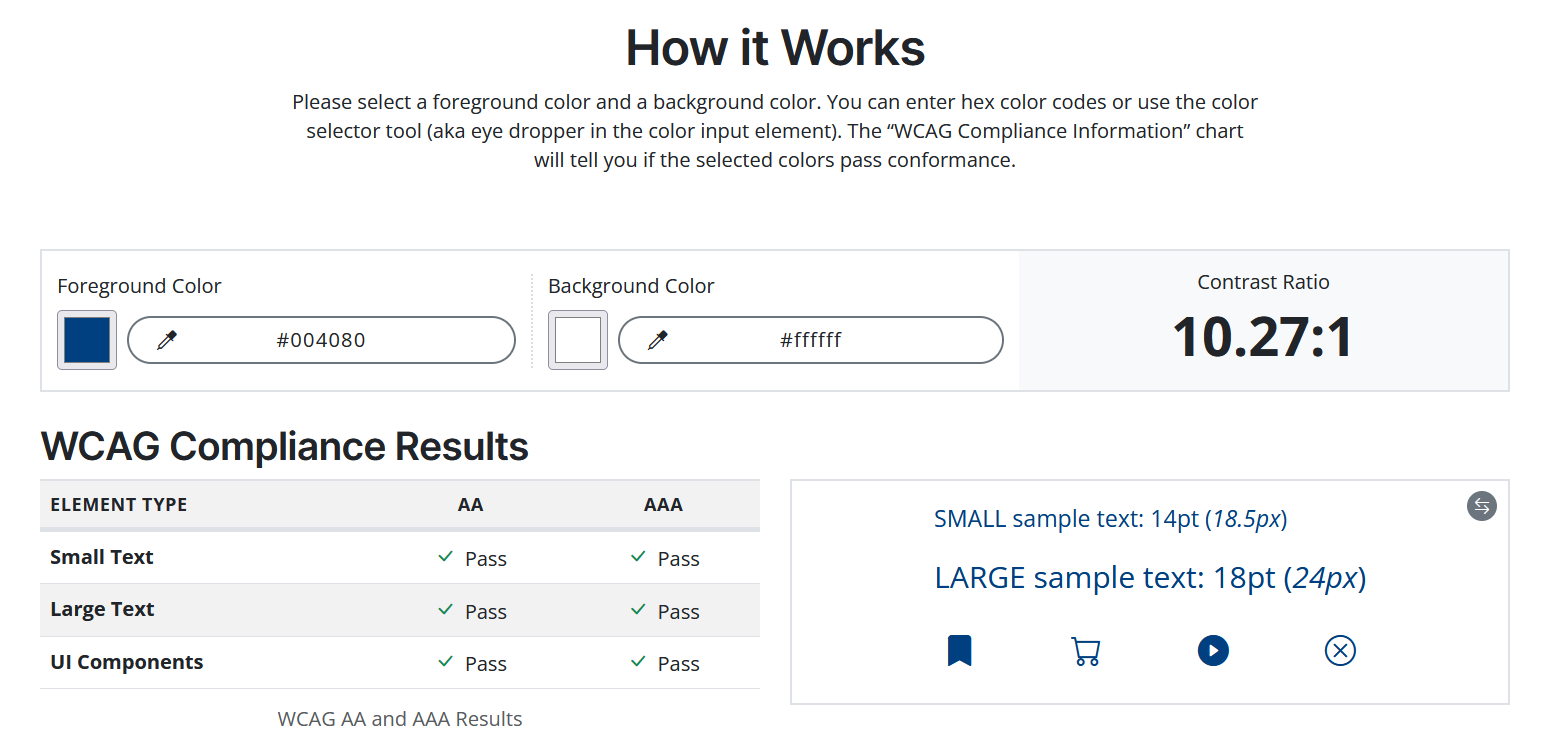
♿ Accessibility First
I made sure that all button colors follow WCAG AA guidelines for contrast. This ensures:
- People with low vision or color blindness can read the text.
- Buttons are clear even on bright or dark backgrounds.
- Focus rings are visible for keyboard navigation.
✅ Final Thoughts
Creating a button system may seem simple, but it plays a big role in making apps usable, beautiful, and inclusive. By focusing on clarity, consistency, and accessibility, I designed a system that works well for everyone, no matter how they interact with the interface.
Tools used
From brief

Topics
Share
Reviews
1 review

First off, you’ve done a nice job putting structure into your case study.
You explain button anatomy, types of buttons, and even include accessibility as a core principle — which is excellent. It shows you understand that good design systems are not just about visuals, but about usability and inclusivity.
That said, here are a few areas where you could really strengthen this project:
1. Accessibility: Practice vs. Principle
You highlight “Accessibility First” in your text, but some of your button states fail contrast ratio standards (e.g., white text on a #80A0BF background only scores 2.73:1, which is well below the WCAG minimum of 4.5:1 for normal text).
👉 As a designer, you want your case study to align what you say with what you show. If you advocate accessibility, make sure your examples actually pass accessibility tests.
Otherwise, it creates a credibility gap.
Tip:
- Adjust your color palette or use darker text/background shades.
- Show before/after contrast tests — this demonstrates your process and commitment to accessibility.
- Make sure the different states are easily discernible.
2. Add Context for Design Choices
Right now, the button variations (primary, secondary, tertiary) are presented, but there’s little explanation of when and why to use each. A strong design system should help developers and designers make consistent decisions.
👉 Consider adding usage guidelines like:
- Primary: use for the main call-to-action (checkout, confirm).
- Secondary: for supporting actions (save draft, learn more).
- Tertiary: for low-emphasis actions (view details).
This adds depth and makes your system more practical.
3. Show Edge Cases & States
You included button anatomy and some visual examples, but think about real product scenarios:
- What happens if the label is very long?
- How do buttons adapt to different screen sizes?
👉 Adding these details shows you’ve thought beyond the “happy path” and considered real-world implementation challenges.
4. Visual Clarity in Presentation
The structure of your case study is good, but you could improve storytelling:
- Use more annotated visuals (arrows, highlights) to guide the reader’s eye.
- Group states in a side-by-side comparison: default vs hover vs disabled.
- Summarize with a design principles checklist at the end (clarity, consistency, accessibility, scalability).
This makes your case study more engaging and professional.
5. Strengthen the “Final Thoughts”
Right now, the conclusion is a bit generic. Instead, reflect on the challenges:
- “Initially, I chose a color palette that didn’t meet accessibility standards. Through testing, I learned to adjust tones and ensure all states pass WCAG contrast checks. This reinforced my belief that accessibility isn’t optional — it’s part of good design.”
👉 This kind of honesty shows growth and makes your work stand out.
✅ In summary:
You’ve got the foundation of a strong design system case study. To elevate it:
- Make sure your accessibility claims are backed by accessible examples.
- Provide guidelines for usage, not just visuals.
- Cover edge cases and responsive behavior.
- Improve storytelling with visuals and reflections.
This way, your case study won’t just look like a set of buttons — it will read like a designer’s thought process, which is what hiring managers and mentors want to see.
You might also like
Loginino

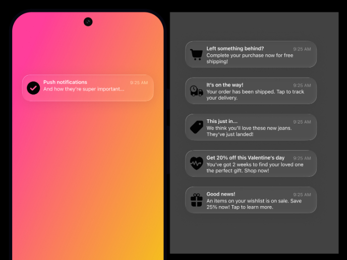
Notification microcopy - Project

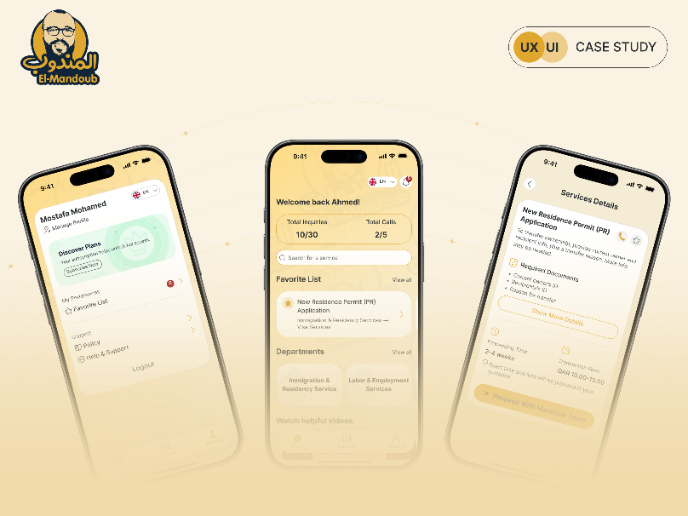
El Mandoub-GovTech App

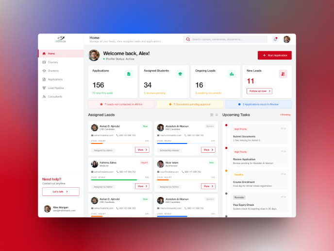
MalishaEdu Counselor Workspace

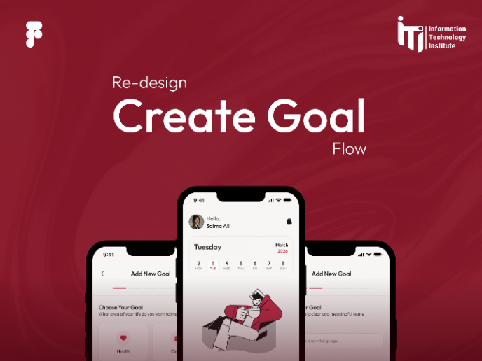
Goal Creation Flow

Portfolio website

Visual Design Courses

UX Design Foundations


Introduction to Figma

Design Terminology
