ShopUs Microcopy
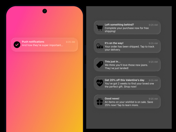
When I designed the push notification microcopy for a shopping platform, my thought process started with keeping it short, clear, and action-oriented since users only glance at notifications for a few seconds. I first considered the hierarchy, making the app name smaller so that the main message stands out. Then I thought about the tone of voice, it had to be friendly and inviting without sounding too pushy, so I used casual language with a hint of urgency. I also made sure the message had a clear purpose, whether it was reminding the user about their cart, updating them on delivery, or highlighting a sale. Lastly, I imagined how the notification would look in both light and dark mode, ensuring readability with proper font sizes and color contrast. Overall, I wanted the copy to feel personal and engaging enough to make users want to tap without overwhelming them.
Tools used
From brief
Topics
Share
Reviews
3 reviews
I really like how your microcopy for ShopUs feels clear and helpful without being stiff—it’s friendly and guides users along smoothly. Those little phrases are doing their job: guiding actions, calming nerves, and helping users feel confident.
To make it even stronger:
- Point out the fun stuff: Is there a quirky error message or a cozy confirmation? Highlight how those moments make the experience feel human.
- Show it in context: A few sneak peeks of the copy embedded in mockups (like a checkout glance or form prompt) would help people feel how it flows in the UI.
- Frame it with intent: A short line like “Built to make international checkout feel frictionless” adds a human touch to your purpose.
Overall, your microcopy is doing a great job sounding smart and approachable—and a little more storytelling and visuals would take it to the next level.
Looks great!
I can only agree with the feedback already given.
Outline where a user would land if a notification is being pressed/clicked on. If you don't have views available, you can add native annotations to help developers understand the expected behaviour they need to code.
Other than that, keep up the great work!
Nice work, Shivani — your microcopy is clear, warm, and action-driven, which really fits push notifications. To push it further, show the copy in UI context and highlight a few “delight moments” (like playful errors or confirmations). That’ll make the personality shine and show how it supports the overall experience.
You might also like
SiteScope - Progress Tracking App

CJM for Co-Working Space - WeWork

Ubani Design System

Accessible Signup Form for SaaS Platform

Loginino

Notification microcopy - Project
Content Strategy Courses

UX Writing

Common Design Patterns


