Redesign Dashboard

Tools used
Share
Reviews
2 reviews

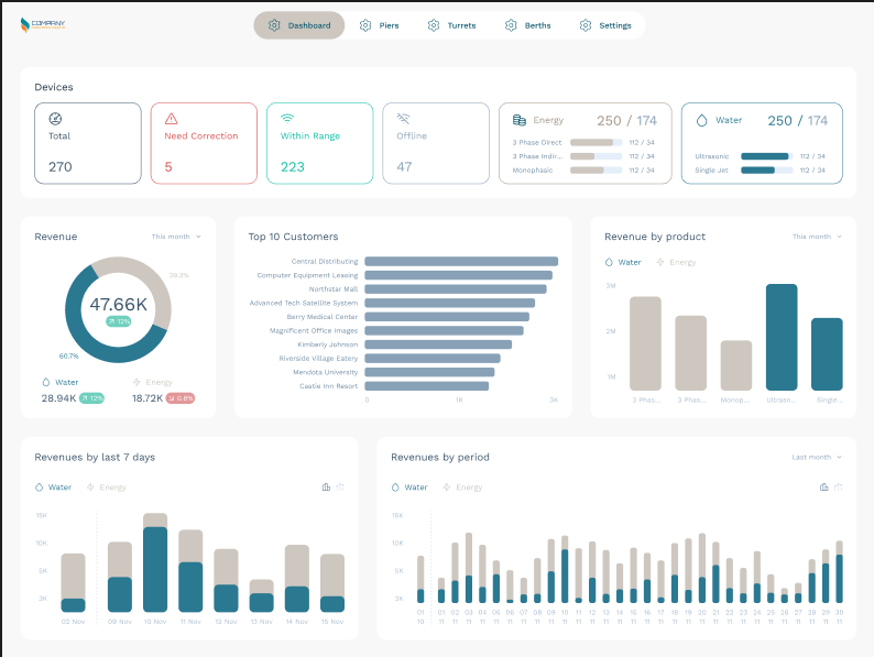
The dashboard redesign demonstrates its original professional and consistent replacement status, offering a colour scheme ranging from blue to green black. The advantages are that better contrast improves consistent color schemes, acquired information hierarchy, and ease of reading of diagrams. However,
is a potential issue with readability of some numerical elements and labels, ensuring that the new color scheme corresponds to standards without WCAG barriers.
Without a business context, it is difficult to fully assess the effectiveness of a redesign in achieving product goals, but overall it is presented as a robust task of maintaining a balance of interface refreshes at the same time.

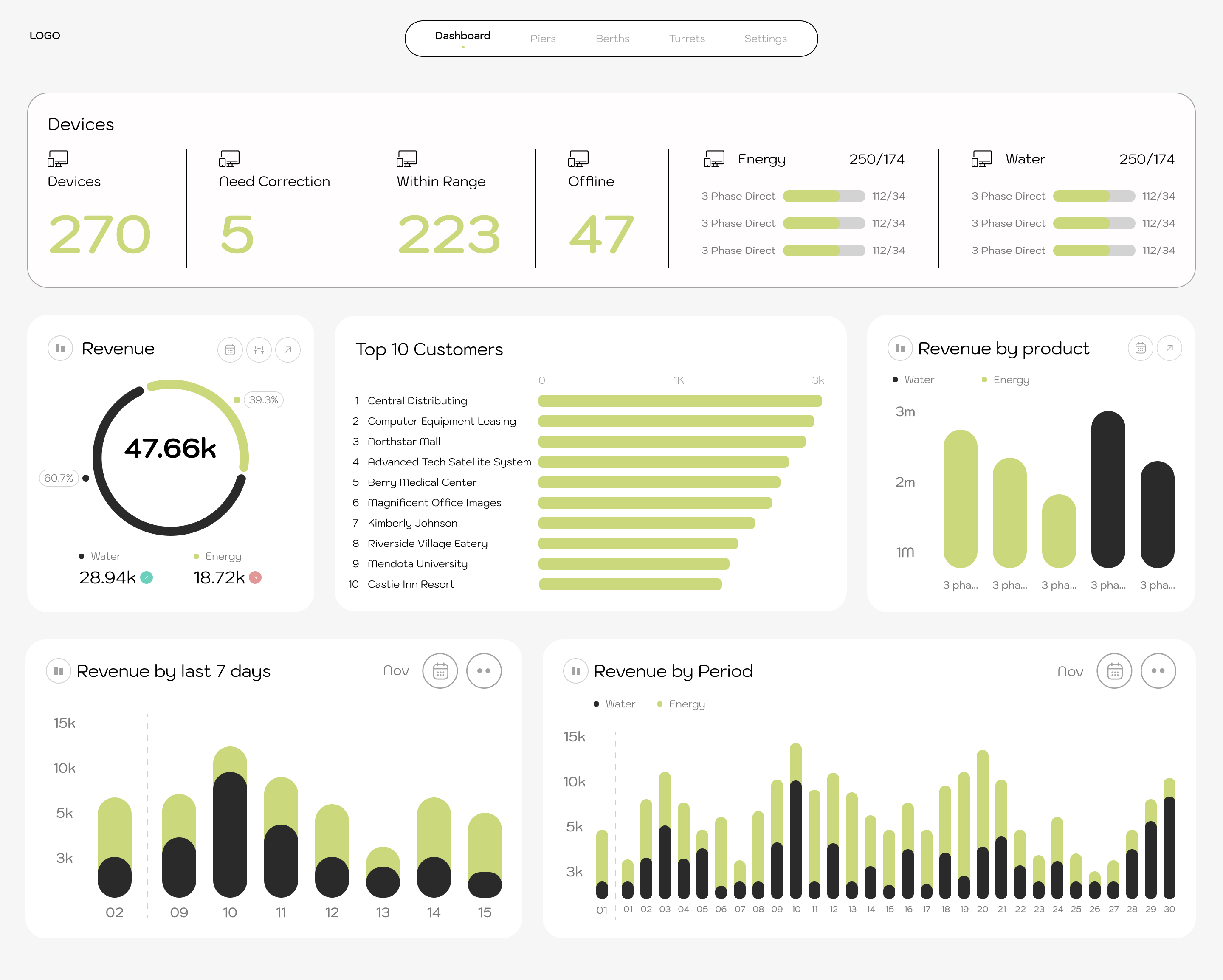
The dashboard redesign presents itself as a professional and coherent alternative to the original, introducing a color scheme change from blue to green-black. Strong points include a consistent color scheme, preserved information hierarchy, and improved chart readability thanks to better contrast.
However, it's worth noting potential issues with the readability of some numerical elements and labels, and ensuring the new color scheme meets WCAG accessibility standards.
Without business context, it's difficult to fully evaluate the redesign's effectiveness in achieving product goals, but overall it presents as solid work maintaining a balance between refreshing the interface while preserving familiarity.
You might also like

Improving Dating App Onboarding: A/B Test Design

FORM Checkout Flow - Mobile


A/B Test for Hinge's Onboarding Flow


Accessibility Asse


The Fitness Growth Engine

Uxcel Halloween Icon Pack

Popular Courses

UX Design Foundations


Introduction to Figma

Design Terminology
