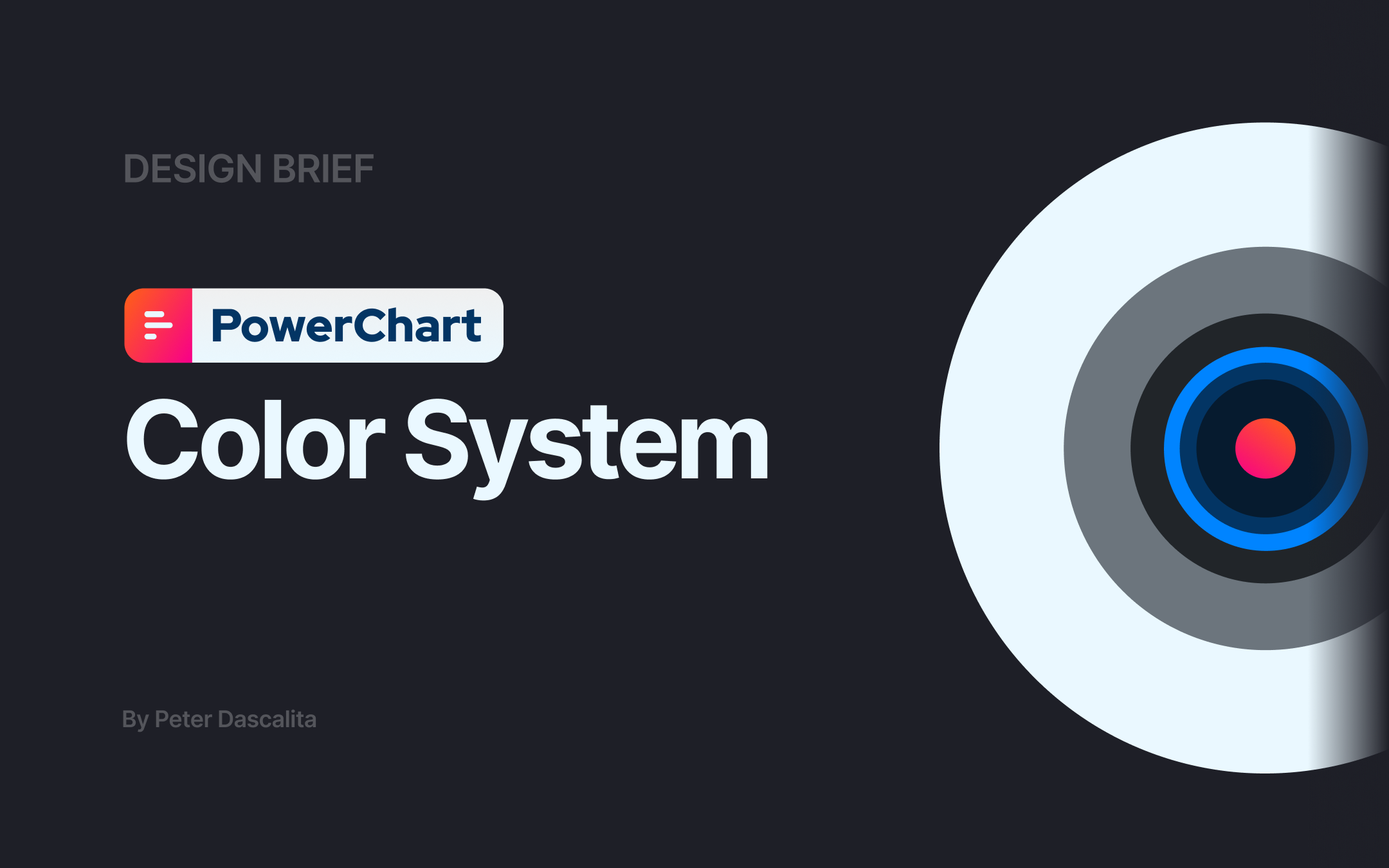
PowerChart Color System
PowerChart Touch is a workflow management app that allows doctors to review their schedule, patient list, and patient charts, including medical notes, prescribed medications, and laboratory results.
Some of the existing app’s features seem buried under a relatively flat visual and informational structure. In this project, I explore how a more deliberate and strategic use of colour might enhance the user experience and complement the existing product’s technical capabilities.
Tools used
From brief
Topics
Share
Reviews
1 review
Hi Petru-Emanuel,
I enjoyed reading through your rationale. It’s clear you put a lot of thought into your decisions, and your process is well explained.
I found your choice of the PowerChart app for this project really interesting. Instead of choosing a more mainstream tool, you deliberately picked something widely used in a specific niche (healthcare) that could really benefit from a visual upgrade to enhance the user experience. That was a smart and thoughtful decision.
I’m also just starting out in UI/UX, so I feel a little hesitant to give detailed feedback on the app’s structure or UI improvements.
On a side note, you might want to double-check the first line on page 8 (tertiary colors)—just a small thing I noticed.
Keep up the great work!
You might also like
🖥 Desktop Checkout Flow Design

Website CRM Dashboard
Pebble Accessible SAAS Signup Flow
Music Player UI - Light & Dark Mode
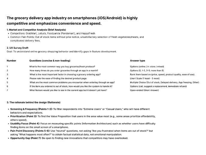
Create a UX Research Survey
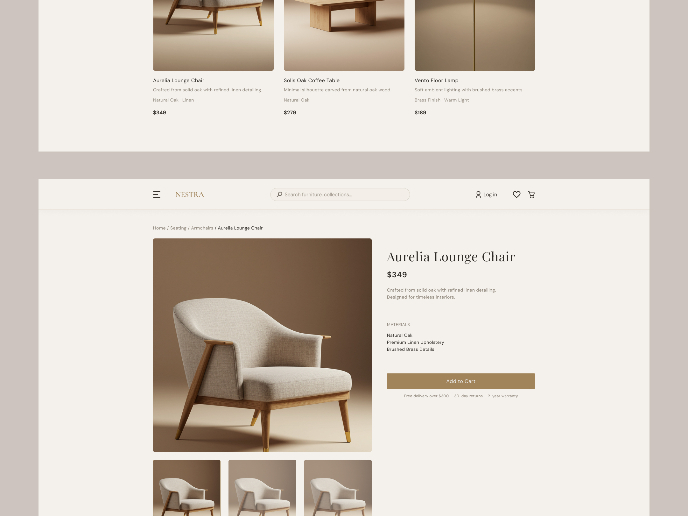
Nestra from homepage to checkout process
Visual Design Courses

UX Design Foundations

Introduction to Figma


