Payment Page

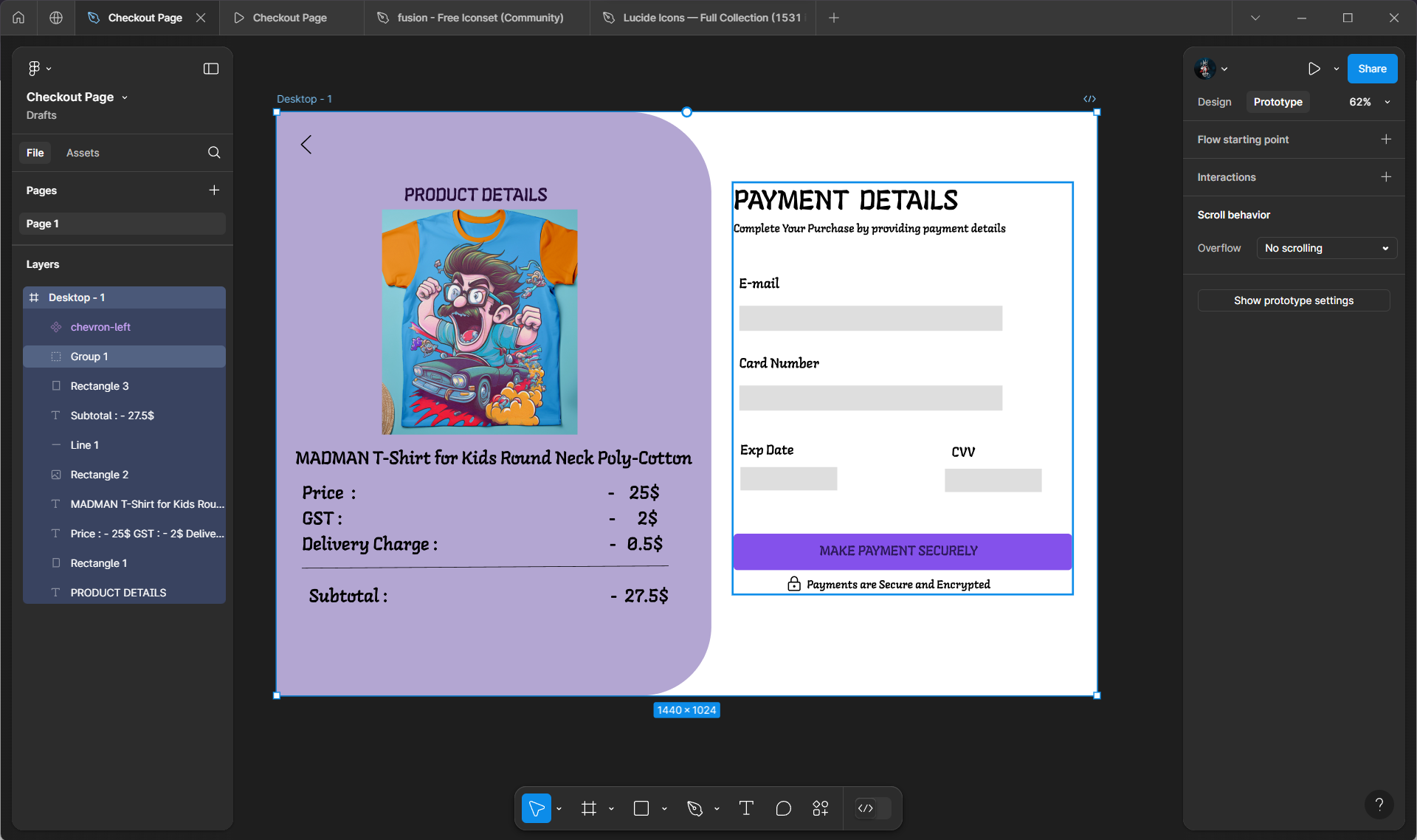
This a checkout page of a t-shirt buyer. This is used for payment purposes.

Reviews
1 review

First of all good start, I can see your ideas flowing! I would suggest going away doing a bit more research on putting these kind of screens together. There are a lot of inconsistencies in terms of space and input field size. The payment button seems to be a little to big and the black writing clashes too much with the button colour. Adding some placeholder text in each field will help users identify what they need to add. Good luck on your journey!
Sure I will try to improve my work
Good luck I wish you the very best!
2 Claps
Average 2.0 by 1 person
You might also like

Project
Bridge: UI/UX Rebrand of a Blockchain SCM Product

A UI/UX overhaul project of Bridge, a blockchain-based enterprise supply chain management web app originally called BSCM. This short case st

Project
Pulse Music App - Light/Dark Mode

This project presents a mobile music streaming interface designed in both light and dark modes. The visual direction combines Japandi minima

Project
Monetization Strategy

This project evaluates two monetization models (freemium and paid) for a new mobile point-and-click adventure game. It compares their streng

Project
Designing A Better Co-Working Experience Through CJM

Project ContextThis project focuses on improving the experience of individuals using co-working spaces. The objective is to identify key pai

Project
Design a Settings Page for Mobile

Showcase your information architecture and content strategy skills by crafting a settings page for mobile.

Project
Zoom Sign in Screen

Designing a WCAG-Compliant Login Screen for Zoom — Here's What I Did & Why Perceivable — Persistent labels above each field (never placehold
Interaction Design Courses

Course
UX Design Foundations

Learn UX design fundamentals and principles that create better products. Build foundational knowledge in design concepts, visual fundamentals, and workflows.

Course
Introduction to Figma
Learn essential Figma tools like layers, styling, typography, and images. Master the basics to create clean, user-friendly designs

Course
Design Terminology

Learn UX terminology and key UX/UI terms that boost collaboration between designers, developers, and stakeholders for smoother, clearer communication.