Notion’s New Color System

Notion is known for its clean and simple interface, but this sometimes limits the use of color to improve clarity and accessibility. The new color system solves this by introducing a well-thought-out palette that combines ease of use with aesthetic appeal.
Primary colors—black, white, and blue—keep the design clear and focused, making headers and interactive elements easy to see.
Secondary colors like green, orange, and red are carefully chosen to emphasize key actions: green celebrates success, orange signals important deadlines, and red highlights errors.
Tertiary colors, such as light gray and dark gray, add structure without overwhelming the user.
System colors like yellow, light blue, and red provide quick and meaningful feedback for notifications, information, and errors.
In the slide, you can see which colors have been tested for WCAG 2.1 AA standards, ensuring the interface is accessible and inclusive for all users. This system makes Notion intuitive, functional, and visually engaging.
Tools used
From brief

Topics
Share
Reviews
2 reviews

Great job Ivan. All the colors seems fine. I suggest to add Semantic Colors which are generally used for status like success, alert, warning and information. You must have included that. Rest seems fine.
All the best!

Great job and presentation Ivan!
You might also like
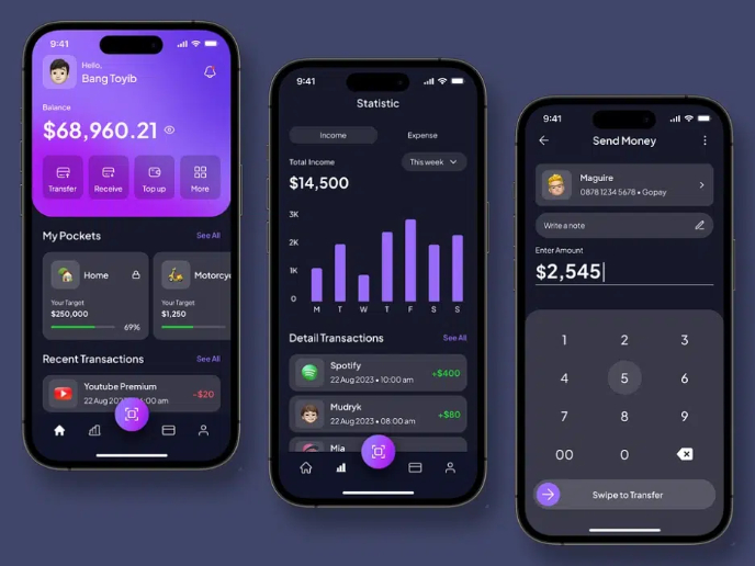
eWallet App Development Project


🖥 Desktop Checkout Flow Design


Website CRM Dashboard


Helpful 404 Error Page for a Fintech Mobile App

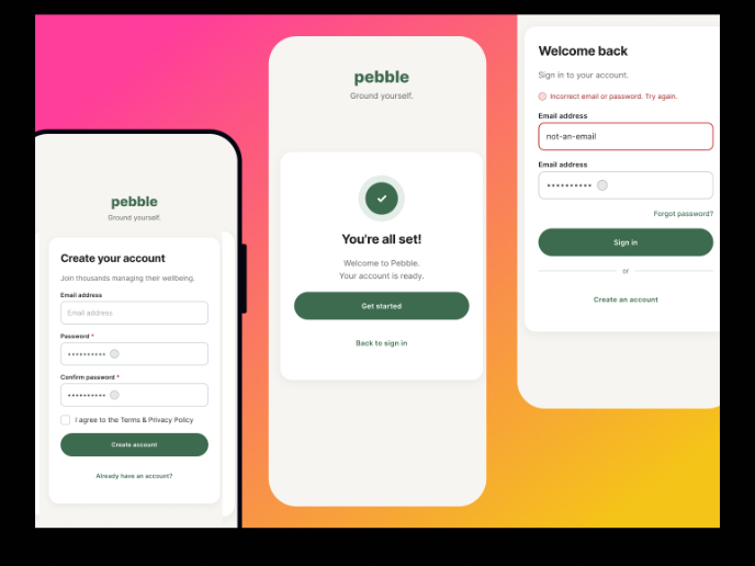
Pebble Accessible SAAS Signup Flow

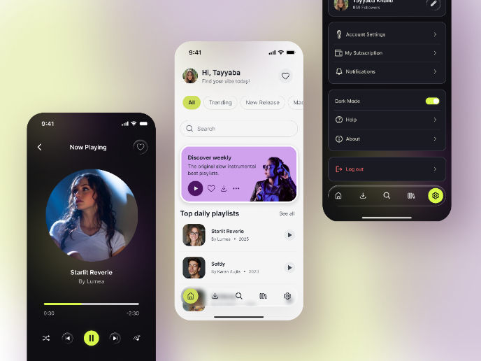
Music Player UI - Light & Dark Mode

Visual Design Courses

UX Design Foundations


Introduction to Figma

Design Terminology
