Landing site design "Unlock Your Vocal Potential"

About
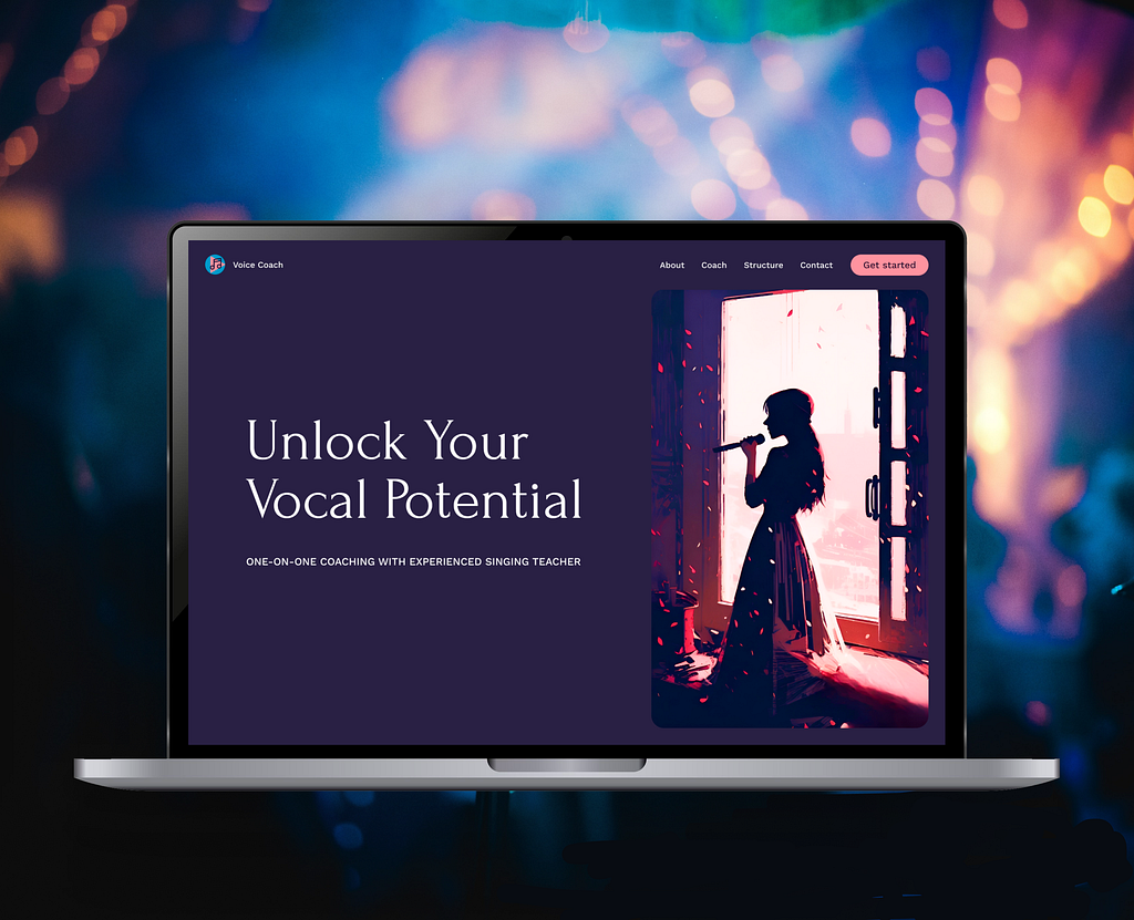
Welcome to my landing site design project for singing lessons, where you can unleash your vocal potential with the guidance of an experienced coach. Website offers a user-friendly experience, featuring simple navigation and concise texts to help you find the information you need quickly and easily. Immerse yourself in a captivating atmosphere as site is adorned with a rich and inspiring color palette. The main color, a deep and enchanting dark purple, has been carefully chosen based on psychological research that suggests it stimulates creativity and encourages artistic expression. Complementing this primary hue, you will find accents of lively pink and refreshing turquoise, creating a visually pleasing and harmonious environment. Step into a world of originality as you explore site's unique illustrations. These captivating visuals have been specially generated at my request by AI and further modified by me, ensuring a personal touch that truly reflects the essence of my singing lessons. Whether you're a beginner or looking to refine your singing skills, my landing site is the gateway to discovering the joy and power of your voice. Join and unlock your true vocal potential with the guidance of experienced coach.
Reviews
2 reviews

Using multiple colors in a website can be a bit challenging but I like how you only used them to differentiate the different sections of the website making it much easier to digest.
Unlike the presentation itself which is a bit busy with colors.
Good job done nonetheless.

I really like the work you've done here,
You used very well the white space it does not impact the reliability of the content on the Desktop version, but I would suggest you to reduce the quantity of text and increase a little bit the body size of the type face.
The website has a very distinguished identity and personality. I would love to read the content that you used for the demo. To understand the tone and language used.
There's a very good hierarchy of content, very neat and clean.
Love the work done with the illustrations. Love the colors you chose.
The only issue I would point out would be the mobile version which has too much text I would suggest you to optimise the content for the mobile reduce a little bit the amount of text to just essential.
Some buttons lack a little bit of consistency because sometimes they are aligned on the left and sometimes they are aligned on the right.
You might also like

Improving Dating App Onboarding: A/B Test Design

FORM Checkout Flow - Mobile


A/B Test for Hinge's Onboarding Flow


Accessibility Asse


The Fitness Growth Engine

Uxcel Halloween Icon Pack

Popular Courses

Information Architecture


Everyday UX Flows by Checklist Design


UX Design Foundations
