Landing Page for Fashion Service

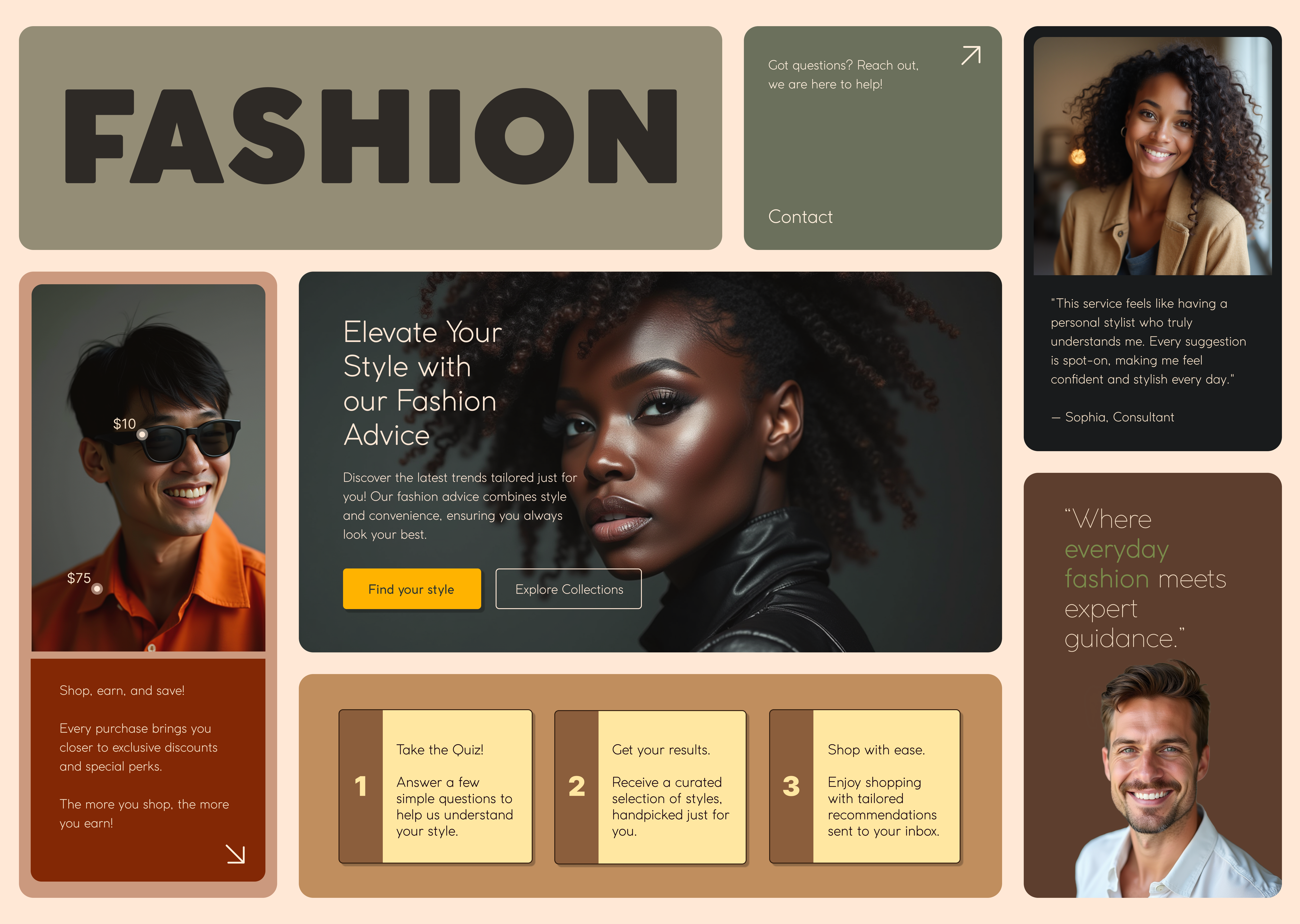
The landing page for this fashion service was designed using a Bento style layout, ensuring a structured yet visually engaging presentation. Unlike many competitors who rely on long-scrolling layouts or overly complex interfaces, this approach provides clear content segmentation, allowing users to grasp the unique value proposition quickly. Each section is designed for effortless navigation, ensuring users can easily find relevant information without cognitive overload.
Key Difference
What sets this fashion service apart is its personalized approach to everyday fashion. While many platforms offer generic recommendations, this service curates outfit suggestions tailored to individual style preferences. Users complete a style quiz, and in return, receive personalized daily outfit inspiration directly in their inbox—eliminating guesswork and making dressing effortless.
Loyalty Perks
To encourage long-term engagement, the service also offers exclusive discounts for loyal customers, rewarding users who frequently interact with the platform. This encourages repeat visits and strengthens brand affinity, creating a seamless blend of style inspiration and tangible benefits.
This landing page effectively communicates the service’s modern, user-centric approach to everyday fashion by combining a visually clean, structured layout with highly personalized user engagement.
Tools used
From brief

Topics
Share
Reviews
1 review

Hi Antonija,
I really like your colour choices and imagery—they create a cohesive and visually appealing style. The bento-style layout is an interesting and fresh approach!
That said, most e-commerce websites follow familiar layout patterns for usability reasons. Introducing a completely new structure could potentially confuse users or lead to drop-offs. It would be fascinating to test this layout with users and evaluate each section carefully.
Some key questions to consider:
- Is it clear which elements are interactive?
- How do users navigate to the product page?
- Can users easily find the cart?
- How do they get a holistic view of a product?
- How does search functionality work?
- Is the login process intuitive?
Conducting user research and benchmarking could be great next steps to refine the landing page further.
By the way, I love the glasses and shirt elements with small price indicators—such a cool detail! 🤩 Keep up the great work!
Yuliia
You might also like

eWallet App Development Project


🖥 Desktop Checkout Flow Design


Website CRM Dashboard


Helpful 404 Error Page for a Fintech Mobile App


Pebble Accessible SAAS Signup Flow


Music Player UI - Light & Dark Mode

Content Strategy Courses

UX Writing


Common UX/UI Design Patterns & Flows


Building Content Design Systems
