Falcore AI Case study

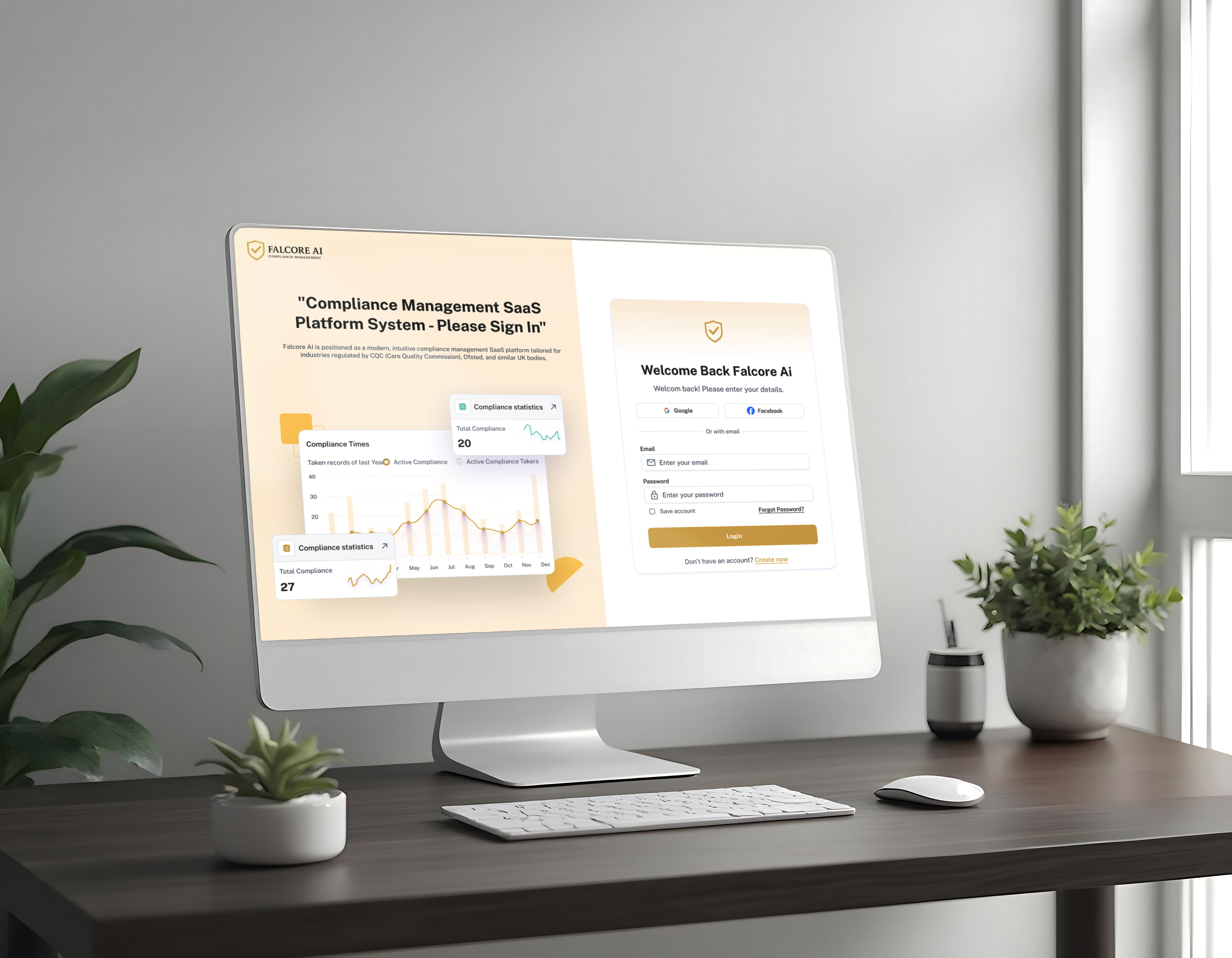
Falcore AI is a modular, mobile-first platform that unifies HR, compliance, operations, and communication into one ecosystem. It helps organizations streamline workflows, reduce compliance risks, and improve team efficiency—especially in regulated industries like healthcare, education, and logistics.
Reviews
3 reviews

Topic: Communication
Score: 3
✅ Strengths:
- The tone is clear, confident, and easy to follow.
- Uses bullet points effectively for readability in sections like "Project Goals" and "Design Process".
- Clear problem articulation with a concise project overview.
🔧 Opportunities for Improvement:
- Some phrases feel generic or repetitive (e.g., “intuitive,” “streamlined” — consider replacing with more specific outcomes or user reactions).
- Could enhance the storytelling with more narrative depth around user context (What did failure of compliance mean for them? What pain points existed before?).
Topic: Presentation & Format
Score: 3
✅ Strengths:
- Clean layout with well-balanced white space.
- Each section is visually distinct and easy to digest.
- High-res mockups are crisp and professional, especially the dashboard UI and workflows.
🔧 Opportunities for Improvement:
- The "Design Process" section feels more like a checklist than a visual journey — adding flow diagrams or journey maps would help.
- Could benefit from a short animated prototype (GIF/video) to demonstrate how interactions work within the dashboard or forms.
Topic: Craft & Quality of Execution
Score: 4
✅ Strengths:
- The design work is polished, consistent, and clearly built for enterprise usage.
- Form design, tables, and filtering UIs are thoughtfully executed with a strong grasp of usability patterns.
- Visual consistency across components and attention to iconography and spacing.
🔧 Opportunities for Improvement:
- Consider showcasing mobile or tablet variations to highlight responsive thinking.
- More contrast on some muted grays would boost accessibility.
Topic: UX Foundation & Process
Score: 3
✅ Strengths:
- Covers all UX stages: understanding the user, setting goals, designing, and testing.
- Mentions usability testing and iteration, which reflects maturity in approach.
🔧 Opportunities for Improvement:
- Lacks depth in user research: Who were the users? How many were interviewed or observed? What themes emerged?
- Could elaborate on metrics or KPIs tracked post-launch (or potential ones), especially since it’s a compliance product — i.e., fewer errors, faster workflows, better audit scores?
Evaluation Summary:
The candidate showcases solid visual design skills, enterprise UX awareness, and a clear end-to-end process. Though the research and storytelling can be strengthened, the attention to execution and practical solutions shows readiness for mid-level roles in B2B/enterprise environments.

This case study is clear and well-structured. I like how you highlighted Falcore AI’s modular approach and mobile-first focus, which immediately shows its adaptability and modern design thinking.
The way you explain the platform’s benefits such as streamlining workflows, reducing compliance risks, and improving efficiency gives a strong sense of user value. It could be even stronger if you briefly mention specific design choices or interactions that support these outcomes.
Overall, it presents the product as professional, practical, and thoughtfully designed for complex organizational needs.

Okay, overall I can see the project is visually polished and there's clearly some thought put into the system. But I have a few observations:
What works:
- Color consistency and that warm gold-beige accent works well – builds trust, which matters in compliance
- Dashboard has sensible hierarchy – metrics at the top, details below. Not overwhelming.
- Responsiveness is evident – desktop and mobile hold together nicely.
- Typography looks readable, spacing breathes
What concerns me:
- Information density – That chart with three compliance standards (CQC, Ofsted, GDPR) at once might be overwhelming. I'm not sure if for a user who needs to react quickly, this isn't too much at once.
- Status colors – in "Recent Incident" you've got yellow "Under Review", green "Open", red "Closed", orange "Escalated". This is somewhat unconventional – usually red = problem, green = okay. Here "Closed" is red, which can be confusing. Might be worth rethinking the semantics.
- Attendance heatmap – the calendar grid is a nice idea, but I'm not sure if those gold shades provide enough contrast for people with color vision issues. Might be worth testing with accessibility tools.
- Login screens – seem okay, but I don't see any validation hints or error states. What does error communication look like? That's crucial in forms.
What I don't know:
- How does navigation between modules work? "Training Matrix", "Incident Reporting" – are these separate views or overlays?
- What does the mobile view of the main dashboard look like? Only login screens are visible
- What happens when there are 50 "Critical Issues", not 536? Does the interface scale?
SUMMARY:
Solid foundation, but the devil's in the details. Would be good to see edge cases, error states, and make sure accessibility is up to par – especially in healthcare where WCAG requirements apply. But GREAT job! 💪😊✌️
You might also like

Accessible Signup Form


Entrant - Analytical Dashboard

Uber Eats Push notifications


Transit Cairo — Digital Mobility Redefined


Babylon Balance - Designing Financial Clarity Through Constraint


Entrant Accessible Signup and Login Forms
Popular Courses

UX Design Foundations


Design Terminology


Introduction to Product Management
