Heuristic Analysis for Website
Tools used
From brief
Topics
Share
Reviews
1 review
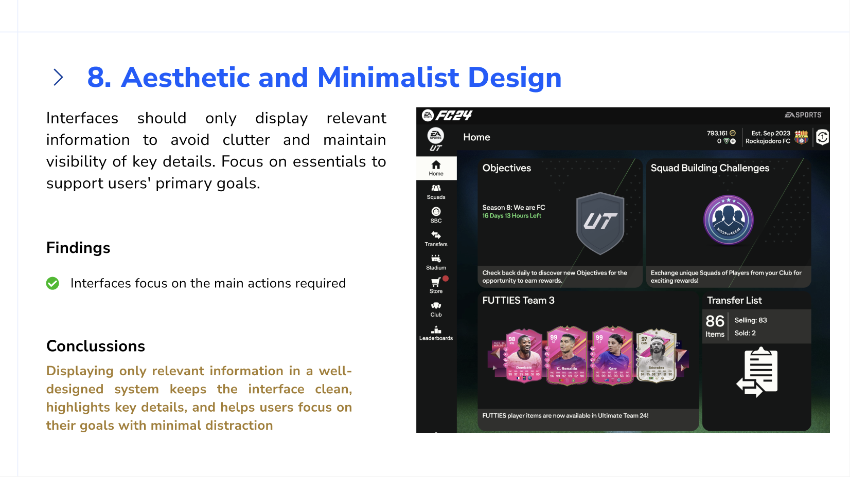
Well done! I think the analysis covers all fronts well and makes it clear what is being analysed. I would have liked to see a higher degree of criticism though! Maybe I am overly critical but a few low hanging fruit issues are apparent to me if I look at the app. I agree that the systems looks decent at first glance but I think there's many improvements possible on some fronts. The UI feels outdated with current standards, and on the aesthetic and minimalism side, as I do think there is much to be desired in terms of very poor whitespace usage, overly detailed (and non-standard) icon usage there. Color use is very highly contrasting which can cause eye strain (but might be good for outdoor use or for inclusivity reasons).
2 Claps
Average 2.0 by 1 person
You might also like

Project
PLANTIST
A vibrant online marketplace where plant lovers can buy a diverse range of plants, gardening tools, and accessories. Our platform is designe

Project
Lumen
All explanation on the image above

Project
NORTHSIDE - Coworking space Customer Journey Map
Most coworking brands have the same problem: acquisition is easy, retention isn't. The website sells a lifestyle. The product delivers a des

Project
Accessible Signup Form for Monkey Survey
The following redesign demonstrates how I improved the accessibility of the Survey Monkey signup experience for mobile users. Redesigned the

Project
Crave Corner - Bakery App Design
Project Overview Crave Corner is a bakery ordering app designed to help users easily discover and order freshly baked products. The goal is

Project
Wealthsimple 404 Page
I built a 404 page for Wealthsimple's website. For people who are not in Canada, this is a banking platform that was made to make banking ve
User Research Courses

Course
Ethical & Responsible Product Design
Learn to build products that respect users, society, and the planet while driving sustainable business growth

Course
Product Management Foundations
Learn how to turn nascent ideas into successful products using proven product management frameworks, clear processes, practical strategies, and best practices.

Course
The Product Development Lifecycle & Methodologies
Learn the full product development lifecycle: from validating ideas and defining strategy to designing MVPs, testing with users, and launching products that hold up over time.

