Empty State Designs for a Learning Platform

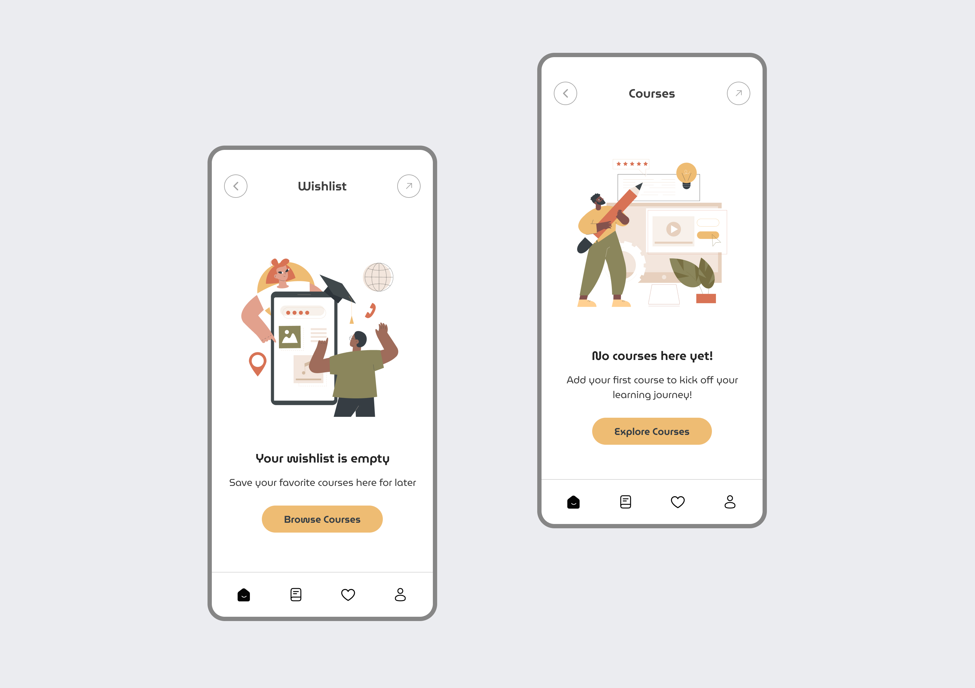
Wishlist Screen (Left)
- Content: A central illustration depicts a person in a graduation cap, holding a tablet displaying a course with a "4.5" star rating. A globe and a light bulb icon are also visible on the tablet, suggesting learning and ideas. The person has a cheerful expression, creating a positive vibe.
- Message: Below the illustration, the text reads "Your wishlist is empty." A smaller line of text clarifies, "Save your favorite courses here for later."
- Call to Action: A prominent orange button with rounded corners reads "Browse Courses," encouraging users to explore available options.
Courses Screen (Right)
- Content: A central illustration shows a person holding an oversized pencil, with a light bulb and a stack of books beside them, symbolizing study and knowledge. The person is smiling and appears enthusiastic.
- Message: The text reads "No courses here yet!" followed by a prompt, "Add your first course to kick off your learning journey!"
- Call to Action: An orange button with rounded corners reads "Explore Courses," motivating users to start their educational experience.
Overall Impression
The designs are visually appealing and user-friendly. The illustrations effectively communicate the purpose of each section, while the clear and concise messaging guides users towards the next step. The consistent design language and prominent call-to-action buttons ensure a seamless and engaging user experience, even in the absence of content. The use of positive and encouraging imagery helps to motivate users to engage with the platform.

Reviews
2 reviews

Hi Ankita, great job on these empty state designs! 🌟 The illustrations are cheerful and clearly convey the purpose of each screen. Messaging is concise and the CTAs are prominent, guiding users effectively toward the next step. One small suggestion: consider refining the project description to feel more natural and personal, so it matches the quality of your visual design. Overall, very solid work! ✅

Hey, Ankita, while the designs seem clean the description of the project seems a bit too ai generated and while there's nothing wrong to use it, I'd suggest changing the tone of your writing or if you are using it to help write about the explanation of your desigion decisions, use different speech pattern. Overall, designs seem pretty nice!
You might also like

Improving Dating App Onboarding: A/B Test Design

FORM Checkout Flow - Mobile


A/B Test for Hinge's Onboarding Flow


Accessibility Asse


The Fitness Growth Engine


The Relational Workspace

Content Strategy Courses

UX Writing


Common UX/UI Design Patterns & Flows


Building Content Design Systems
