E-Commerce App Concept (Halloween Theme)


For this challenge, I created a custom icon specifically designed for an e-commerce application on a smartphone. The goal was to develop a visually appealing and functional icon that reflects the essence of the app while ensuring it stands out on mobile devices.
The design process focused on simplicity, clarity, and representing the core features of e-commerce, such as shopping and convenience, to enhance user engagement and recognition at first glance.
Tools used
From brief
Topics
Share
Reviews
7 reviews
I enjoyed the creativity and the exquisite implementation of your icon work. Well done!

The spooky icons are very cute and they are always recognisable at first glance. Maybe it's difficult to recognize the shopping icon but the notifications help us.
I just love this kind of halloween design.
Congrats!

Amazing work on the icon set! Each icon is so detailed and creative, capturing the Halloween vibe perfectly. Really impressive design—great job! 🎃
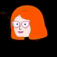
I really like the art style you chose for the icons and I especially love the profile icon. Really clever!
The icons can be a little tricky to make out all the details with the orange offset (particularly the notification and home icons) but I think if you filled them without the slight offset, they would be perfect.
Very creative!

Hey Miftakhul! Great job with this set! I absolutely love the off-set printing look that you have here! I would consider stripping away some of these details in order to better fit within the app that you have designed them for. Some of the icons get lost on what it is at such a smaller scale. Beautiful work though! You've done a great job with consistency here. Keep it up!

Great presentation and the duotone icons look good. I'm not a big fan of white strokes over the dark background.
The icons are super well created, congratulations!

Hi Miftakhul, it's a very nice project. I must say I find your work very creative. They are definitely impressive, but I find it a bit cluttered. The site has too much fun for a serious site. I think it doesn't fit the concept. The icons themselves are beautiful and creative. But it doesn't fit the context.Congratulations for your creative and energetic work
You might also like

edX Sign-Up Page Redesign


Beautify Login page WCAG principles


Design Prioritization Workshop


Sanyahawa - Personal Portifolio_login page

Uxcel Halloween Icon Pack


eWallet App Development Project

Visual Design Courses

UX Design Foundations


Introduction to Figma

Design Terminology
