"Design Studio" website

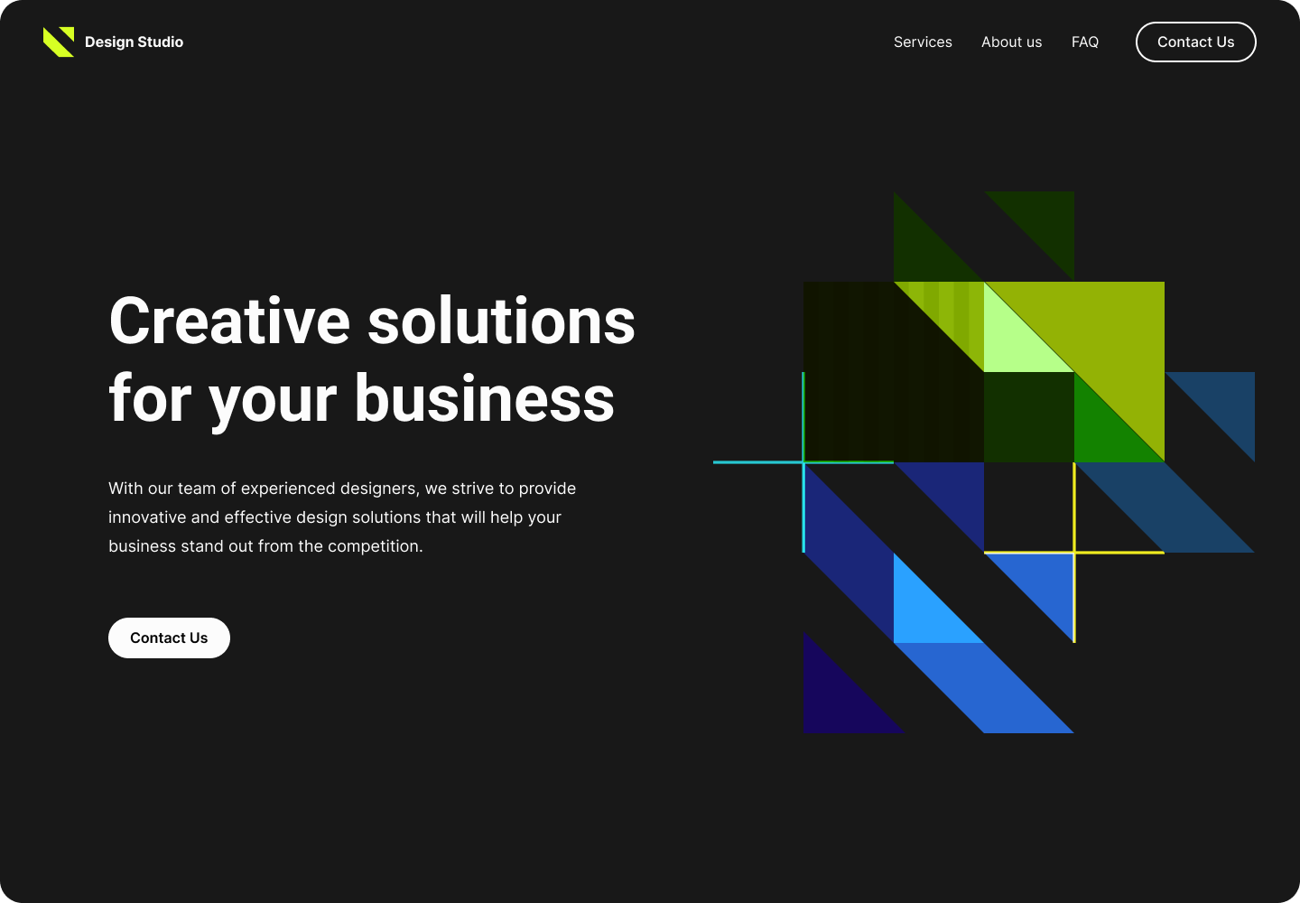
I am pleased to present the design of the first page of the "Design Studio" website.
Thank you for watching!
Reviews
2 reviews

Hi, your design looks nice, but unless people landing on this site know your very well beforehand, the copy will not sell.
Try to inform the customer what you do and why they should choose you, be specific and truthful.
Thank you!

I think you made a good start on the overall layout as it's typical for the first fold of a homepage. The colors used are also nice. However, there are plenty of room for improvements here:
- We need more engaging micro contents as the current heading is saying something every generic
- Could we select/ design a better hero image which has more meaning and easier to understand?
- The CTA "Contact us" on the left side should be in a bigger size to catch more attention and more harmony with the size of the hero texts.
Nice effort anyway, Iryna 😘
8 Claps
Average 4.0 by 2 people
You might also like

Project
Improving Dating App Onboarding: A/B Test Design
This project explores how improving the onboarding experience of a dating app can increase profile completion and early user engagement. I d

Project
FORM Checkout Flow - Mobile

Try out the prototype here. Design Rationale Why mobile? Mobile accounts for the majority of e-commerce browsing, and premium furniture pur

Project
A/B Test for Hinge's Onboarding Flow

This project focuses on improving the onboarding experience of a dating app - Hinge, by addressing low profile completion rates. Since profi

Project
Accessibility Asse

For this project, the LearnLink website was selected, and the goal was to redesign the login and sign-up pages specifically, adapting them t

Project
The Fitness Growth Engine

This slide shows how user behavior translates into business success by connecting activation, habit formation, retention, and monetization i
Editors’ Choice
Project
Uxcel Halloween Icon Pack

🎃 Introducing the Uxcel Halloween Icon Pack! 🎃 This custom Halloween-themed icon set was created to enhance the seasonal user experience o
Popular Courses

Course
Common UX/UI Design Patterns & Flows

Learn how to use tried and tested UX/UI design patterns and flows to solve recurring design problems faster and build interfaces that feel intuitive

Course
Design Composition
Learn the fundamental principles of visual layout, balance, and structure to create compelling and effective design compositions that engage and intrigue users.

Course
HTML Foundations

Learn the fundamentals of HTML, from basic formatting and structure to advanced elements and best practices, to create accessible and responsive web pages.