Comprehensive Button System for Tech Platforms

Why a Button System?
Buttons are an integral part of any digital product. A well-thought-out button system ensures:
- Consistency across the platform.
- Flexibility to adapt to various use cases.
- Efficient design and development workflows.
To achieve this, I created a system featuring four button types, leveraging primary and secondary colors with properties that allow extensive customization.
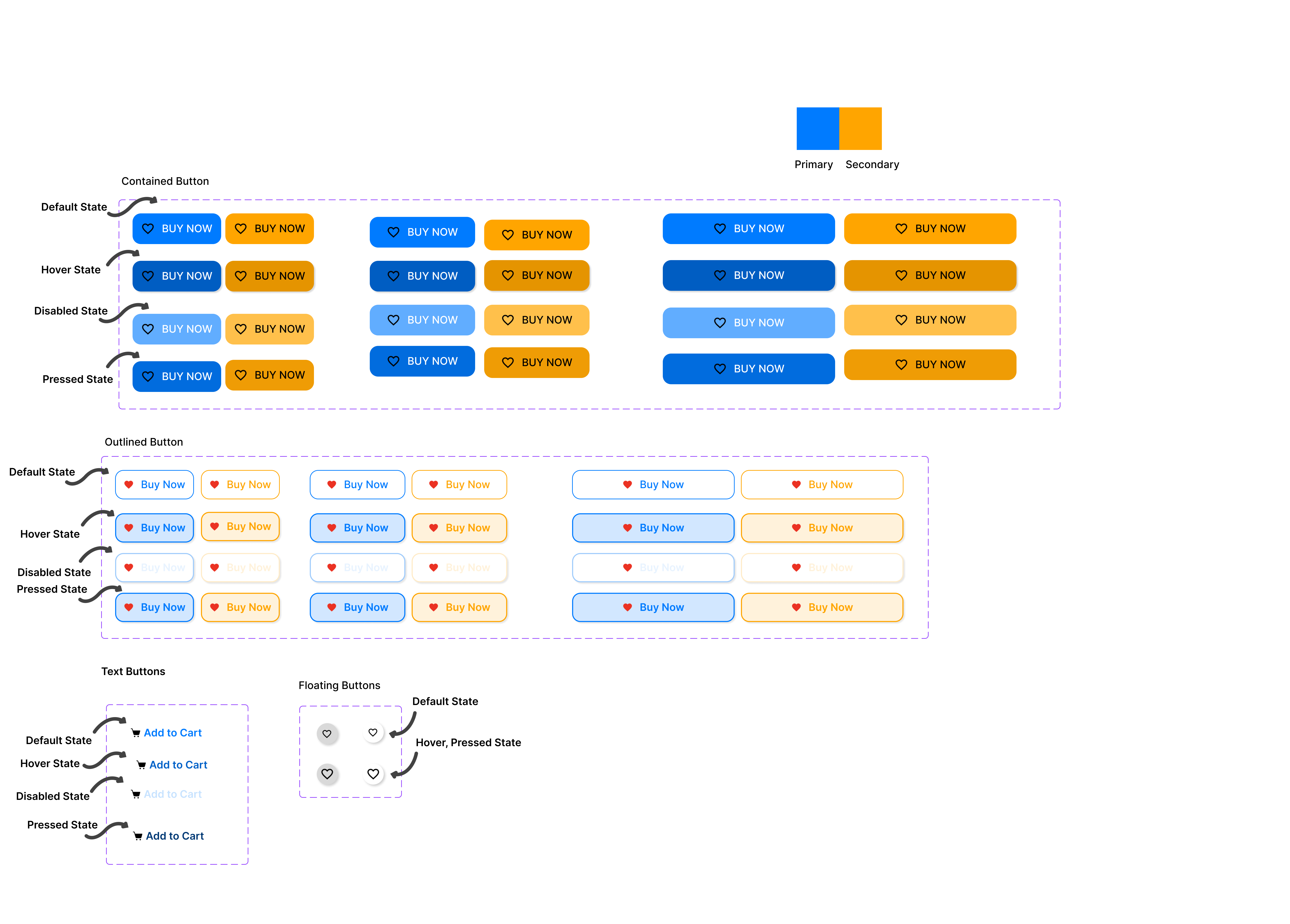
Button Types
Contained Buttons
These are solid buttons with a prominent background color. Contained buttons are high-emphasis, distinguished by their use of elevation and fill. They contain actions that are primary to your app.
Outlined Buttons
These have a transparent background with a border. Outlined buttons are medium-emphasis buttons. They contain actions that are important, but aren’t the primary action in an app.
Text Buttons
Text buttons are typically used for less-pronounced actions, Minimalistic buttons with no background or border. Ideal for tertiary actions like Forgot Password, etc.
Action Floating Buttons (FABs)
Circular buttons often used for quick, primary actions. Icons can be used as toggle buttons when they allow selection, or deselection, of a single choice, such as marking an item as a favorite.
Design Foundation: Colors and Typography
I selected one primary color (#007BFF) and one secondary color (#FFA500) for the system.
- Primary Color: Represents the most important interactive elements.
- Secondary Color: Used for less prominent actions or to complement the primary color.
The One Button Rule
To ensure simplicity and scalability, all button variants are built around a single base button. This base button can be customized with the following properties:
Button Properties:
- Size: Small, Medium, Large
- State: Default, Hover, Disabled, Focused
- Background Color: Primary or Secondary
- Label: Dynamic text for each use case
- Icons:
- Show Left Icon: Boolean
- Left Icon: Icon asset
- Show Right Icon: Boolean
- Right Icon: Icon asset
Implementation: Variants with Component Properties
To make the system modular, I created the following variants:
Size Variants:
Small: Compact for tighter spaces.
Medium: Default for most use cases.
Large: High emphasis for key actions.
State Variants:
Default: Standard button appearance.
Hover: Slight color shift for feedback.
Disabled: Grayed-out appearance to indicate inactivity.
Focused: Outlined to signal keyboard navigation.
Icon Variants:
Show/hide icons on either side for flexibility in design.
Example: "Submit" button with a checkmark on the left.
Key Challenges and How I Solved Them
- Consistency: By restricting the palette to primary and secondary colors, I maintained a cohesive look across all buttons.
- Scalability: Using properties, the system can be expanded or adapted to new use cases without needing to create entirely new components.
- Accessibility: I ensured a high contrast ratio for text and background colors to meet accessibility standards (WCAG).
This button system is more than just a collection of styles; it’s a framework for efficient collaboration between designers and developers. Whether you’re working on a startup MVP or a large-scale platform, a modular approach like this can save time and elevate the user experience.
Figma Link - https://www.figma.com/design/fZx3VOk45qFi1NSgIWAIt4/BUTTON-SYSTEM?m=auto&t=ijvcVGgoNGfsjldB-7

Reviews
1 review

Excellent comprehensive button system! Well-organized states and variants for tech platforms. Great work!
You might also like
Loginino

Notification microcopy - Project

El Mandoub-GovTech App

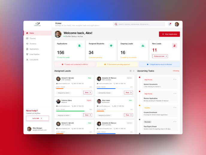
MalishaEdu Counselor Workspace

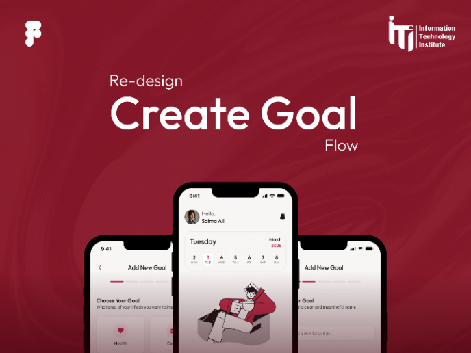
Goal Creation Flow
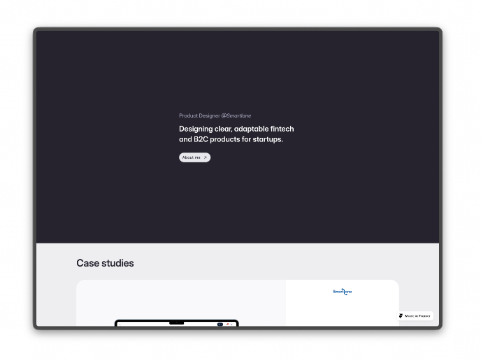
Portfolio website

Visual Design Courses

UX Design Foundations


Introduction to Figma

Design Terminology
