ComfyChic - Web Landing Page

These design decisions for ComfyChic are intended to create an inviting and user-friendly online environment that resonates with customers seeking both style and comfort.
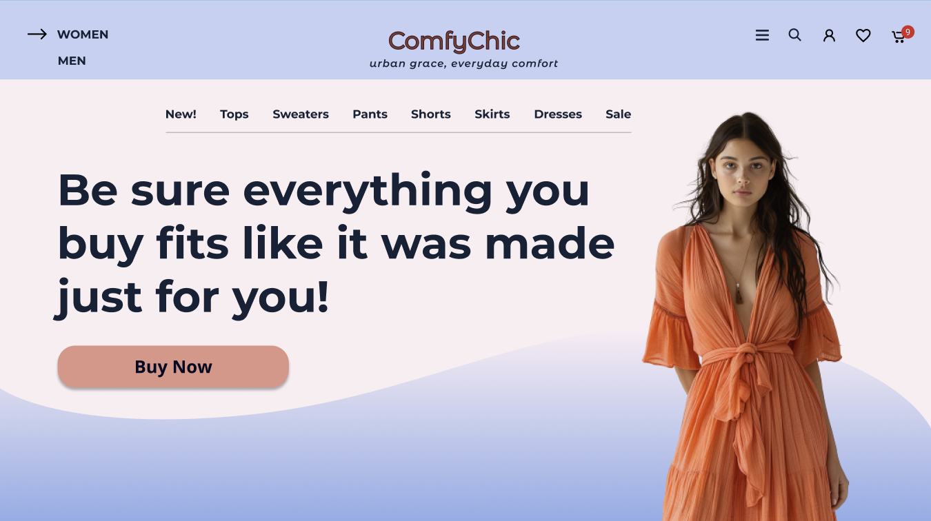
- Color Scheme: I selected a split complementary color palette that balances calmness and energy, promoting a comfortable yet vibrant shopping experience (soft blue - to relax, soft coral - to engage).
- Consistent Branding: The use of consistent colors, typography (Montserrat), and minimalistic design elements ensures a cohesive and recognizable brand identity.
- Motivating CTAs: The Soft Coral color of the CTA buttons captures attention and encourages interaction, effectively guiding users toward conversion without overwhelming the overall design.
- Design Efficiency: The layout is crafted to be aesthetically minimal, avoiding unnecessary elements that could detract from the user experience.
- Active Negative Space: Utilized around major elements to draw focus and create a relaxed browsing environment, reflecting the brand’s commitment to comfort.
- Passive Negative Space: Consistent spacing between elements across the site improves readability.
- User Engagement: Intuitive navigation and clear, accessible content structure enhance user engagement. The discount offer encourages users to register on the site and share their feedback. There is an additional option - ComfyChic Atelier, that offers a unique tailoring service that allows customers to customize purchased garments to their exact measurements, ensuring perfect fit and comfort.
- Design Accessibility: All design elements adhere to WCAG 2.1 standards.
UPD: I've edited my project according to the first two reviews
From brief

Topics
Share
Reviews
2 reviews
Although the design brief specifically calls for unleashing creativity on the landing page, which is distinct from a full website, you did a good job here. The CTAs, including buttons and text, really grab attention, and the layout flows well. It’s also clever to include user testimonials and offer discounts for social media tags.
While the hierarchy and flow are well executed, the overall visual style feels a bit outdated for my taste, especially with the use of shadows and blurs.
I also recommend featuring a more diverse range of people in your images to reflect that your clothes are for everyone, not just the young and skinny. This could also be a great opportunity to showcase some creative flair.
For some fresh design ideas, you might look at what other designers are doing on Uxcel’s showcase, Dribbble, or Behance.
Keep up the fantastic work!
What can be done better, in the priority order:
- Visual design — from colors, styles, typography to layout & components positioning.
- Bit more descriptive and action driven copy
- Simpler & cleaner branding
You might also like

SONZ - Entertainment platform


Camp & Travel Explorer - App Design


Solar system Dashboard Utility

Uxcel Halloween Icon Pack


Signup page for a SaaS website


Color System

Content Strategy Courses

UX Writing


Common UX/UI Design Patterns & Flows


Go-to-Market Strategy Fundamentals
