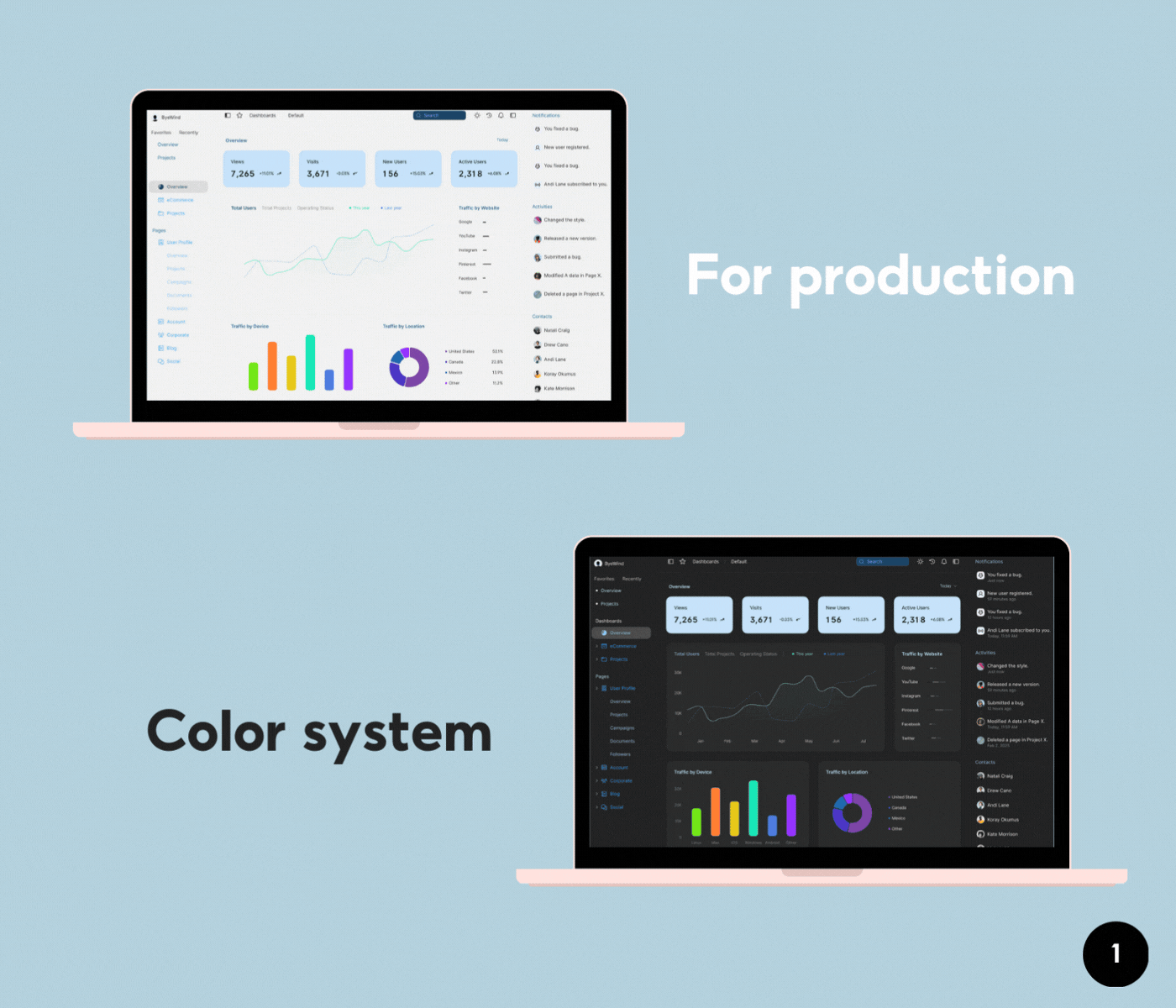
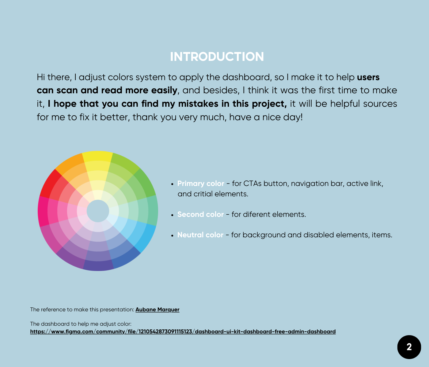
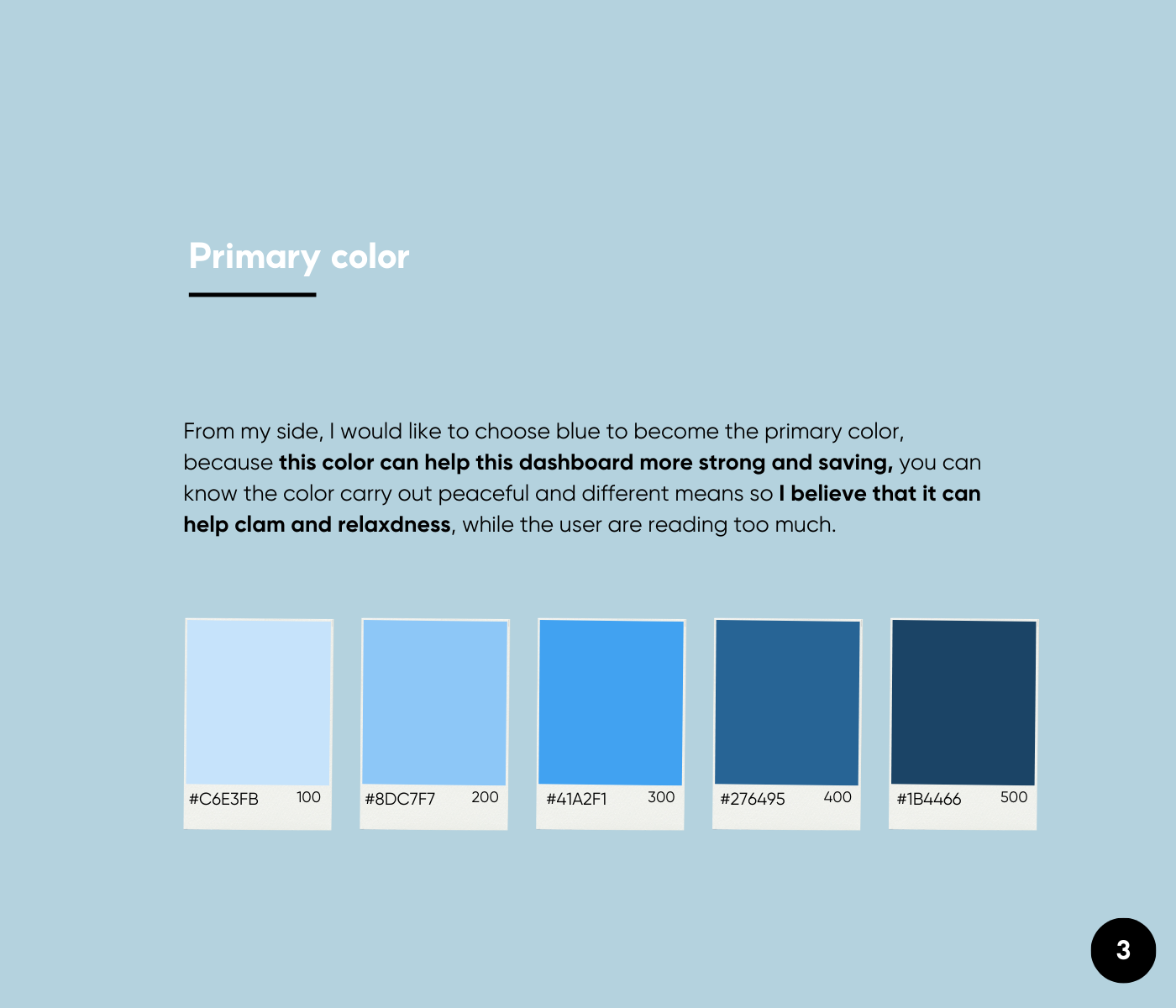
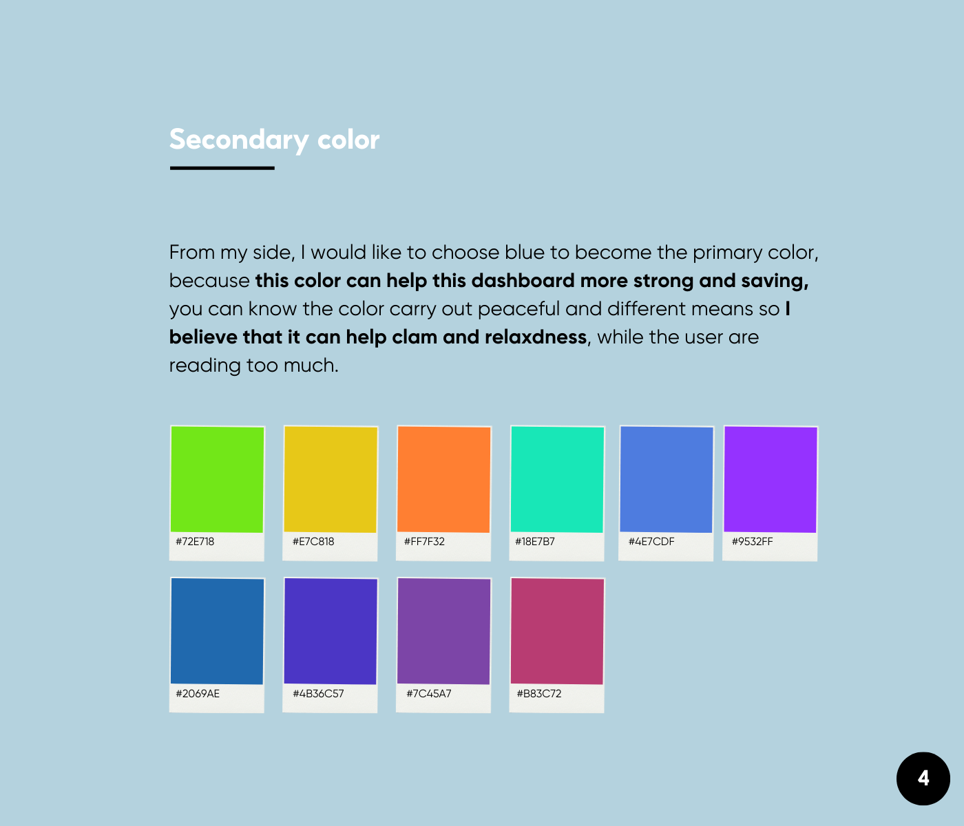
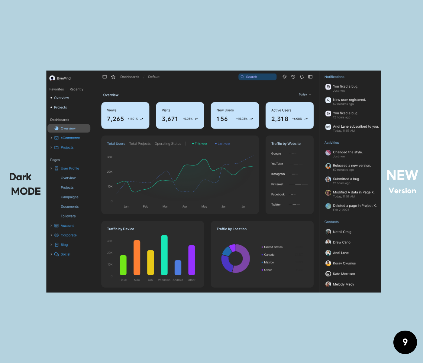
Color system with the dasboard


Reviews
1 review

Hi Bao, great to see your project. I appreciate how you present the project when incorporating the application of color system in two modes: light and dark one. 3 groups of colors used are also essential and enough to present your ideas. However, personally I have some opinions that I think would contribute to your project further.
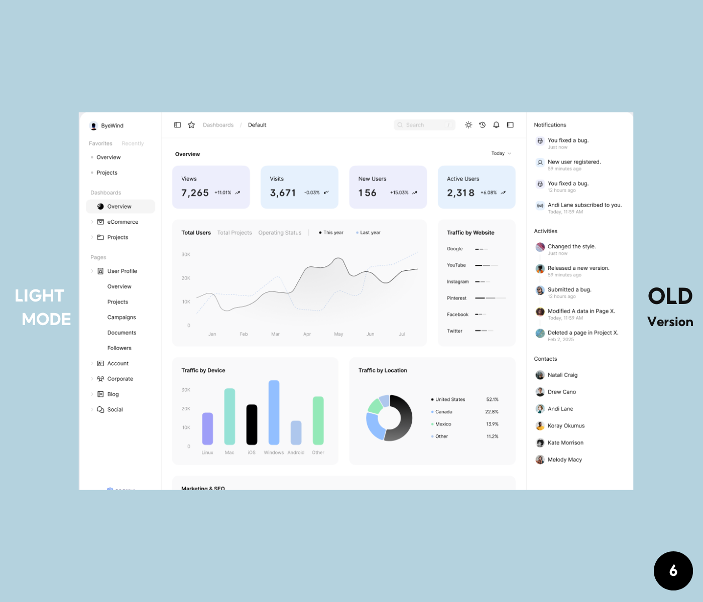
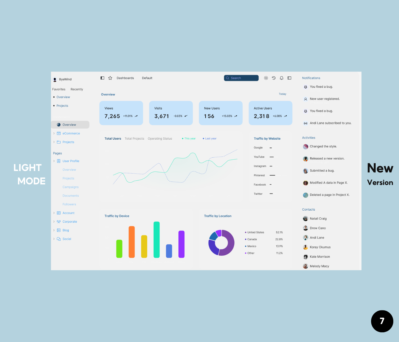
- If the goal is to creating the feeling of calm and relaxing, I do prefer the old version. In general, the use of colors is very consistent as neutral colors are mainly used for text & background, secondary colors are used for charts/ graphic elements and primary colors are used in moderation. In the new version, the use of primary color for all the side menu makes it a bit overwhelmed, as it is hard to know which menu/element is in focus for need more attention.
- Using bright/ high saturated color for text would be not suitable. For example, if you try testing the legend text "This year" or "Last year" in the chart, I guess it would not meet the requirement of WCAG in term of contrast.
- The secondary colors used in the chart are really, really bright.
- If you squint your eyes to take in the entire website, those colors will stand out first with very high contrast, which could potentially cause discomfort for users when looking at it for an extended period.
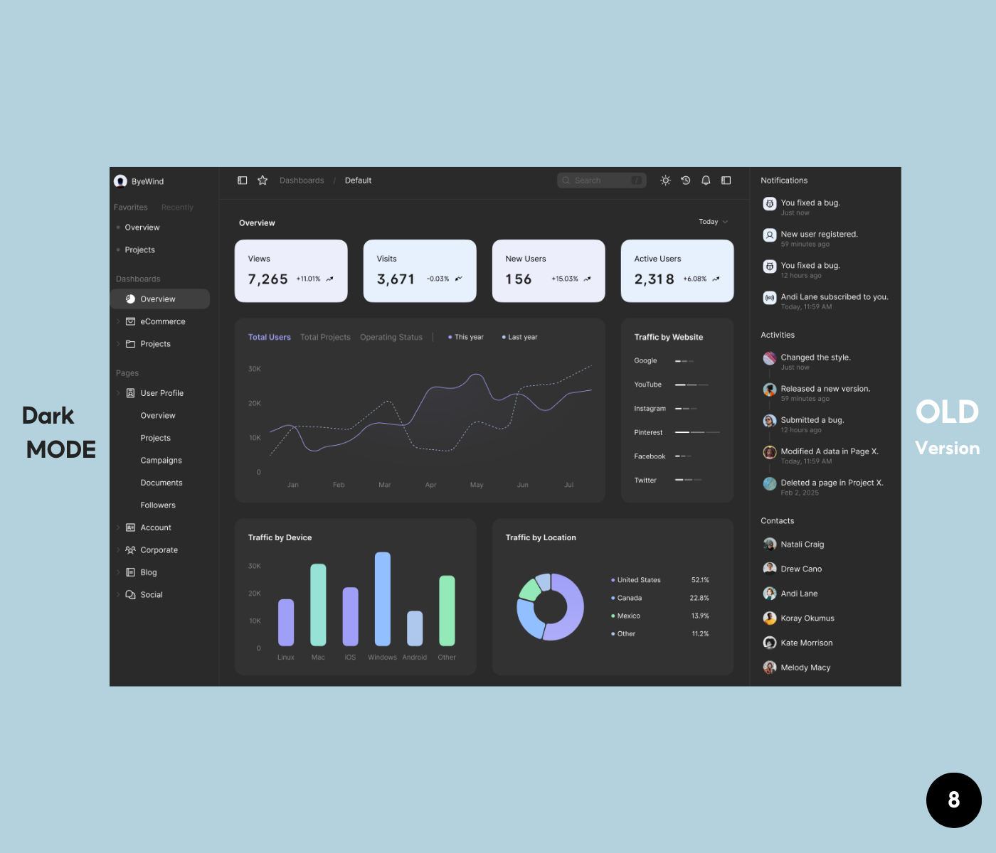
- I recommend you should have two separate color schemes for light and dark modes. It would be better to control the overall contrast and clarity of the UI design. Let's take a look at color system of Apple or Google for reference.
Hope the sharing would support you in some ways. Have a nice weekend!
thank you very much; it is really helpful to me.
3 Claps
Average 3.0 by 1 person
You might also like

Project
HealthFlow: Designing a Simple and Insightful Wellness Dashboard

This project focuses on designing a health and wellness dashboard that simplifies how users track and understand their daily well-being. Das

Project
Accessibile Login & Signup Form for Notion

OverviewThis project involved designing an accessible mobile login and signup form for Notion, a widely used SaaS productivity and workspace

Project
Improving Dating App Onboarding: A/B Test Design
This project explores how improving the onboarding experience of a dating app can increase profile completion and early user engagement. I d

Project
FORM Checkout Flow - Mobile

Try out the prototype here. Design Rationale Why mobile? Mobile accounts for the majority of e-commerce browsing, and premium furniture pur

Project
A/B Test for Hinge's Onboarding Flow

This project focuses on improving the onboarding experience of a dating app - Hinge, by addressing low profile completion rates. Since profi

Project
Accessibility Asse

For this project, the LearnLink website was selected, and the goal was to redesign the login and sign-up pages specifically, adapting them t
Visual Design Courses

Course
UX Design Foundations

Learn UX design fundamentals and principles that create better products. Build foundational knowledge in design concepts, visual fundamentals, and workflows.

Course
Introduction to Figma
Learn essential Figma tools like layers, styling, typography, and images. Master the basics to create clean, user-friendly designs

Course
Design Terminology

Learn UX terminology and key UX/UI terms that boost collaboration between designers, developers, and stakeholders for smoother, clearer communication.