Color System project management

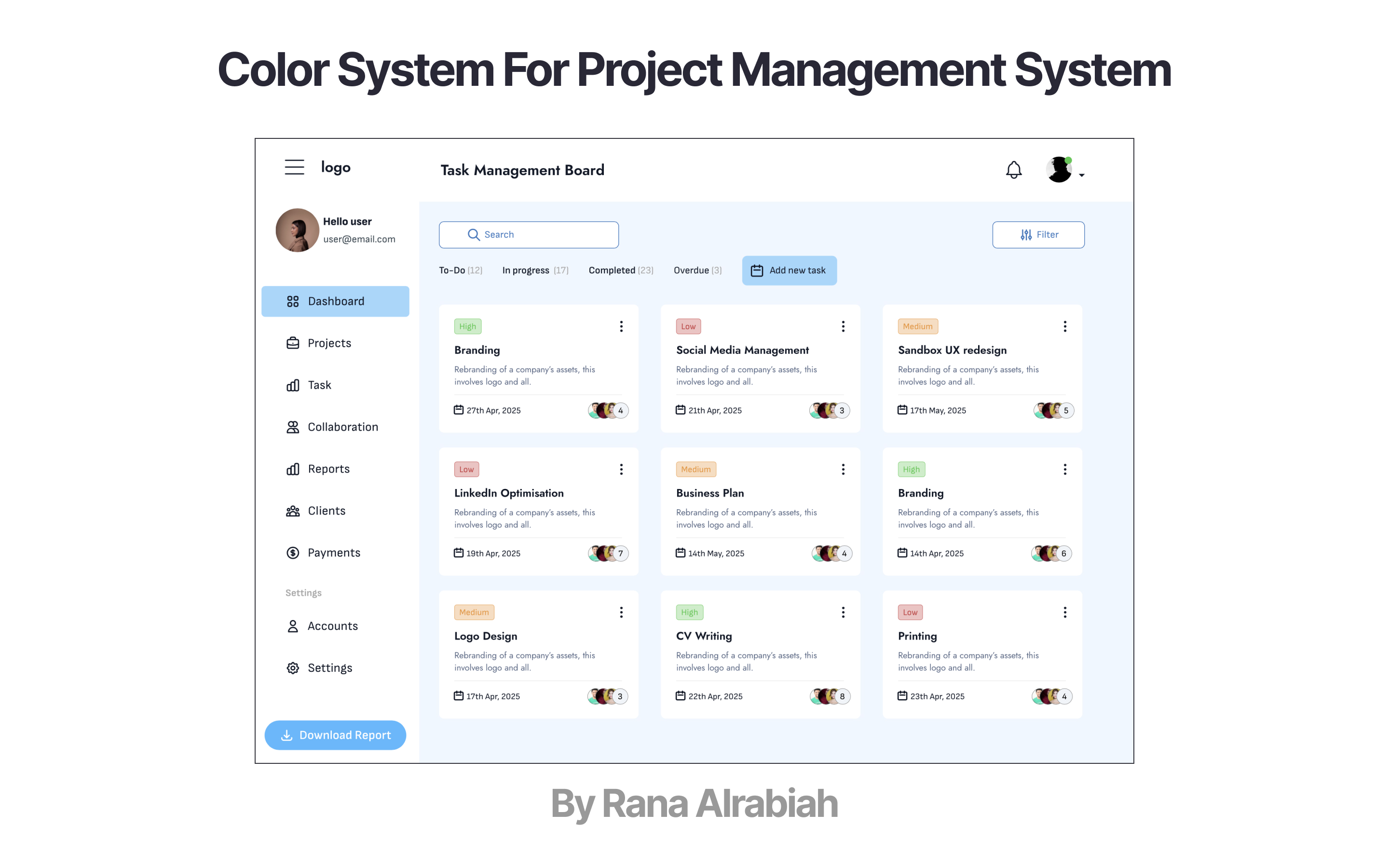
To develop the color system for a task management website, I created a quick UI design for a fictional productivity platform.
I designed a screen intended for laptop devices to showcase the full color system, applied thoughtfully across both light and dark modes.

Reviews
4 reviews
The color system in your design look harmonic, suitable for a the professional look and feel of a project management system. And you mockup illustrate better of the color system usage. Perfect.
Going forward, might be useful to check the accessibility issues to ensure good readability for users. Additionally, might be worthwhile to design the different states of the color system, e.g. hovered, clicked, enabled and disabled.
All in all, your color system is elegant and beautiful.

You have done a really good job building this colour system. Separating Primary, Neutral, and System colours clearly shows strong thinking. Your blue tones feel calm and trustworthy, perfect for a task management platform. System colours like green, red, and orange are very intuitive and make it easy for users to understand task statuses quickly. Also, showing how the colours apply inside a real UI makes the system feel practical and ready to use.
One small thing you could improve is the brightness gap between Colour #1 (#A0D7FE) and Colour #3 (#53B7FF). They are close, and making them a little more different would create a better hierarchy. In the Neutral palette, Colour #5 (#576585) feels a little too blue compared to the others. If you make it slightly greyer, it will match the rest even better. The orange system colour (#EC922A) could be a little darker to pass accessibility for text contrast.
Adding hover, focus, and button pressed states would complete the system nicely. If you want to push it even further, creating a Dark Mode version will make your system feel more flexible and future-ready.
Overall, this is a clean, thoughtful, and real-world-ready colour system. You should feel confident that with just a few small tweaks, it will be even stronger.

Clean UI, great UX!

Perfect
You might also like

Improving Dating App Onboarding: A/B Test Design

FORM Checkout Flow - Mobile


A/B Test for Hinge's Onboarding Flow


Accessibility Asse


The Fitness Growth Engine


The Relational Workspace

Visual Design Courses

UX Design Foundations


Introduction to Figma

Design Terminology
