Color pallet


I built a student dashboard. How did I choose the colours?
- First, by understanding colour psychology, I wanted my users to feel safe and experience growth. With this in mind, I chose teal for the UI, as it lies between green and blue—colours that represent growth and safety, respectively.
- When building for accessibility, I used dark blue for the fonts to maintain colour consistency, as it also works well with a light teal background. Initially, I chose white as the background, but then I thought using a monochromatic colour scheme might create a more cohesive and consistent look.
- For the CTA, I used green to make it stand out, as it provides good contrast and accessibility with both teal and light teal backgrounds.
- I used dark green for the borders, and for the sidebar, I used a light teal tint—just enough to be visible without drawing too much attention.
I tried my best to create a better dashboard with well-reasoned colour choices. I may have made some beginner mistakes, but I'm eager to learn and grow. If you notice anything I could improve, please don’t hesitate to share. Thank you!
Tools used
From brief

Topics
Share
Reviews
2 reviews

Sachin, I really like how you tied your color choices to psychology and accessibility—it shows thoughtful intent; simplifying the palette a bit more could make it feel even cleaner, and I’m excited to see your next iteration!
Hey, Sachin! Good job! I can't access the figma link, from now on you can create links available for viewing for everyone. Hence I will evaluate based on your description and thumbnail. The rationale for using teal for growth and safety, dark blue for accessibility, and green for call-to-action elements is well thought out. Your consideration of monochromatic schemes and contrast for accessibility shows good attention to detail and user needs. good start!
You might also like
SiteScope - Progress Tracking App


CJM for Co-Working Space - WeWork

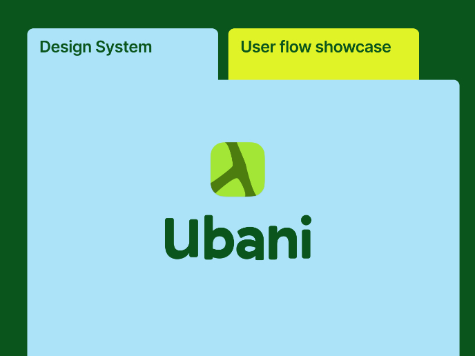
Ubani Design System

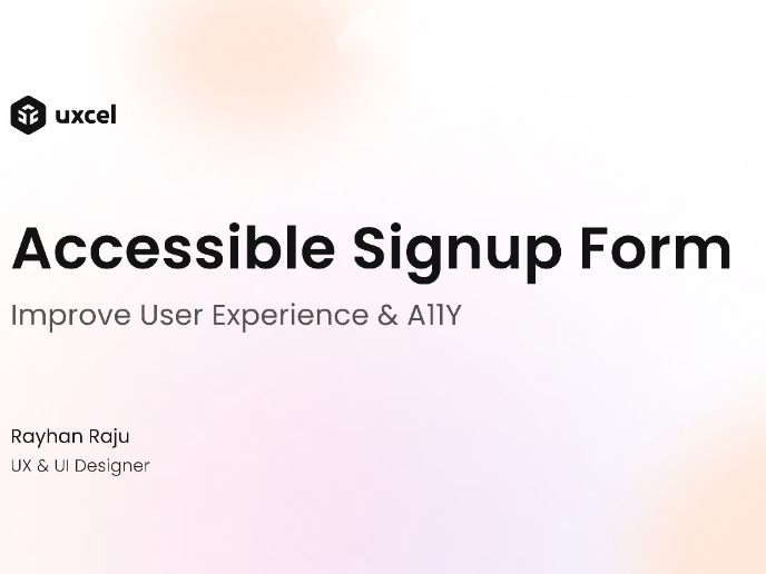
Accessible Signup Form for SaaS Platform
Loginino

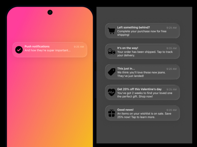
Notification microcopy - Project

Visual Design Courses

UX Design Foundations


Introduction to Figma

Design Terminology
