ASANA / Color System for Productivity Tool

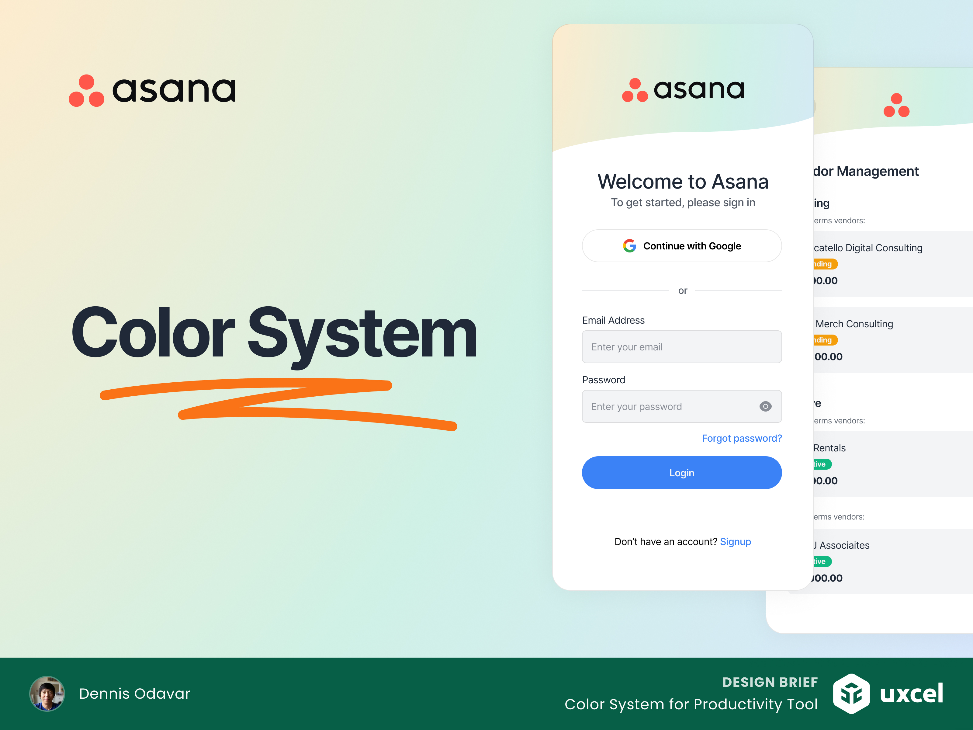
In response to the design brief given, I'm excited to present the new color system for Asana. My goal was to create a fresh, vibrant look that sets Asana apart from competitors while ensuring clarity and usability. This revamped palette is designed to enhance readability and user interaction, making project management and team collaboration a seamless experience.
Design Decisions
- Platform Choice. Asana is a widely recognized and utilized work management tool, suitable for both individual users and teams. Designing for the desktop version allows for a feature-rich interface.
- Color Selection. The chosen colors create a professional, approachable, and energetic look. The primary and secondary colors are inspired by modern design trends to evoke trust and productivity.
- WCAG Compliance. Ensuring color contrast compliance is crucial for accessibility, making the tool usable for individuals with visual impairments.
- Brand and UI Integration. The consistent use of the color system in branding and UI elements ensures a cohesive and recognizable brand identity. The system colors provide clear visual cues for user actions and system statuses.
Thank you!

Reviews
2 reviews

Love the way of the presentation.

Your color system looks amazing and conveys all details keep up the good work.
6 Claps
Average 3.0 by 2 people
You might also like

Project
Improving Dating App Onboarding: A/B Test Design
This project explores how improving the onboarding experience of a dating app can increase profile completion and early user engagement. I d

Project
FORM Checkout Flow - Mobile

Try out the prototype here. Design Rationale Why mobile? Mobile accounts for the majority of e-commerce browsing, and premium furniture pur

Project
A/B Test for Hinge's Onboarding Flow

This project focuses on improving the onboarding experience of a dating app - Hinge, by addressing low profile completion rates. Since profi

Project
Accessibility Asse

For this project, the LearnLink website was selected, and the goal was to redesign the login and sign-up pages specifically, adapting them t

Project
The Fitness Growth Engine

This slide shows how user behavior translates into business success by connecting activation, habit formation, retention, and monetization i

Project
The Relational Workspace

Over four years, I led the design evolution of a high-stakes education platform, transforming a fragmented messaging app into a cohesive Stu
Visual Design Courses

Course
UX Design Foundations

Learn UX design fundamentals and principles that create better products. Build foundational knowledge in design concepts, visual fundamentals, and workflows.

Course
Introduction to Figma
Learn essential Figma tools like layers, styling, typography, and images. Master the basics to create clean, user-friendly designs

Course
Design Terminology

Learn UX terminology and key UX/UI terms that boost collaboration between designers, developers, and stakeholders for smoother, clearer communication.