Afruxy Listing Images

For Afruxy’s sanding sponges, the objective was to create compelling, high-quality listing images that not only attract potential buyers but also clearly communicate the product’s features, benefits, and use cases.
Understanding the Product & Market Research
Before diving into the design, extensive research was conducted to understand:
- The target audience (DIY enthusiasts, woodworkers, auto-detailers, and general consumers).
- Competitor listings to identify industry standards and opportunities for differentiation.
- Amazon’s image requirements and best practices for optimization.
- Customer pain points and expectations from similar sanding sponge products.
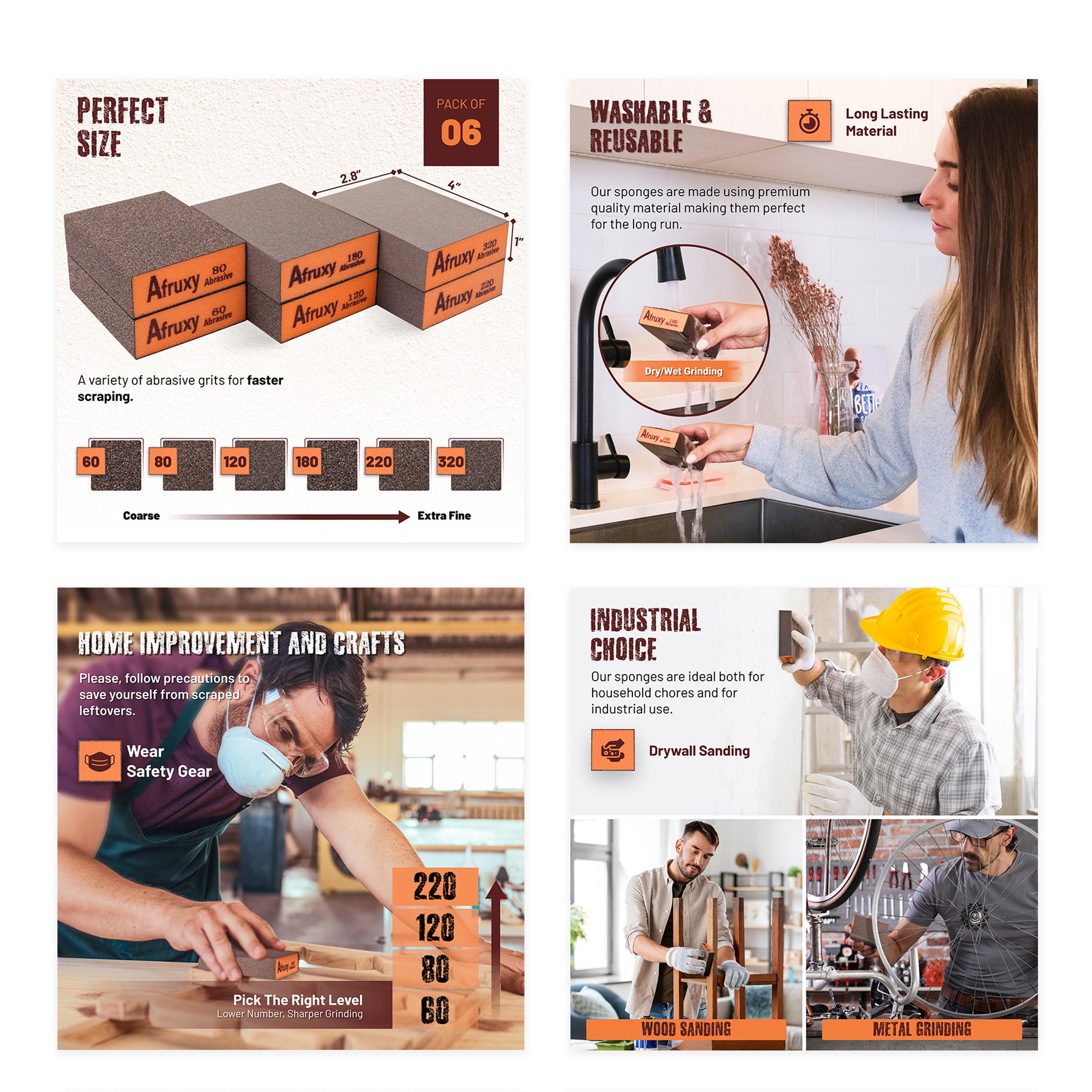
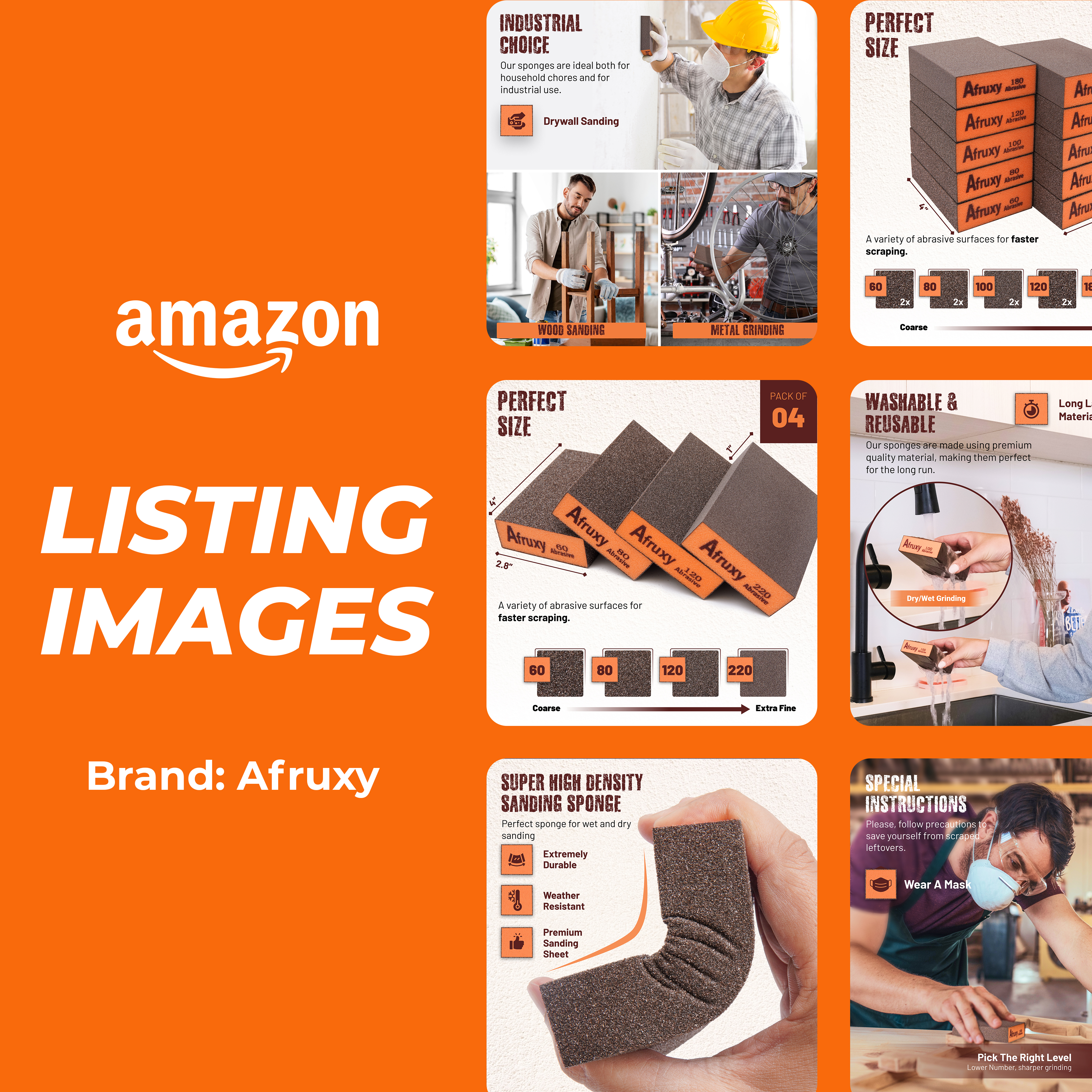
Product Differentiation & Features (Infographics)
- Infographic-style images were designed to break down key features:
- Multiple grits for various applications.
- Durable and reusable nature of the sponges.
- Ergonomic, easy-to-hold design.
- Icons and concise text were used for quick comprehension, enhancing scannability.

Use-Case Demonstration (Lifestyle Images)
- To build trust and provide context, real-life usage images were included.
- The sanding sponges were shown in action on wood, drywall, and metal surfaces to highlight versatility.
- These images added an emotional connection by placing the product in relatable settings.
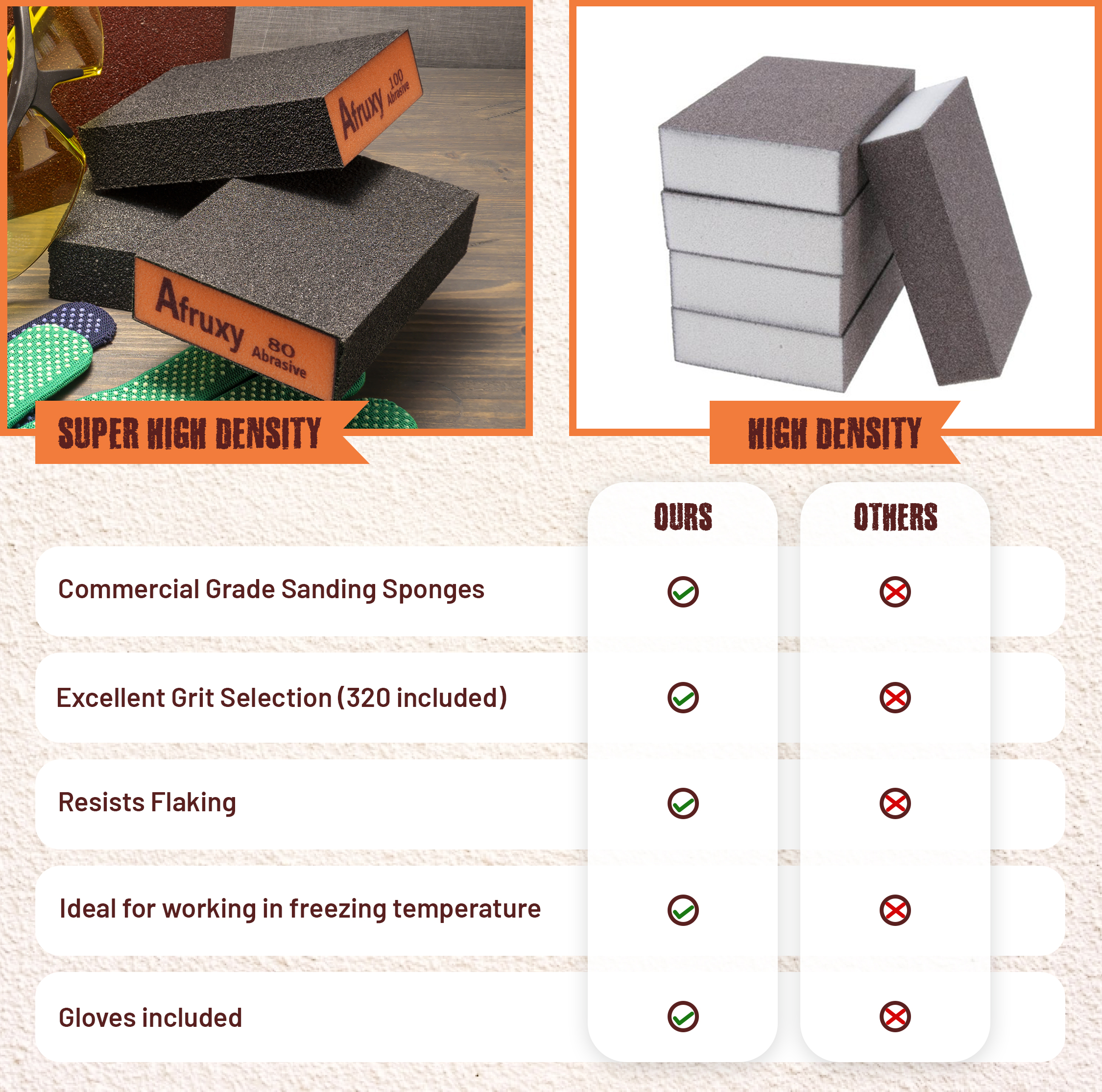
Comparison Chart
- A comparison chart was included to contrast Afruxy’s sanding sponges with competing products.
- This visually emphasized advantages such as durability, multiple grit options, and superior material quality.
This project aimed to enhance Afruxy’s Amazon listing by creating a visually compelling, informative, and conversion-driven set of images. The strategic blend of hero shots, infographics, lifestyle images, and comparison visuals ensured that customers could quickly grasp the product’s value, leading to better engagement and increased sales potential.
Tools used
Topics
Share
Reviews
1 review

I loved this project, Usama. It’s very interesting to see the different directions design can take and the impact this has on a product page. Congratulations!
You might also like
SiteScope - Progress Tracking App


FlexPay


Mobile Button System


CJM for Co-Working Space - WeWork


Ubani Design System


Accessible Signup Form for SaaS Platform
Popular Courses

UX Design Foundations


Introduction to Design Systems


Building Content Design Systems
