Checkbox alignment
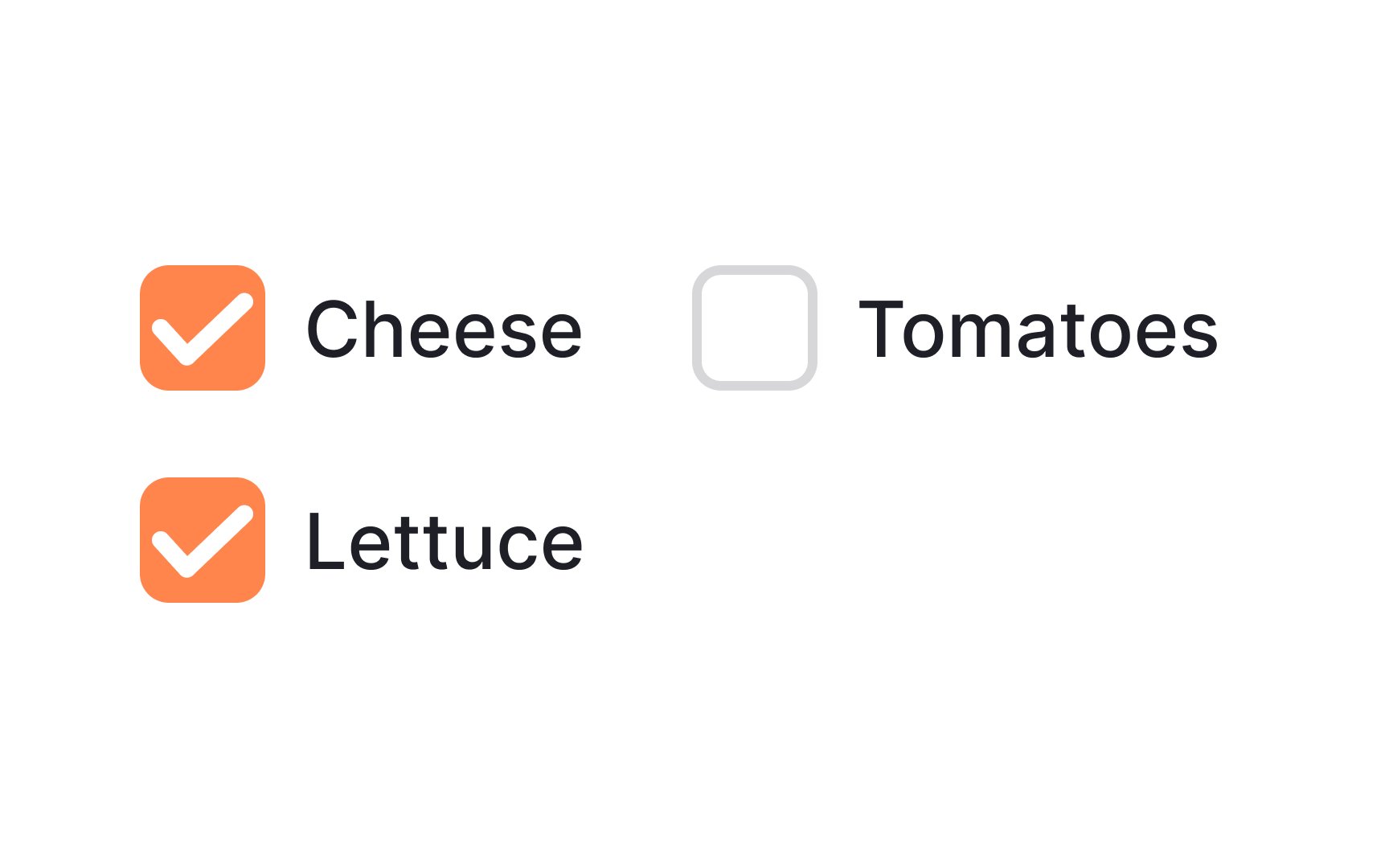
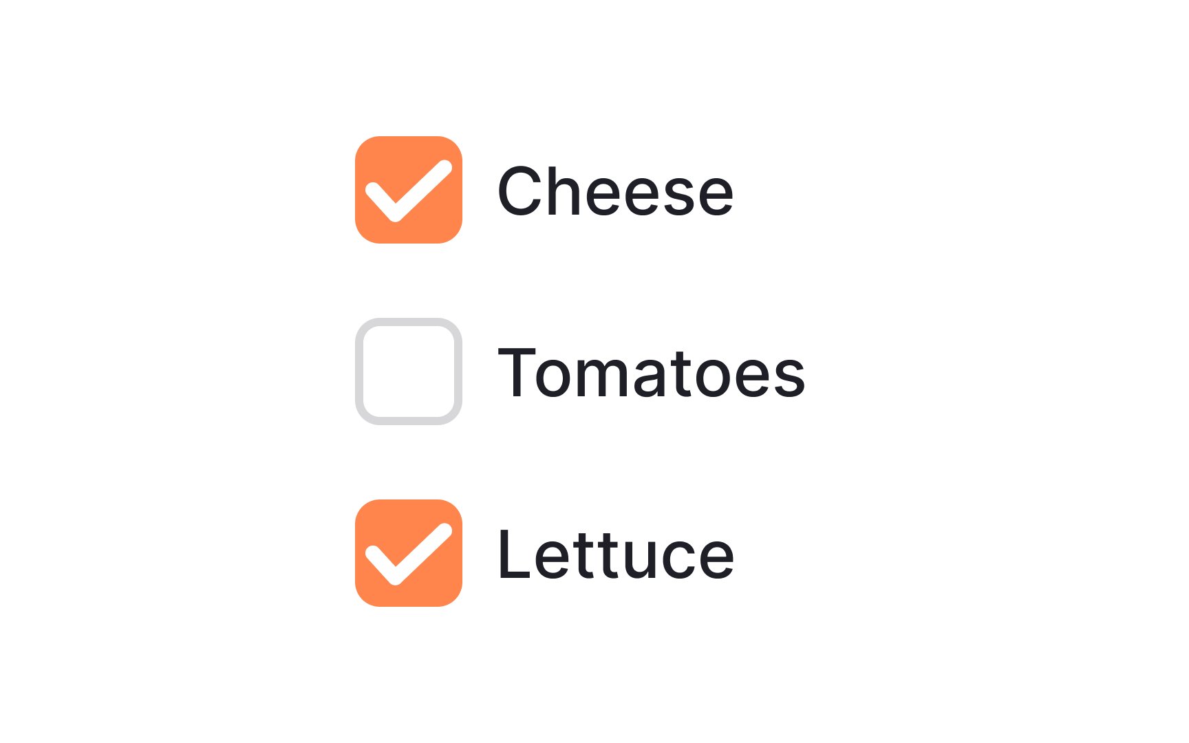
Align your inputs on a single column towards the left side of the screen. Why? There are two reasons:
- A single, vertical line is easier to follow.
- Studies have shown that users in left-to-right languages tend to scan pages starting from the left part of the screen.[1]
You can still use a horizontal layout, but your buttons and labels should be arranged so that users can tell without trouble which choice corresponds to which label.
References
- F-Shaped Pattern of Reading on the Web: Misunderstood, But Still Relevant (Even on Mobile) | Nielsen Norman Group
