Contrast font sizes
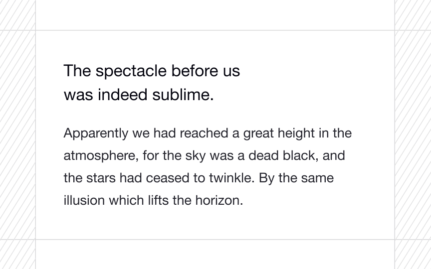
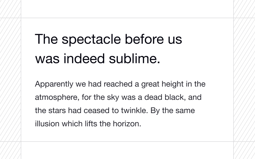
Varying font sizes can be a highly effective way to guide the reader's eye and emphasize important elements within your design. By strategically increasing the size of certain fonts, such as headings or key information, you create a focal point that immediately captures the viewer's attention.
In contrast, using smaller font sizes for less important text, such as captions or supplementary information, allows them to recede into the background and maintain a supporting role. This helps maintain a clear focus on the most critical content, preventing distractions and enhancing overall readability.


