Learn 8 essential techniques to design in Figma like a pro
Master essential Figma techniques to boost your design speed and efficiency. Elevate your workflow and create stunning designs faster.


Figma has gained a reputation for being an intuitive, easy-to-use tool that requires minimal instruction to create stunning designs. It has become the most popular tool for many designers to start their careers.
Despite its popularity, many people are intimidated to start designing with Figma or think they need formal training to use it effectively. We've created a lesson that will not only teach you how to create a simple landing page but also introduce you to the most important features in Figma.
You'll learn to create components to maintain consistency throughout your project, add auto layout to create responsive layouts that will adjust to any device or screen, resize elements in a group, add images in bulk, and much more. By practicing with Figma's basic tools and learning a handful of useful tips and tricks, you'll be able to quickly create a landing page design on your own.
Set up a Figma frame

In Figma, a frame is the starting point of a design project. It’s essentially a container for holding design elements like shapes, text, images, and other layers. It's used to create and organize various sections of a design, such as pages, screens, or components. Other design tools might refer to frames as "artboards," which serve a similar purpose.
When selecting a frame size in Figma, designers have a range of options to choose from, including popular device and asset templates such as phones, tablets, desktops, and watches. The most common canvas sizes for web and mobile design are 1920 x 1080px for desktop web, 375 x 812px for iPhone X, and 360 x 640px for Android devices. However, the frame size may vary depending on the project's specific requirements. For instance, if you’re designing for Mac users, you can use the canvas size 1440 x 1024px for a landing page.
💡 To create a frame in Figma, use the keyboard shortcuts “F” or “A” or select the Frame tool in the toolbar.
Use a grid

Using a grid is essential to create a well-structured layout. To use grids in Figma, first enable the grid view by selecting "View" in the top menu and then clicking "Grid." Once the grid is visible in the right-hand menu, adjust the grid settings to your preference — you can modify the spacing between grid lines, the number of columns and rows, and the overall size of the grid. Figma lets you create grids for both horizontal and vertical responsive layouts that automatically adjust as the screen size changes.
When designing a landing page, a popular choice of grid type is the column grid. Column grids allow for easy alignment and organization of content, making it a useful tool for creating a visually pleasing layout. You can choose the number of columns based on the content you have and the desired layout. Start with a 12-column grid, which is a common choice for many web designs.
💡 Master Figma's core functions from the ground up with Introduction to Figma course. Explore the basics and beyond to elevate your craft.
Define text styles

When you're designing a landing page, you want to make sure your text is styled in a way that's easy to read and helps guide users to the most important information. This means establishing a typography hierarchy, which can be time-consuming and tedious to do manually. Figma has a great feature that makes this process a breeze — text styles. Text styles help designers quickly apply a consistent set of formatting properties to all the text elements throughout their design.
With Figma’s text style, you can easily modify things like:
- Font family, weight, and size
- Line height
- Letter spacing
- Paragraph spacing and indentation
- Decoration (strikethrough and underline)
- Transform (uppercase, lowercase, and capitalization)
- Other OpenType features (tabular figures, small caps, etc.)
And if you ever need to make a change to your text, like adjusting the font size or letter spacing, you can do it with just one edit, and all the elements with that text style will update automatically. Note that properties like color, justification, text box alignment, and text box resizing cannot be set in text styles.
Apply text styles
You can create your own text styles in Figma in the Text section of the right sidebar by clicking the “+” icon to create a new style. Format the text with the font family, size, color, and other properties you want to use.
It’s essential to select proper naming for your text styles. You can use a sized-based naming system (XS, S, M, L, XL) or use functional names to describe the intended use of a style, such as a page mail title, modal header, or button label.
To apply a text style to a piece of writing, open the Text Styles panel on the right-hand side of the screen by clicking on the "T" icon or by going to the "Text" menu and selecting the four dots icon "Style.” Select an existing style that you want to apply.
💡 To edit a text style, select the text layer and make the desired changes. Then, click "Edit Style" next to the relevant existing style in the Text Styles panel.
Define color styles

Color is one of the most important elements of a landing page. Colors can affect our moods, influence perception, and create a certain impression of a brand. When designing a landing page, designers typically start by building a color palette and selecting colors that best fit the product or service and evoke the desired emotions. These colors are then used for various UI components such as buttons, tabs, and icons, as well as text and backgrounds.
However, manually applying colors to each element can be time-consuming and tedious. Color styles in Figma come in here as a lifesaver. Similar to text styles, color styles allow designers to create a set of tools, in this case, colors, that can be used and reused consistently throughout a design project. The benefits of using color styles include maintaining consistency, saving time and effort, and ensuring a strong visual identity that aligns with branding.
It's important to note that color styles in Figma can specify the color value, opacity, and blend mode but not other properties such as border thickness, border style, or shadow. These properties need to be specified separately for each object or text layer.
Apply color styles
In Figma, designers can create a comprehensive and organized color palette for their design system. How can you create a color style in Figma?
- Select a color using the color picker
- Click on the "Fill" section in the right-hand menu
- Create a new color style by pressing “+” or use an existing one
- Add a name and description that specifies what this color will be used for
- Specify other color properties
Designers can easily apply color styles to other elements or text layers. To do so, go to the Fill section in the right-hand sidebar and click the four dots icon in the upper right corner to bring up the Color Styles modal. From there, select your preferred color style. When it comes to naming color styles, it's best to choose a naming convention that is clear, concise, and consistent:
- Semantic naming convention utilizes color names that describe the intent, such as "Primary," "Secondary," "Danger," "Background," and more. This naming approach emphasizes the color's value rather than relying on a name and numeric scale combination. Other examples of semantic names include “Brand,” “Accent,” “Warning,” “Alert,” and “Success.”
- Contextual naming convention defines color names for specific types or categories of components, such as "color-primary-button," "color-default-icon-small," "color-error-modal," and others. This method is more suitable when working with more extensive design systems or collaborating with other designers, as it promotes consistency and clarity across the entire design file.
Create components

Components in Figma are reusable design elements that designers can employ to create a consistent UI design across a project. A component can be anything from a button, menu, or form field to more complex elements like headers, footers, and navigation bars.
Designers need to use components in Figma when they want to:
- Ensure visual consistency throughout the design project
- Save time when designing and updating multiple elements
- Ensure that changes to one element are applied to all instances of that element throughout the project
For example, when creating a landing page, a designer would need to create components for any elements that will be repeated throughout the design, such as headers, footers, navigation menus, cards, buttons, and forms.
How do you create a component?
- Select the element or group of elements that you want to make into a component
- Right-click on the object and select "Create Component" from the dropdown menu
The element will then become a component and can be added to the "Assets" panel for easy reuse throughout the design project.
Figma allows components to be nested within other components. When might you need this feature? Let's say you are designing a landing page with a header that includes a logo, a navigation menu with dropdowns, and a search bar with a Submit button. To create this header, you could start by creating a top-level component for the entire header, which would contain the logo, navigation menu, and search bar components.
💡 You can create a component by pressing the "⌥ + ⌘ + K" keys (for Mac) or the "Ctrl + Alt + K" keys (for Windows).
Turn objects into components

So, how do you create a component?
- Select the element or group of elements that you want to make into a component
- Right-click on the object and select "Create Component" from the dropdown menu
- The element will then become a component and can be added to the "Assets" panel for easy reuse throughout the design project.
Note that a main component defines the properties of the component, such as its color, size, and typography. Designers create instances — copies of a main component that can be reused in designs. Instances are linked to the main component, which means that any changes made to the main component will be automatically updated in all its instances.
Let’s say you want to create a section for customer testimonials on your landing page. A useful way to achieve consistent design is by using a testimonial card component. This component may include layout, typography, and colors for the card.
Then, you duplicate or copy the main component to create instances of the testimonial card for each customer testimonial. You can edit things like names, photos, and testimonial text on these instances and also adjust their size and position to fit your layout. These changes to instances won’t affect the main component.
If you decide to make changes to the overall design of the testimonial card, like font size or color, you can make the change in the main component. Figma will automatically update all instances of the testimonial card in your design to reflect the changes you’ve made.
Use componetized icon libraries

Icons are not merely decorative elements in designs; they play a crucial role in enhancing navigation and improving the overall user experience. In Figma, you can access a variety of icons from its built-in icon library with the help of the Font Awesome cheatsheet or use plugins such as Feather Icons or Material Design Icons.
If you're working on a larger design in Figma, you can easily reuse icons by converting them into components. Simply select the icon and click the "Create Component" icon in the top toolbar, or use the shortcut “Option + Command + K” (on Mac) or “Ctrl + Alt + K (on Windows).” For vector icons, make sure to select the entire group or frame that represents the icon.
When using the component, remember to use its instances and not the main component. You can duplicate the component by holding the Option key (on Mac) or Alt key (on Windows) and dragging the icon. Alternatively, you can copy and paste an icon using the familiar shortcuts “Command + C” and “Command + V” (on Mac) or “Ctrl C/Ctrl V” (on Windows). By utilizing components, you can save time and maintain consistency throughout your design.
💡 We've crafted a Uxcel's comprehensive Free Icon Set — a versatile collection of over 500 beautifully crafted, pixel-perfect icons.
Use auto layout

Auto layout is a Figma feature that helps designers create designs that adjust automatically based on the content and constraints. This makes the designs dynamic and responsive. Designers can easily create interfaces that adapt to different screen sizes, and content changes, without having to manually adjust each element individually.
Auto Layout is a powerful tool for creating landing pages for the following reasons:
- Responsive designs: Auto layout allows designers to create landing pages that look great on various screen sizes and devices.
- Easy updates: With auto layout, designers can quickly update the layout and spacing of elements when the content of the landing page changes.
- Consistency: Auto layout ensures that all elements of the landing page are evenly spaced and aligned, resulting in a more professional design. While it can help with alignment and consistency, the overall aesthetic still relies on the designer's skills and creativity.
To apply auto layout, press “Shift + A” or click ”+” next to ”Auto layout” in the right sidebar with a frame selected. Alternatively, you can right-click on a frame or object and select “Add Auto layout.”
💡 You can only apply the auto layout to frames. Figma will create an auto layout frame if you select objects that are not already in a frame.
Where can you use auto layout?

Use auto layout in Figma for interfaces with repeating elements like tables, forms, lists, or menus. Auto layout eliminates the need to manually adjust the position and size of each element, saving time and effort.
Some of the most common cases are:
- Aligning elements horizontally or vertically. For example, you can organize cards, avatars, or a group of buttons this way.
- Maintaining spacing between elements. You can set an equal spacing between cards or set the spacing between an image and text in a card.
- Setting padding. You can set the right and left padding, and the top and bottom padding of a container or you can specify individual values for each side.
- Aligning elements inside the auto layout container. You can align elements to the top left, top center, top right, center left, center center, etc.
If you decide to add or remove elements within the auto layout container, the layout will automatically adjust to accommodate the changes while maintaining the spacing and alignment of the remaining elements.
💡 Auto layout is designed to work with rectangular shapes and may not function as expected with irregular shapes, such as circles or polygons. However, there is a trick to avoid this problem — you can turn elements of any shape into components, which will automatically become frames, and then apply auto layout to them.
Horizontal and vertical resizing with auto layout

You can use horizontal and vertical resizing together with auto layout when you need to define how layers will behave when you resize their frames. There are three types of behaviors you can set for elements when you need to resize the frame horizontally or vertically: hug contents, fixed width, and fill container.
Let’s understand them in practice. Imagine you want to add cards with images and short text to your landing page with the cards automatically resizing when you type any text.
These are the steps you’ll need to follow:
- Create a frame, e.g., 280px x 200px, and add an image
- Add two text layers (a title and body text, for example) and apply auto layout. A frame will automatically be created — let’s call it a “text frame”
- Select the vertical direction for the text frame, set the spacing to 4px, and add some right and left padding to this auto layout — e.g., 16px
- Set the width similar to the frame with an image, e.g., 280px, with fixed horizontal resizing, meaning the frame will stay fixed no matter what. If you try to add elements with a larger width to the right or left, the elements will be out of the frame
- Set the horizontal resizing to “Fill container.” It means the text will take up the whole available horizontal space, except for the padding
- The vertical resizing of the text frame should be set to “Hug contents,” so if you add more text, the frame will increase its size
- Select the two frames and apply auto layout
- Click on the vertical direction and set some spacing — e.g., 16px
- Set the bottom padding of the parent frame to 16px
- Mark the "clip content" and if you need a card with rounded corners, set the radius to 16px
- Add color to the card — e.g., white
The best ways to insert images in Figma

In Figma, images are added as fills for layers, and designers can view and edit them in the Fill section of the right sidebar. Figma supports various image and video formats, such as PNG, JPEG, HEIC, GIF, WEBP, and MP4.
To add an image to a shape or vector network, you can:
- Drag and drop the image file onto the canvas, which creates a new rectangle with the dimensions of the image and applies it as a fill.
- Use the shortcut “Shift + Command + K” (for Mac) or “Shift + Ctrl + K” (for Windows) or access the Place image/video feature from the main menu under the Figma logo icon, the Quick actions search, or the Shapes menu in the toolbar. It’ll open the system window where you can select images from your computer.
If you have multiple elements to which you want to add images, you can import them in bulk using Figma's Place image/video feature.
Here's how you can add images to cards on your landing page:
- Create a card and duplicate it as needed
- Access the Place image/video featureSelect the images/videos you want from your computer's storage
- Figma will display a plus cursor and a thumbnail of the first file, along with a badge indicating the remaining number of files to place
- Click each card, and Figma will apply the image/video as a fill with the Fill mode set to “Fill"
If you're looking for high-quality images to use in your Figma designs without spending hours searching the internet, there are several plugins available that can help, like Unsplash, Pexels, or Pixabay, among others.
💡 If you want to test your Figma skills, go ahead and take the Figma assessment to verify your level of expertise.
Apply effects to images

Figma offers dozens of options to enhance images in your designs, whether you're aiming for a specific aesthetic or a functional purpose. For example, you can add shadows or blurs to a layer to create elevation or experiment with various blend modes (Figma has 16 of them). Additionally, you can add new colored layers and play around with their opacity to achieve the desired effect.
If you need to add a gradient fill layer to the hero image on your landing page, you can follow these steps:
- Select the hero image layer on the canvas
- In the right sidebar, go to the "Fill" section and click the "+" button to add a new fill layer
- Choose the type of gradient you want to use, such as linear, radial, diamond, or angular. You can also adjust the angle and position of the gradient
- In the "Stops" section, you can add and edit the gradient stops by clicking on the color swatches and adjusting the position and opacity
- To add more stops, click on the gradient line to create a new stop and drag it to the desired position
- You can also adjust the opacity and blending mode of the gradient fill layer
It's crucial to keep accessibility in mind when working with images, especially when adding text to them. Be sure to maintain sufficient color contrast to ensure that all users, including those with visual impairments, can read the text with ease.

You might also like
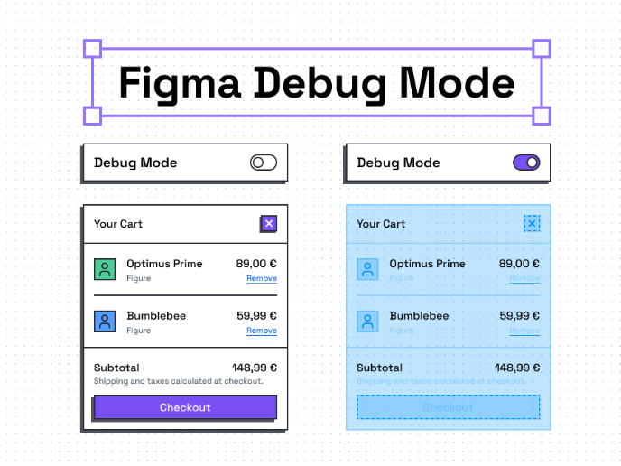
A debug mode for Figma without plugins


Designing for Voice User Interfaces (VUI)


The Power of Self-Determination Theory (SDT) in UI/UX Design

Popular Courses

UX Design Foundations

Introduction to Figma

Design Terminology