Cultural Differences in Color Perception & Meaning
Understand the differences in color perception and association among different cultures across the world
Some color meanings are universal, which comes both from evolution and globalization. But colors also have historical meanings that differ by culture, nation, country, or region. Even if the historical significance is lost, color schemes still evoke strong emotions.
Multinational companies adapt to local markets to succeed. They research how local customers receive the product, its price, and marketing. It's just as crucial to conduct market research on color preferences. For example, a company that emphasizes a set of colors with positive associations in its country can succeed at home but fail abroad.
In this lesson, we'll look at some examples of how colors are perceived in different regions, countries, and cultures. This is not an exhaustive list, however. Consider these as examples to illustrate why you should always do market research on local color meanings.

Studies show that blue is the most universally favored
Between 23% (in Indonesia) and 33% (in Great Britain) of people prefer blue, making it far more popular than any other color. Blue is especially favored in Asia, even where red, yellow, and green are traditionally loved. While men tend to prefer blue more than women, women also rank it as their top color choice.[2]
The ecological valence theory explains this preference by linking it to the positive associations of blue with the sky and water.[3] Consequently, blue is a safe choice in any environment or demographic. Major digital companies like Facebook, LinkedIn, and Skype use blue in their branding, as do stores like GM, Ford, Intel, Boeing, and Walmart, capitalizing on blue's universal appeal. Additionally, blue is a color that most color-blind people can see, except for those with tritan deficiency, the rarest form of color blindness.[4]
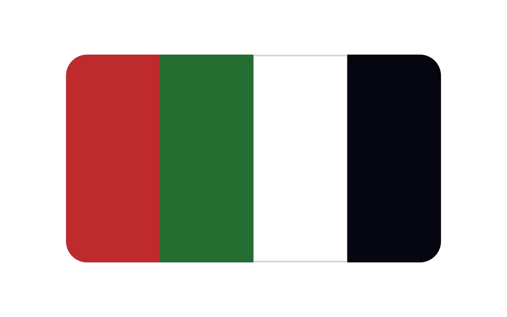
The Pan-Arab colors are black, white, green, and red. Individually, they each represent a historical Arab dynasty or era.[5] These colors have significance across the Middle East and are used in the flags of numerous Arab countries in the region.
In a 2013
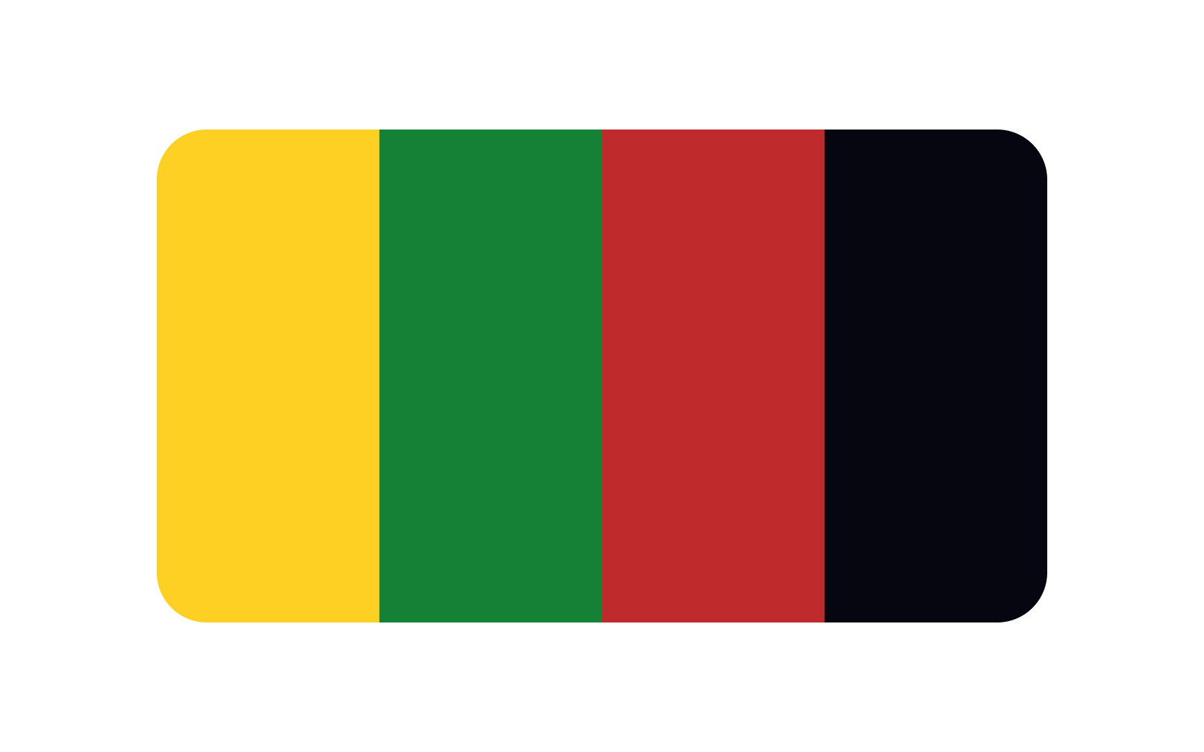
Ethiopia's new flag, created in 1897, was a red, yellow, and green tricolor, which became the symbol of resistance against foreign occupation. Newly independent countries would use these colors in their flags. Another variation of the Pan-African color scheme was developed later. It includes red, green, and black.
The meaning of the individual colors varies from country to country. Generally, their meanings are as follows:
- Green represents the land, hope, growth, and natural fertility.
- Red represents the blood spilled and the common heritage of Africans during the fight against oppression.
- Yellow represents the resource-rich regions, as well as peace and harmony between various ethnic and religious groups.
- Black signifies the
color of the people.[7]
National
These national colors frequently appear on flags, athletes' apparel, local brands, and various other items. Their use underscores a sense of unity within the country. Businesses often integrate these colors into promotional initiatives tied to national holidays.

Red is considered a positive
In China, Vietnam, and some parts of India, it's customary for brides to wear red wedding dresses. During Lunar New Year, many Chinese people give others red envelopes with money. They also wear red during celebrations such as the Spring Festival.[8]
Interestingly, in East Asian stock markets, red signifies a rise in stock

In many Asian countries, white is primarily associated with mourning and funerals, often represented by the undyed linen worn by the bereaved. This association extends to death and the afterlife, where, for example, a white kimono is placed with the deceased in Japan.
Beyond mourning, white also symbolizes purity and spiritual rituals. In Japan, white gravel or stones in Shinto mark sacred spaces for spirits, and Zen gardens with white sand are used for meditation. White is also connected to masculine traits, the element metal, and autumn in Chinese culture.
In essence, white in Asian cultures embodies both the solemnity of death and the purity of spiritual practices.[10]

Scandinavian interior design has a rich history dating back to the early 20th century, originating in Denmark, Norway, and Sweden. The style was influenced by the region's harsh winters and long periods of darkness, which led to a focus on light, simplicity, and functionality. Scandinavian design is characterized by subtle, muted
In recent years, more vibrant colors have started to appear in Scandinavian interiors, reflecting a broader trend.[11]
Interestingly, these color palettes have also influenced digital interface design. Websites like the Stockholm bakery Robin Delselius, Danish fashion designer Cecilie Bahnsen, and Finland's Miela store showcase this aesthetic, using soft, natural tones to create inviting and user-friendly experiences.

From architecture to clothing to food, bright, vivid hues are an integral part of Indian life, especially during festivals like Holi. Each
• Red symbolizes love, passion, and fertility.
• Yellow represents joy, happiness, and knowledge.
• Green signifies nature, growth, and harmony, and is often associated with Islam in India.
• Blue is linked to divinity and transcendence, embodied by Lord Krishna, and is also valued for its calming effect.
• Orange, or saffron, denotes purity, spirituality, and sacrifice.
• White symbolizes purity and peace and is the color of mourning in some regions.[12]
While these colors play a significant role in Indian culture and festivals, Indian UI design often follows global trends. It's not always characterized by these traditional vivid colors. Many Indian digital interfaces incorporate modern, neutral

The
Red is often seen on shrine gates and temples, believed to ward off evil and disaster. The traditional Japanese umbrella, called wagasa, was once considered a luxury item that could protect against evil spirits. Today, it is a beautiful art piece in tea ceremonies and Kabuki theater. Even though red has protective symbolism, giving red items as housewarming gifts is avoided in Japan due to the association of red with fire, which could bring bad luck such as fire accidents.
The presence of red in Japanese architecture, art, and everyday items has made a lasting impact on Japan's vibrant and colorful legacy.
References
- PNAS | PNAS
- Types of Colour Blindness | Colour Blind Awareness
- The Meaning of Colors in Cultures Around the World | The Shutterstock Blog
- Scandinavian Colour Schemes: How Do Scandinavian Countries Compare? — PROJECT NORD JOURNAL | PROJECT NORD JOURNAL
Top contributors


Topics
From Course

Share


Similar lessons

Intro to Color Theory

Color Properties
