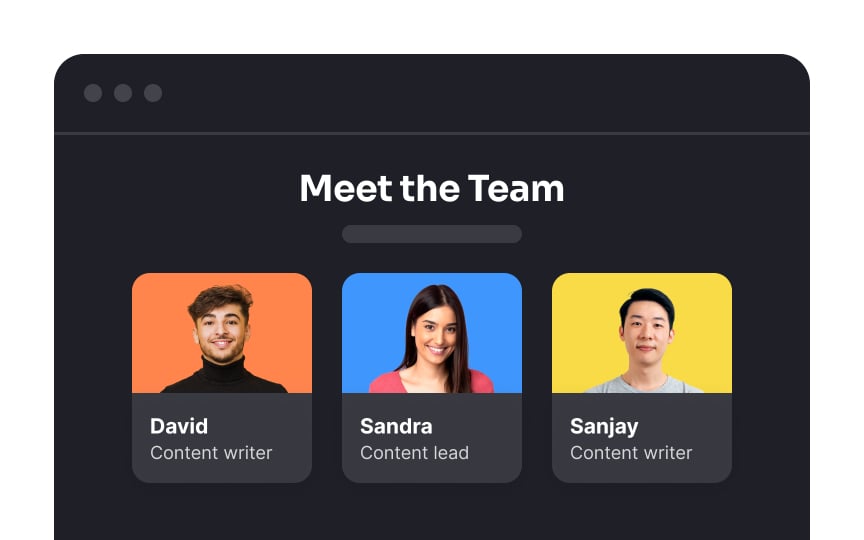
Card
Cards in UI design are compact, self-contained information containers that present a snippet of content, usually accompanied by visuals, headings, and brief text. They are like digital index cards, grouping related content together in a neat and visually appealing manner. Cards are versatile and commonly used to showcase items such as articles, products, user profiles, or notifications, offering an organized way to present modular content and encourage user engagement.[1] They may also contain interactive elements to act on the card's content, such as a Learn More button.

