Provide inline validation
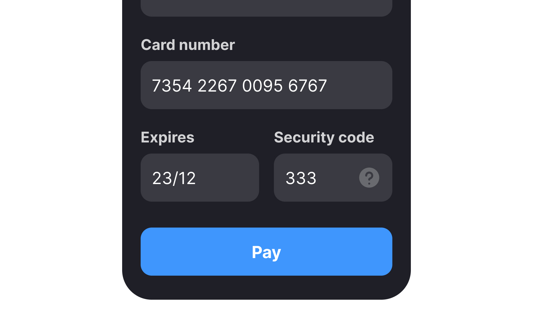
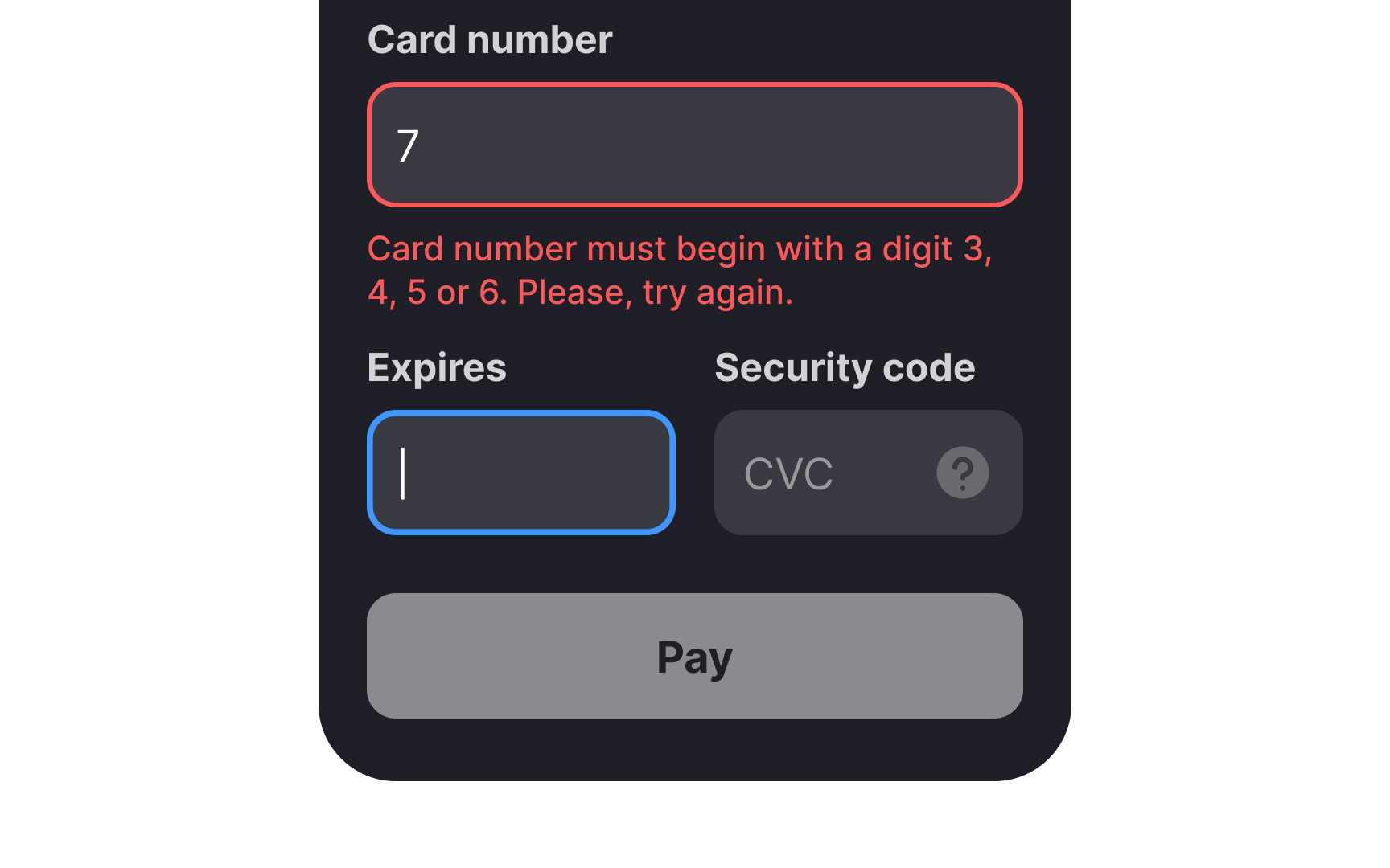
Any form that waits until after a user clicks on Submit to point out any errors is likely to be abandoned by them. To prevent this, offer inline validation on every input field of your form so that users know immediately when they make a mistake and what they should do to correct it. Don’t just flag failed validations, but also indicate successfully completed ones as well. It's a huge time saver, reduces friction, and imparts trust in the system.[1]
Delay inline validation until the user completes their input and shifts the cursor out of the input field. Immediate validation, triggered as users start typing, may be perceived as intrusive or disruptive, potentially causing annoyance.
Pro Tip: Indicate erroneous and successful inputs using prominent, contrasting colors (usually red and green) and a relevant icon.
References
- How to Report Errors in Forms: 10 Design Guidelines | Nielsen Norman Group
Top contributors