Component library
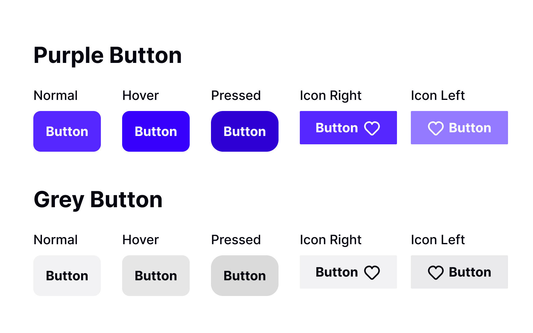
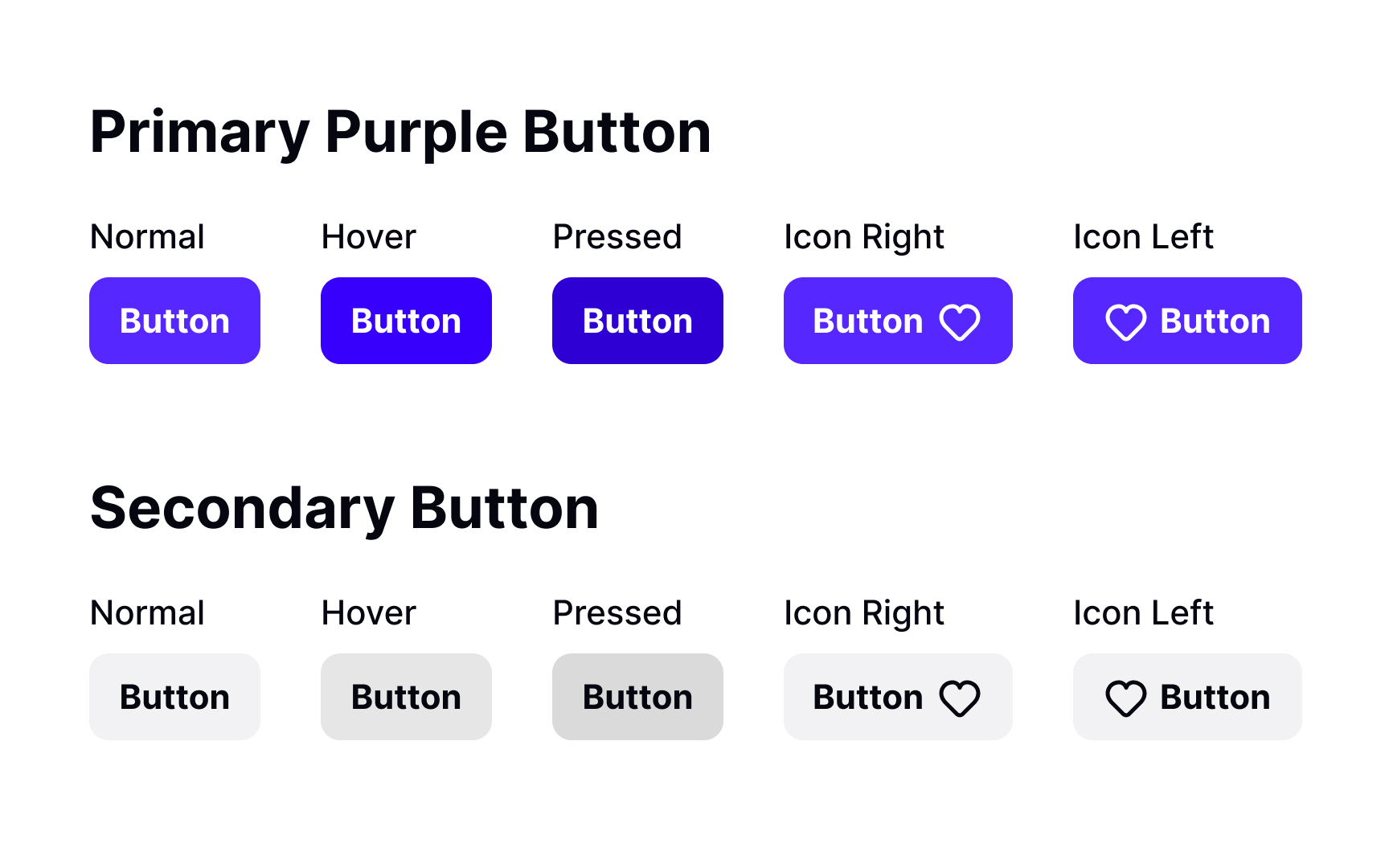
Imagine you're creating a design in Figma. A component library is like your toolbox, filled with parts like buttons, form fields, or navigation bars. When you need one of these parts, you just reach into your toolbox and pull it out. They're all standardized, meaning they look and work the same way every time.
This consistency is vital because it creates a more predictable and intuitive user experience. When users see the same elements, like buttons or fields, acting the same way across your design, it's easier for them to understand and use the product.
Consistency also makes your product look professional and accelerates the design process. Designers can reuse components without the need to recreate them each time. Suppose you decide to alter the color of a button. In a component library, you update the component, and the change is automatically reflected everywhere that button is used. This not only saves time but also ensures the entire product evolves coherently when changes are made.
