Horizontal line dividers
Horizontal dividers are simple lines that can be used to visually group content and create hierarchy within an interface so users can easily scan, find, and navigate content. They are of two types:
- Full-bleed dividers: These lines extend from one end of the container to the other, creating a clear and bold separation. They offer a dramatic and decisive visual break between content blocks or sections, making the separation highly noticeable. You can use full-bleed dividers to separate different content groups or even interactive and non-interactive sections of an interface.
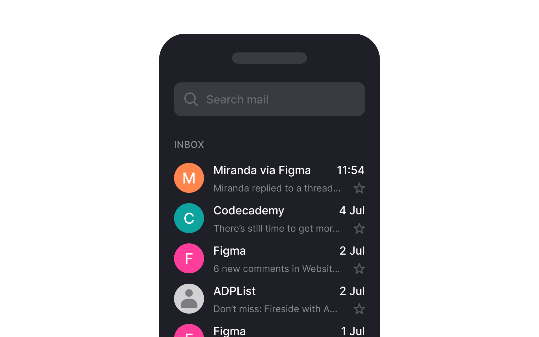
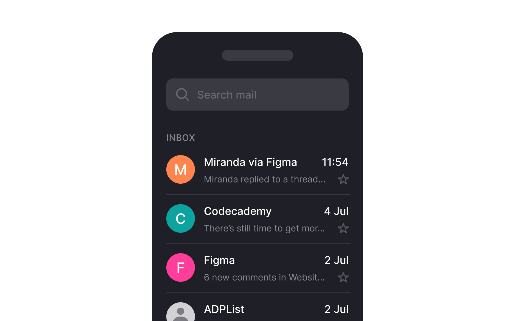
- Inset dividers: These lines are set within the boundaries of the content, rather than extending to the edges of the container. They provide a more subtle separation, maintaining a clean and organized appearance without a strong visual impact. They are most suitable for separating related content within a list, such as emails in an inbox. Always use them along with visual anchors like icons.[1]
Pro Tip: Combine full-bleed and inset dividers to establish a hierarchy of information within the interface.
