Affinity Diagrams in UX Research
Learn how to group and categorize user insights, observations, and ideas to identify patterns, themes, and opportunities
Affinity diagramming, also known as affinity mapping, is a great way to organize and make sense of research findings. In general, it involves grouping research findings into logical clusters, analyzing them, and developing a plan of action based on insights gained.
Affinity diagrams are usually a team exercise involving multiple team members and stakeholders. It can get chaotic if there isn't a clear agenda and someone to moderate and lead the session.
UX
Affinity maps lend much-needed structure and cohesion to your research data by helping you quickly and effectively examine key findings and prioritize issues that need to be dealt with most urgently. It is also a great way to get your product team and stakeholders involved in the design process in a fun and collaborative way.
However, the technique does come with its caveats. For instance, it can be difficult to get a remote team to collaborate on an affinity diagram, although there are tools like Lucidchart that might help simplify the process. It is also not particularly useful in cases where there are very few data items.
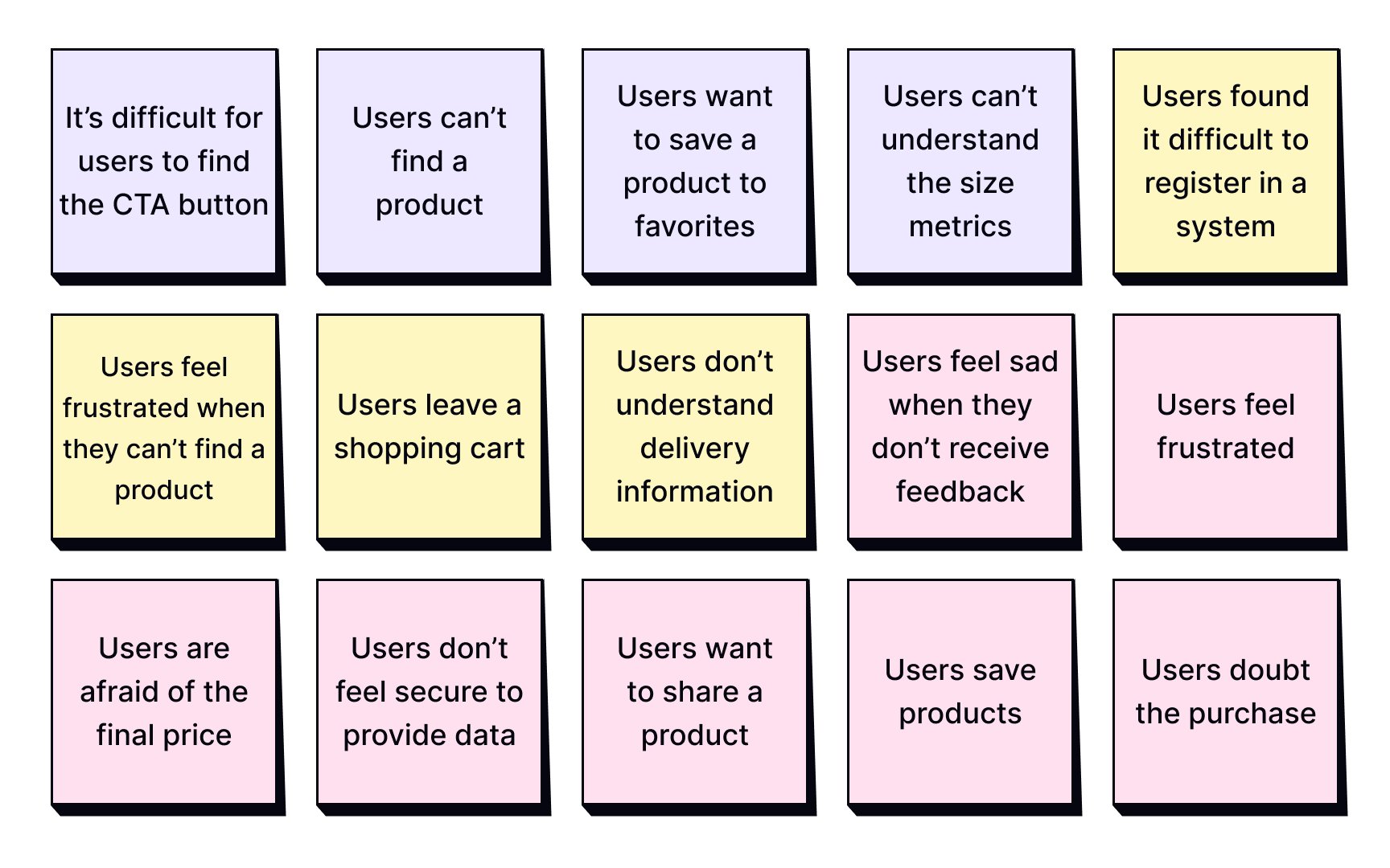
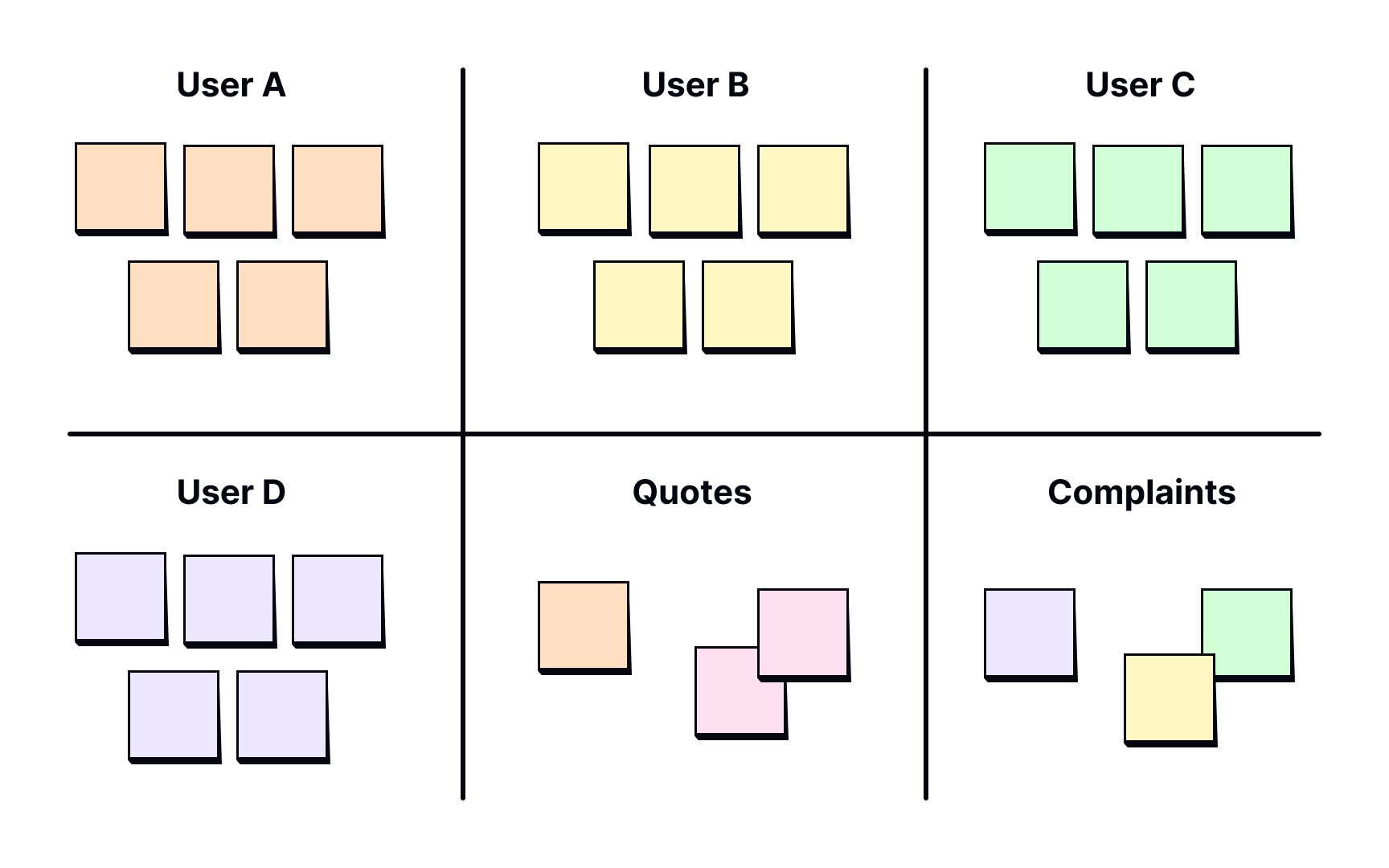
The first step of affinity mapping is listing out every data point from your
Make sure you write down points legibly and concisely for everyone to be able to read and understand. User quotes are great to have on affinity maps, don’t shy away from them! Allocate about 30-60 minutes for this step.
Pro Tip: Don’t worry about data repetitions in the notes — you can stick them overlapping one another. Just make sure the most descriptive note of the lot is on the top.
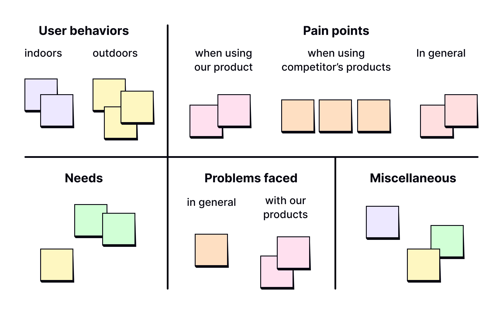
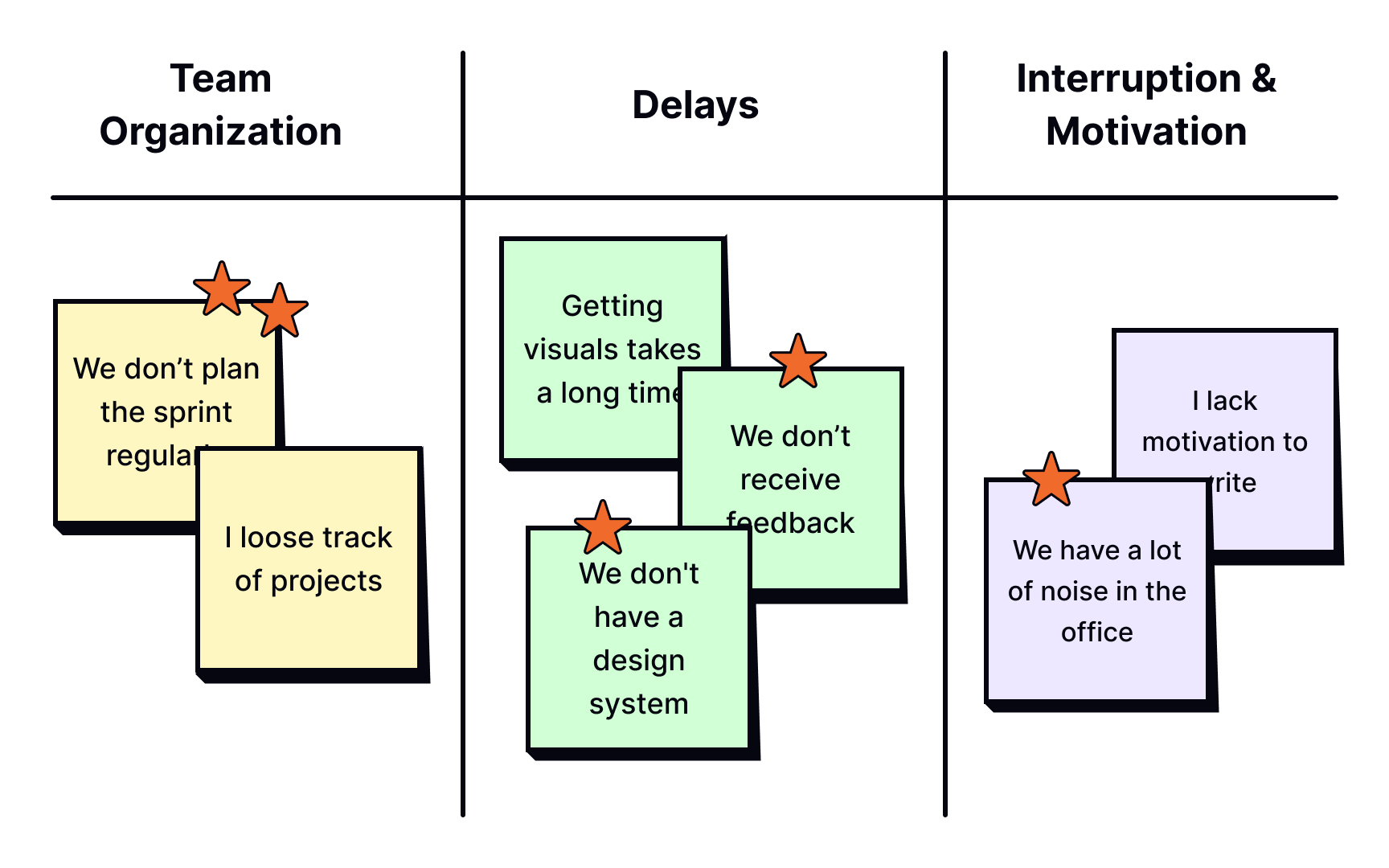
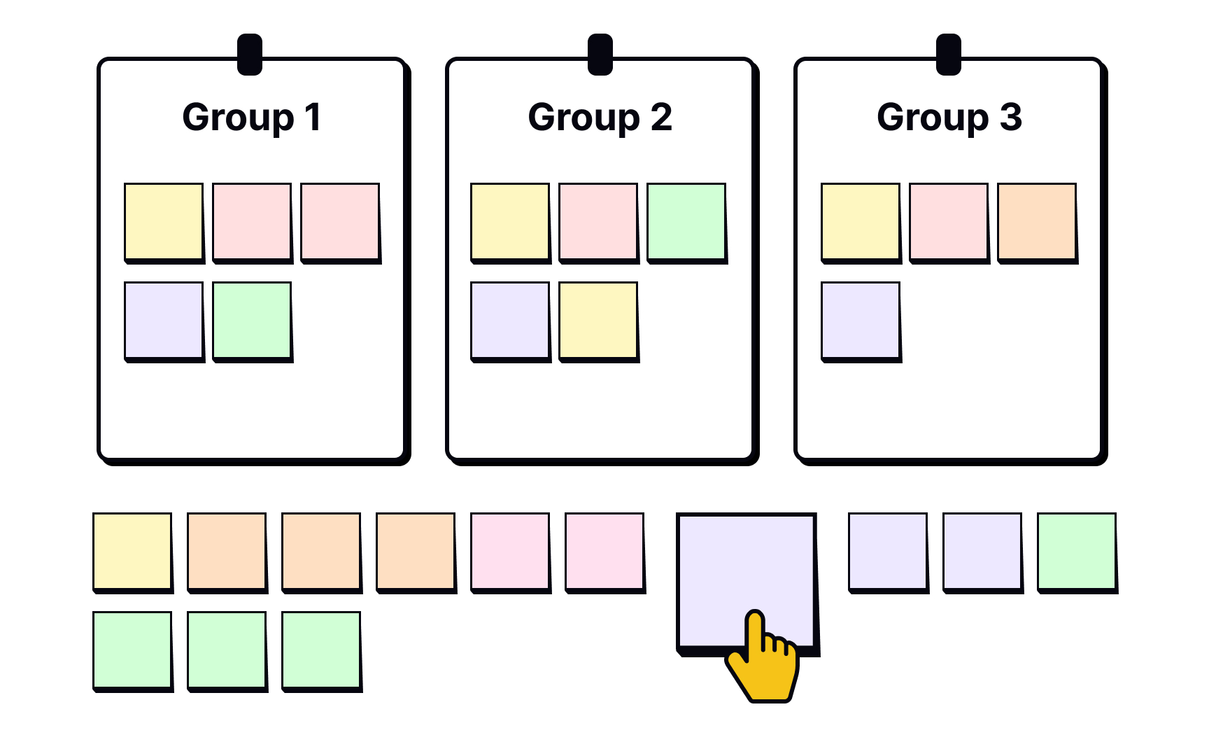
Up to this point in the affinity mapping process, participants of the
Group names can be created on the spot depending on the themes and patterns that emerge and your research goals. It is a good idea to first start with top-level categories and then create granular sub-groups as you go.[2] This step should take you around 60 minutes.
It is quite normal to be left with notes that don’t seem to fit into any group. Sort them under the miscellaneous category and try to make sense of them towards the end of the grouping session.
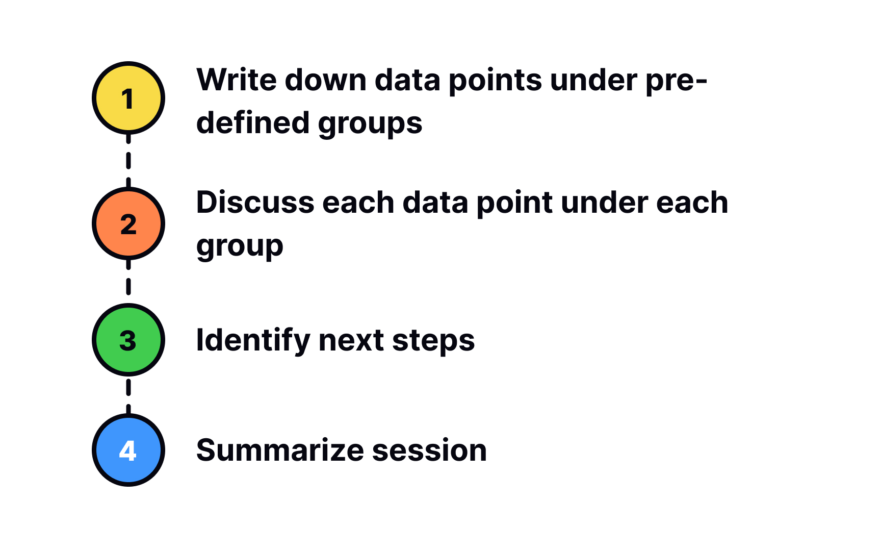
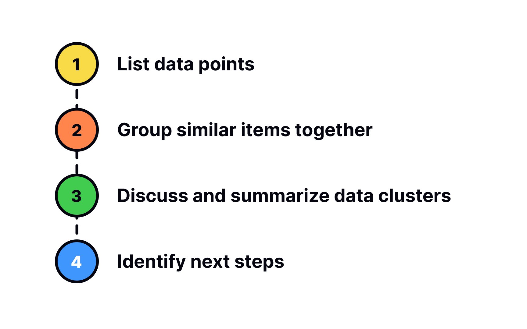
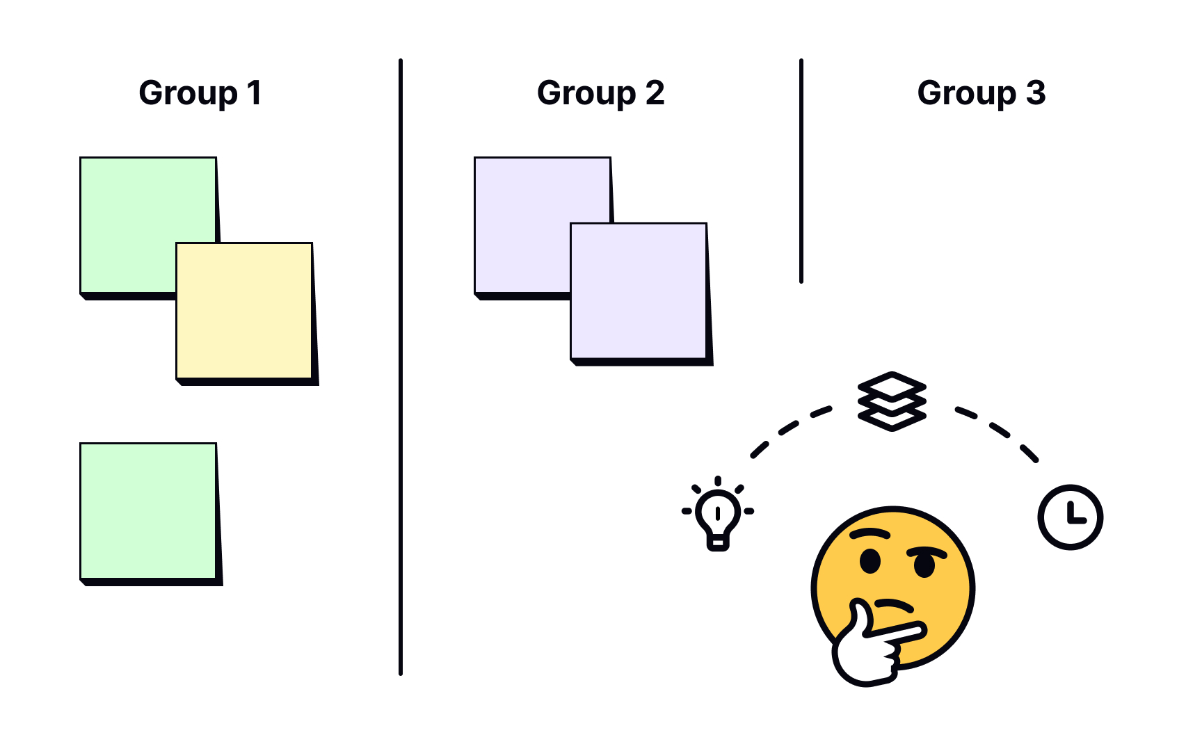
Once you’ve sorted all data points into groups, go ahead and summarize each group in detail. You can use this time to draw connections between data items, categories, and sub-categories. You could also sort out these groups in the order of importance, depending on your goals, vision, and company values.
During the discussion, any knowledge gaps in your
The thing about affinity mapping is that it is a flexible process. Just because you’ve placed a card into a certain group doesn’t mean that it has to stay fixed there. You might realize during further discussion and analysis that it fits better into another group or that it even belongs to multiple groups. So be open to shuffling cards around even in the discussion and summary stage.
Affinity mapping will either help you answer your original
When multiple problems or ideas emerge after your session, get your team to vote on prioritizing them based on how urgent or important they are. A successful affinity mapping session is one that is concluded with actionable insights.
References
- What is an Affinity Diagram and How It Can Help You | Studio by UXPin
- Affinity diagrams: Everything you need to know | UX Design Blog | UX Design Institute
Topics
From Course

Share


Similar lessons

UX Research Analysis

UX Research Reporting
