Use multiple cues for error states
Error messages that don’t clearly indicate which fields need correction create unnecessary friction for everyone, and even more so for users with disabilities, who may need to navigate the form multiple times to locate and resolve issues.
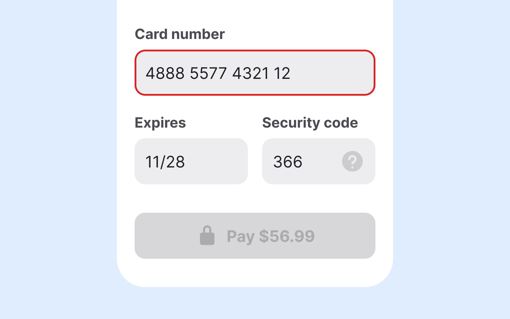
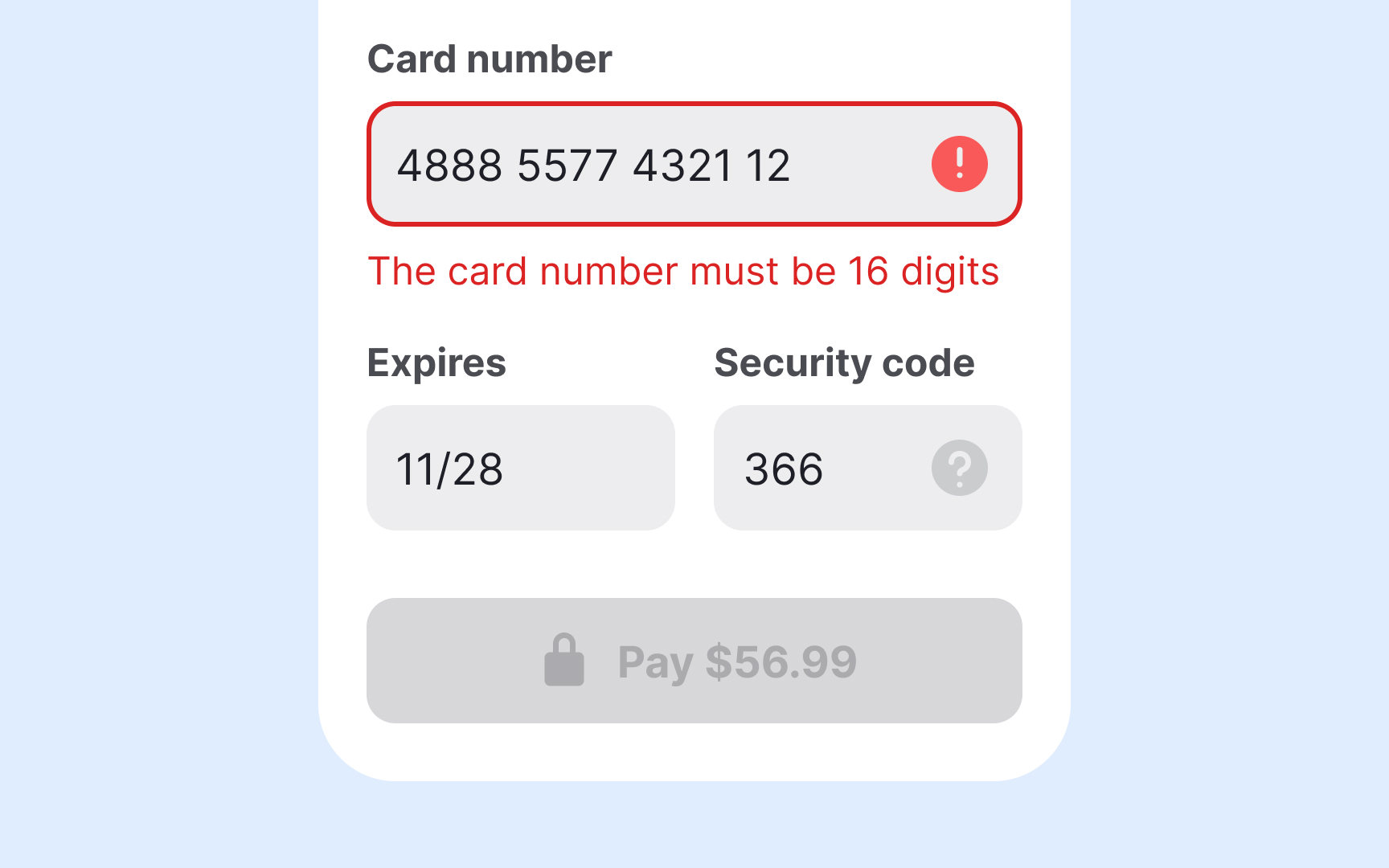
Always communicate errors using multiple cues, not just color. Relying only on red text or borders excludes colorblind users and reduces clarity overall. Combine visual indicators like bold text, high-contrast borders, or warning icons with concise, field-specific messages placed near the input.
If your app runs on a device that supports haptic feedback, consider adding a brief vibration to signal an error, unless users have disabled this option in their settings.
Use clear, actionable language in your error messages. Instead of vague alerts like “Invalid input,” specify what’s wrong and how to fix it, for example, “Phone number must include area code” or “Password must be at least 8 characters.” This reduces guesswork and helps users recover faster.
