Tertiary button
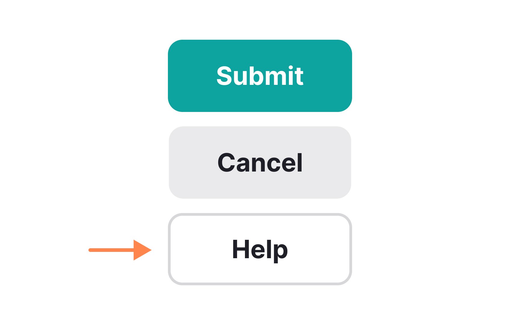
Tertiary buttons are for lesser-performed actions or those that users are unlikely to perform. Therefore, they shouldn’t be attention-grabbing at all. In fact, you may want to place tertiary buttons away from the other buttons in an interface to prevent users from accidentally selecting them. Common style choices include using plain text links, muted or low-contrast colors, smaller font sizes, lighter weights, or simple outlines without fills. These visual cues help signal that the action is less important than primary or secondary buttons.