Keep unselected tabs visible
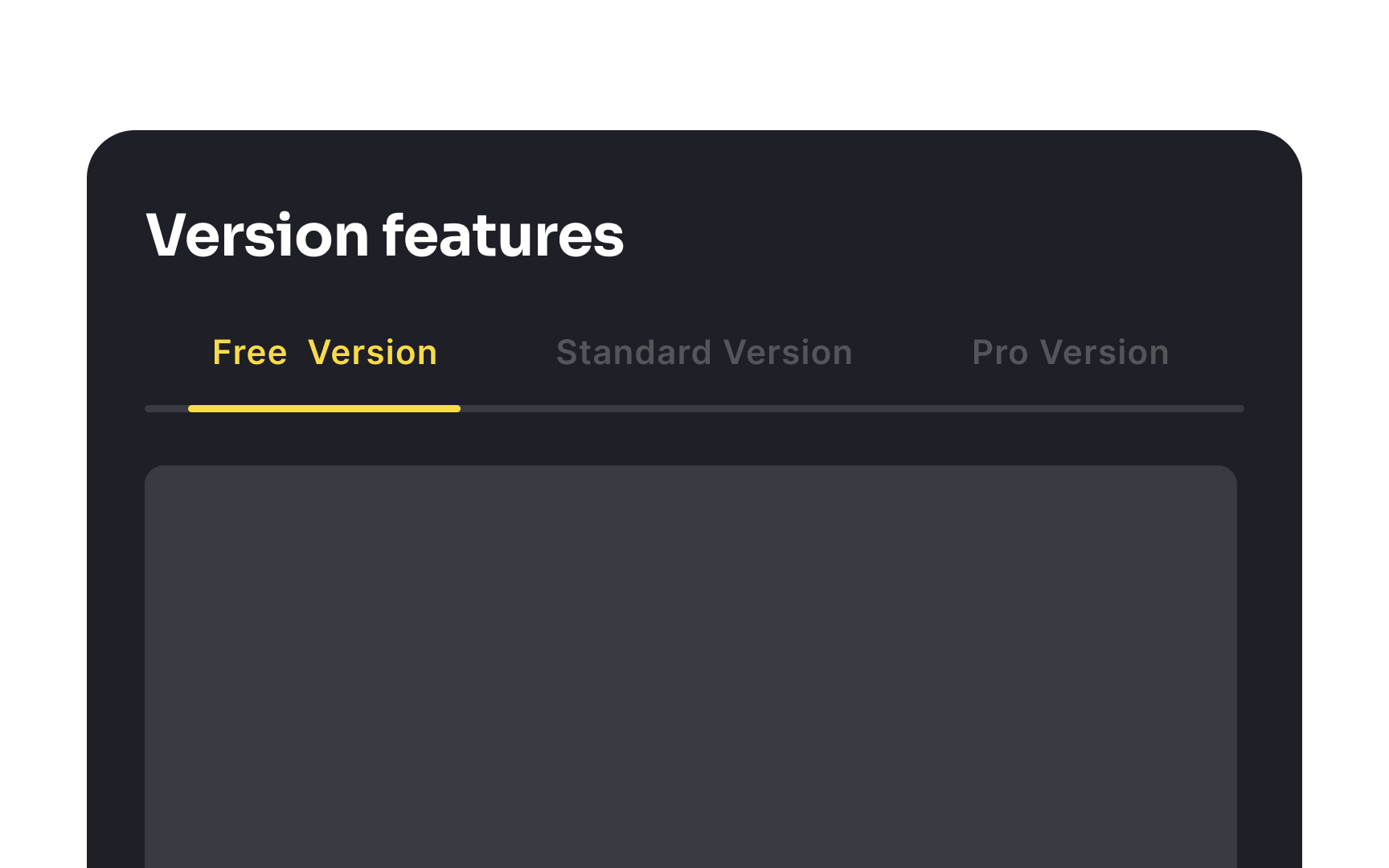
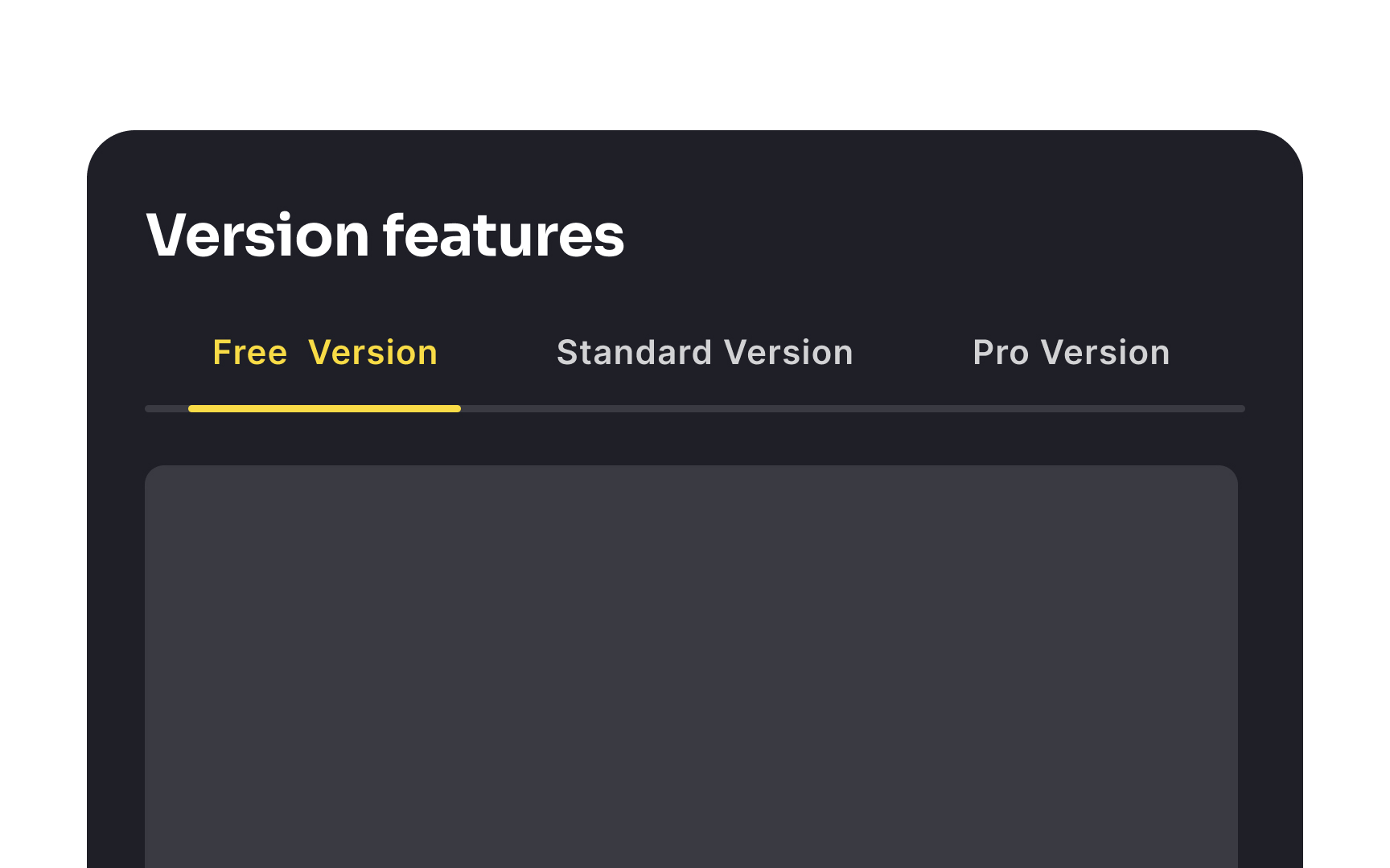
Unselected tabs need to be distinct from the active tab, yet they shouldn't appear disabled or too subdued. If they look too muted, users might mistakenly think they are not clickable or miss them altogether.[1]
It's important to strike a balance where the active tab stands out, perhaps with a bolder color or an underline, while the unselected tabs remain clearly visible and legible. This ensures that users are aware of all available options without confusing the inactive tabs with non-functional elements.
