Emphasis
Working with typography in design implies that at some point, designers need to apply emphasis to highlight the important information and draw users' attention to it.
The most common emphasis techniques in Western typography include:
- Italics & obliques: Italics (a slanted type style that uses unique glyph shapes) and obliques (a slanted version of the Roman type style) create the softest emphasis, although the degree depends on the surrounding text. This method of emphasis is commonly used for book titles, words from foreign languages, or internal dialogue.
- Bold: Bold text usually has a stronger effect than italics or obliques, using a heavier weight than the surrounding text.
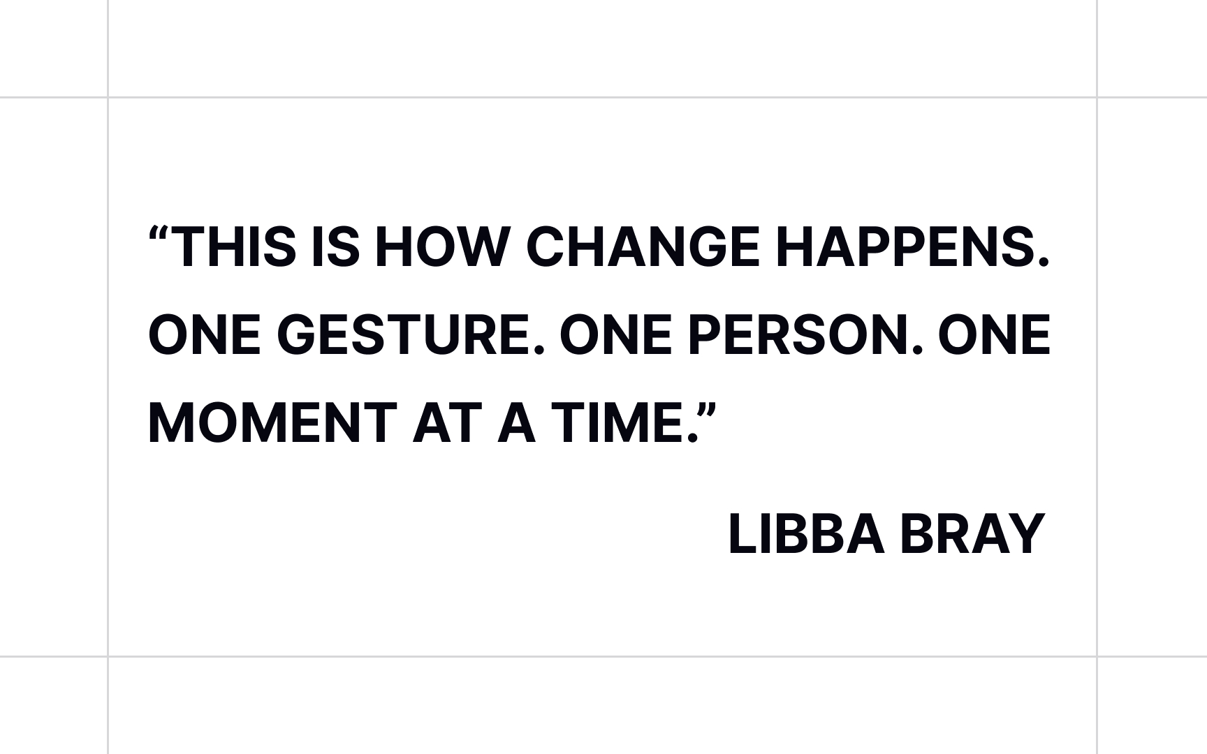
- All caps: All caps help emphasize subheadings, column headlines, and occasionally for words within running text.
- Type size: Larger type works well for headlines and subheads in digital and printed designs.
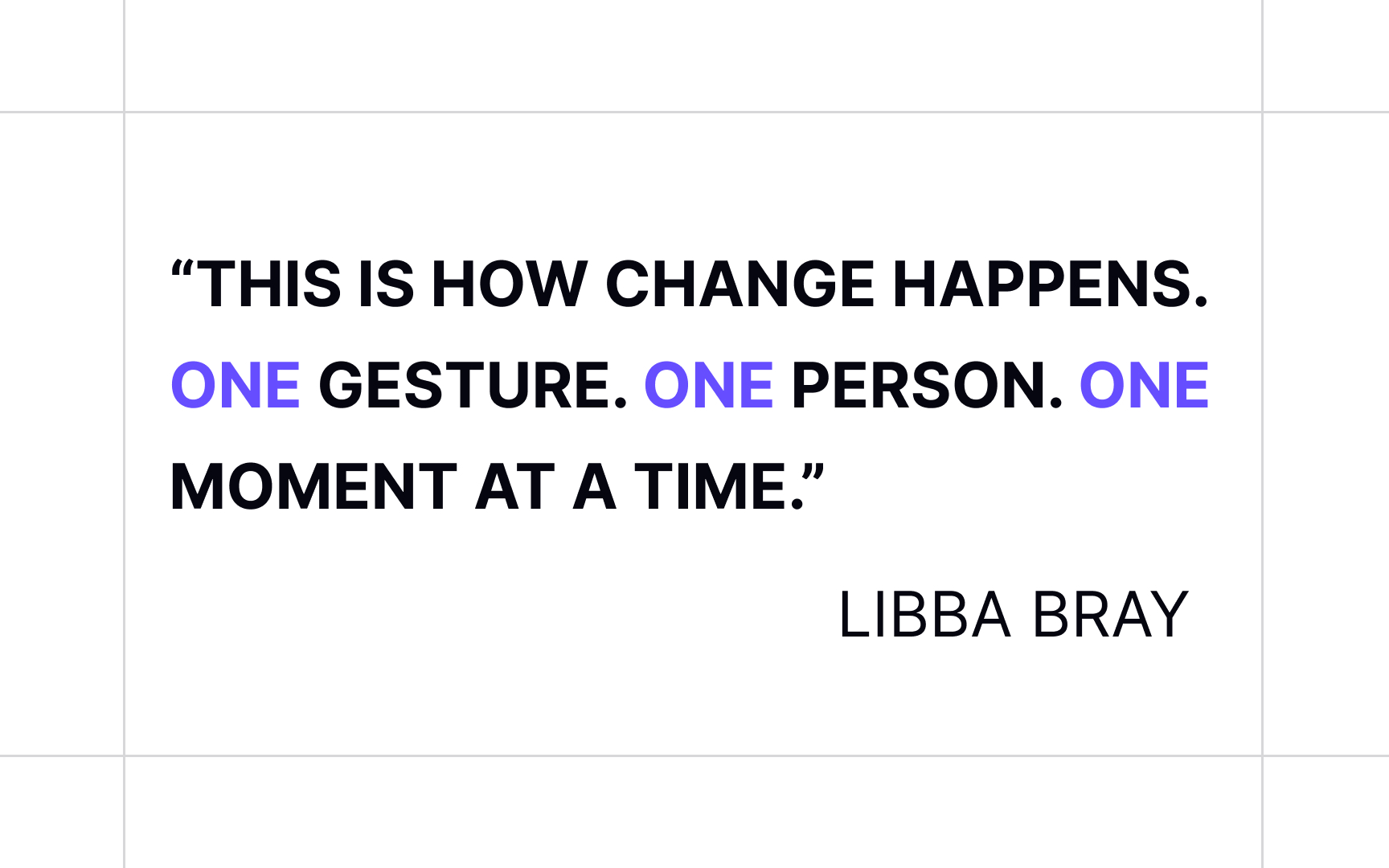
- Color: Emphasis using color has a stronger effect when combined with other techniques like font-weight or case alterations.[1]
Methods of emphasis also include variations in letter spacing, underlining, and overlining.
