Typography Style & Classification
Understand the origin and evolution of common type styles over the history of time
The first alphabet was created around 1000 BC by the Phoenicians. Greeks used the same alphabet, and later, Romans borrowed it to refine the art of handwriting. They developed a number of different forms of lettering and different scripts for official and unofficial needs.
The 15th century marked a huge breakthrough for modern typography — the development of moveable type and the printing press. During this time, a number of practical and decorative typefaces emerged.
Later on, the arrival of the Industrial Revolution and the growth of publishing took typography to a new level. Tons of newspapers, periodicals, booklets, posters, and advertisements required new typefaces and styles.[1]
Why does a designer need knowledge of typographic history? It gives them a broader perspective on typography design, upgrades their skills from amateur to professional, and helps them feel more confident in selecting, combining, and applying typefaces.
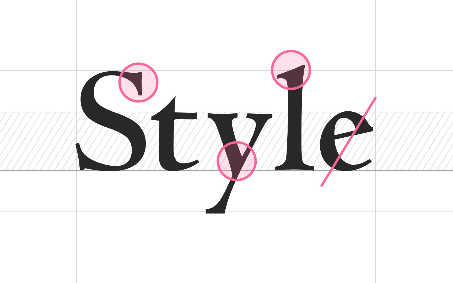
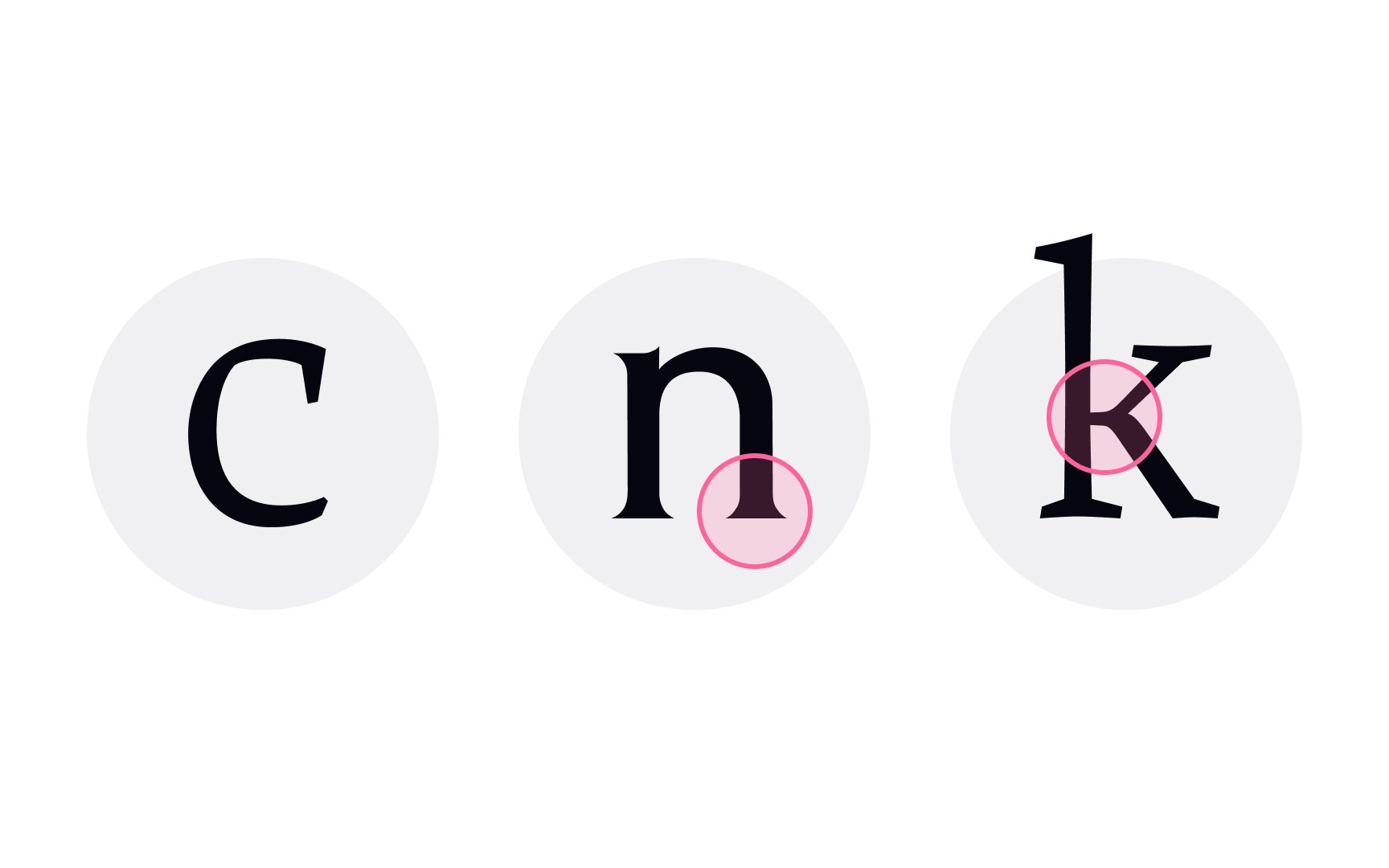
Old Style serifs stem from the 15th century and represent the Humanist movement that deviated from Middle Age restrictions and celebrated human nature and human achievements in education, classical arts, literature, and science. More refined Old Style serifs replaced the heavy and angular Blackletter style, and initially, many letterforms were based on pen-drawn strokes.
The main characteristics of Old Style serifs include:
- A low-weight contrast between thick and thin strokes
- Horizontal crossbars
- Wedge-shaped serifs
- Left-leaning axis or stress
- Small x-heights
- Lowercase ascenders are taller than the height of capital letters
- Numerals have ascenders and descenders and vary in size[2]
The most popular Old Style serifs are Garamond, Caslon, Goudy Old Style, and Palatino. Modern designers use them for projects to convey elegance and splendor.
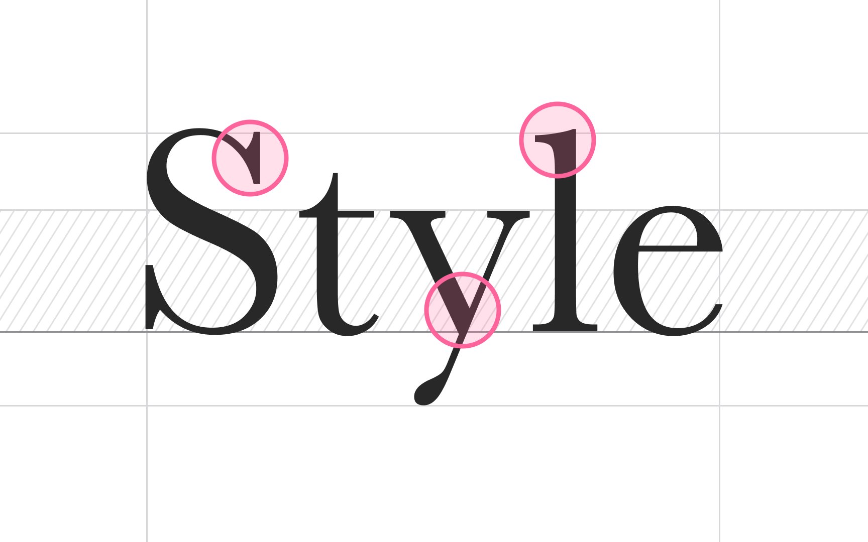
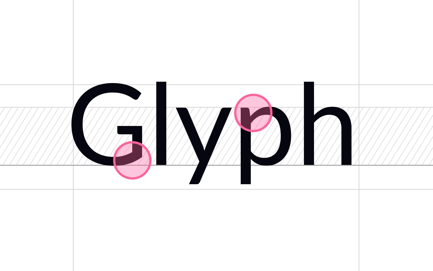
As their name suggests, transitional serifs became the bridge between old-style and modern serifed typefaces. John Baskerville is considered the father of transitional serifs. In the 1750s, during his later years, the retired English manufacturer developed an interest in
Key characteristics of transitional serifs include:
- A more pronounced weight
contrast between thick and thin strokes - Bracketed serifs with flat bases
- Slightly slanted head serifs
- Vertical stress in rounded lowercase letters
- Larger x-height
- Cap height that matches the height of lowercase ascenders
- Consistent numeral size
Well-known transitional serifs include Baskerville, Americana, Bulmer, and Perpetua.
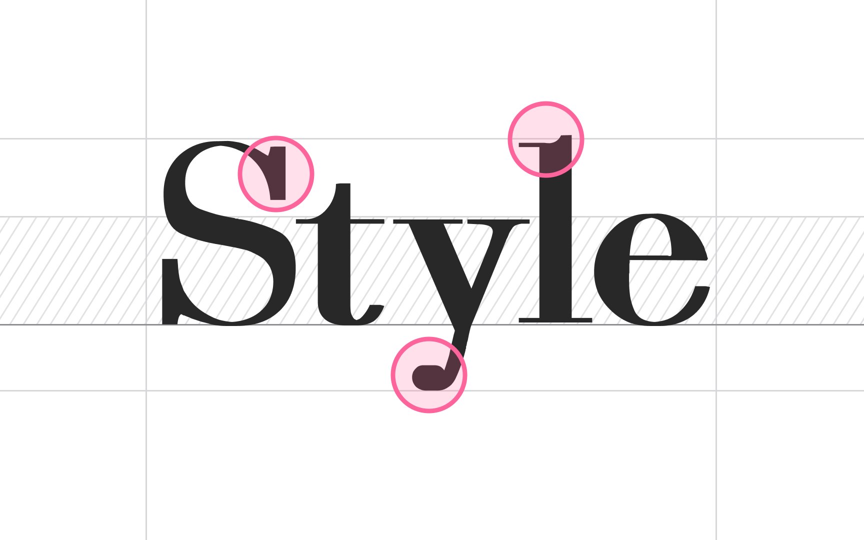
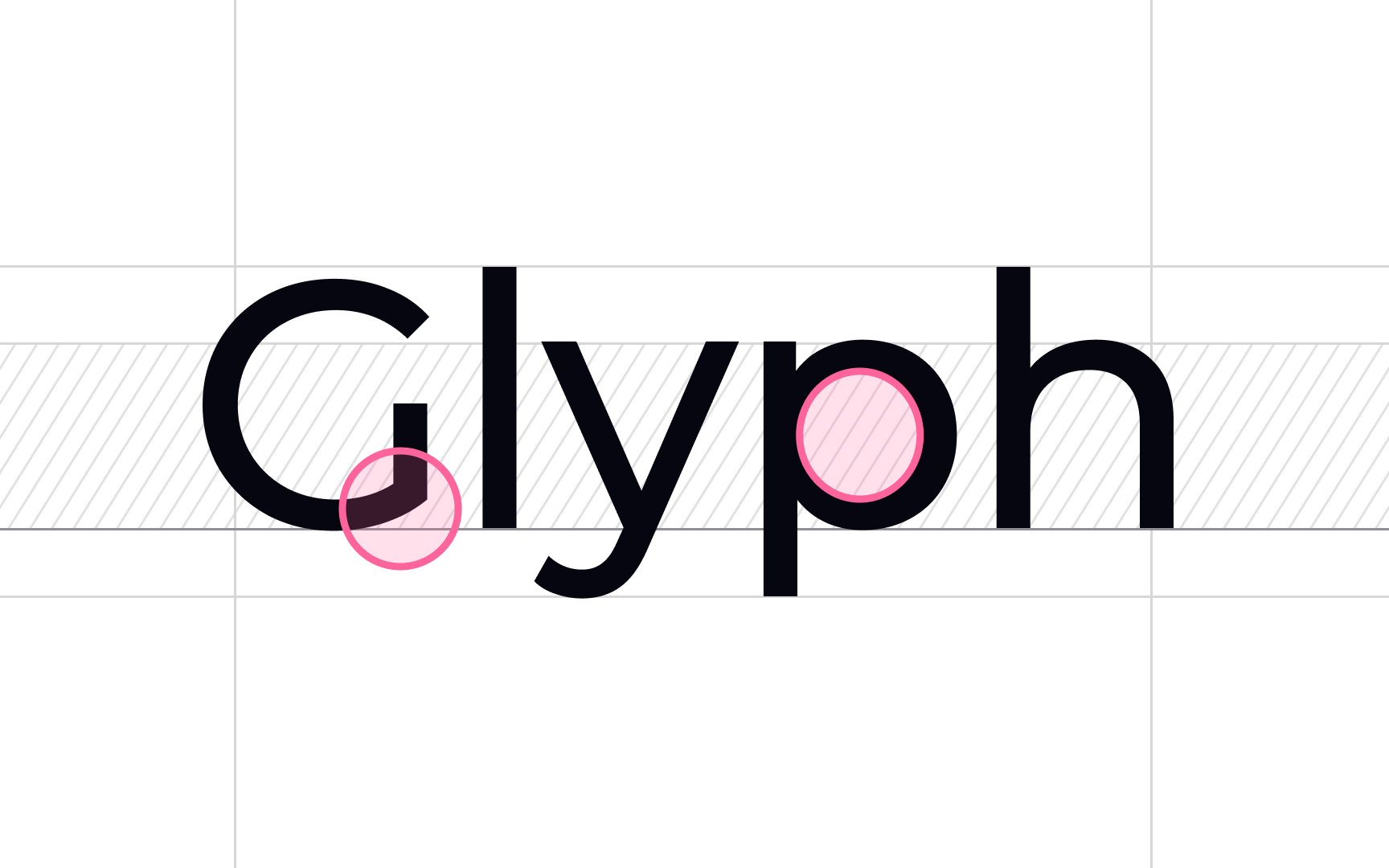
Neoclassical serifs, also referred to as modern or Didone
Key characteristics of neoclassical serifs include:
- High
contrast between thick and thin strokes - Flat, hairline serifs
- Horizontal stress
- Small apertures
- Vertical axis
Well-known modern typefaces include Bodoni, Didot (the first Didone), Bernhard, Modern Roman, Aster, Century Schoolbook, Fenice, and Kepler.
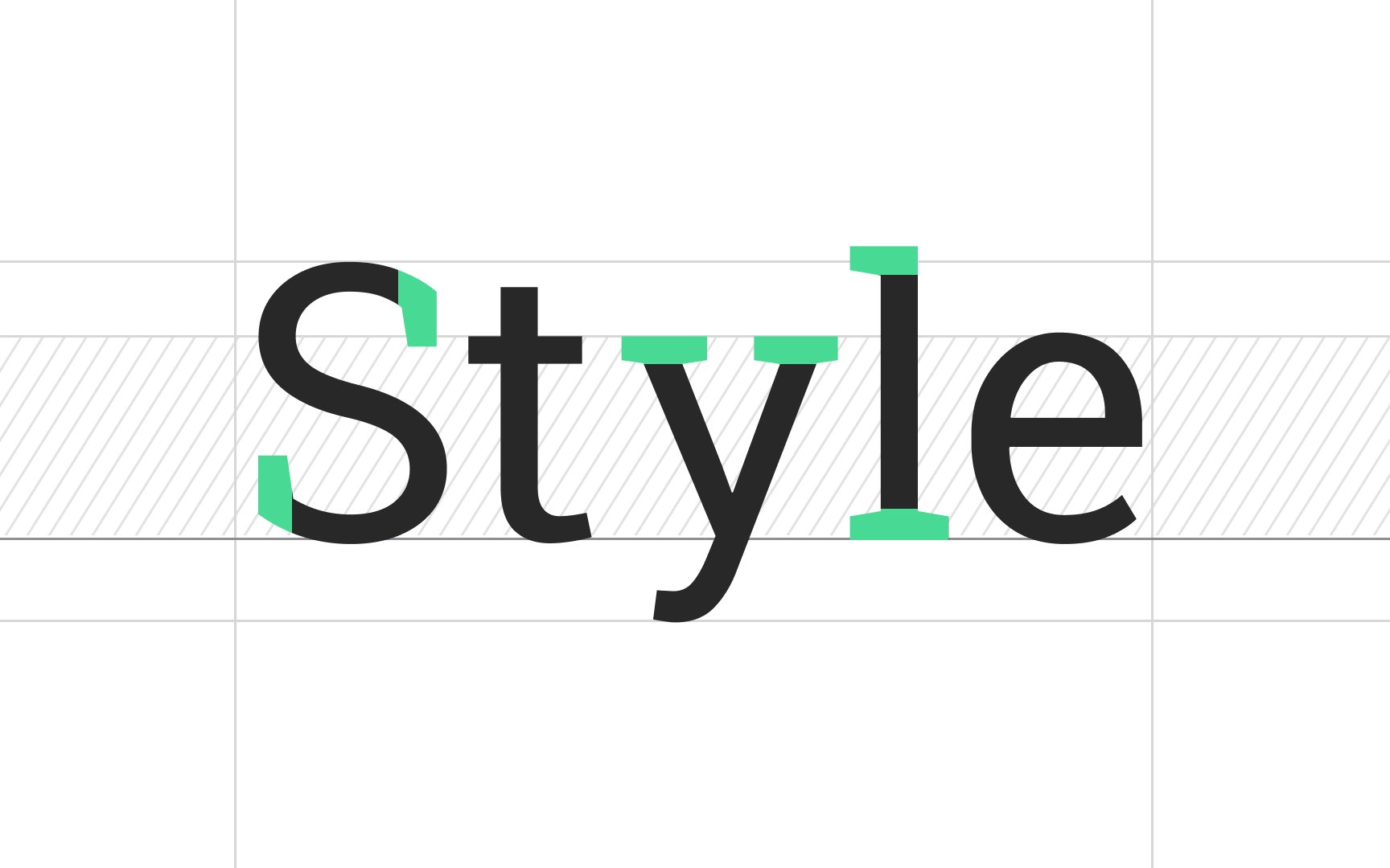
Slab serifs were invented in the 19th century and were characterized as:
- Sturdy and block-like
- Had no evident weight
contrast in strokes - Their terminals could be either blunt and angular or rounded
With the development of printed media, slab serifs became remarkably popular. Publishers used this distinct
Interestingly, the credit for the typeface's second name — "Egyptian" — belongs to Napoleon Bonaparte. After his Egyptian campaign, the Western world was swept by a fascination with Egyptian culture. In many European saloons, you could have encountered furniture and decor resembling the artifacts found in Egyptian tombs. At the same time, due to a marketing gimmick, Slab serifs were often called "Egyptian" even though there was no connection between this typeface and traditional Egyptian writing systems.[3]
Popular slab serif fonts include Rockwell, Clarendon, Serifa, Courier, and Memphis.
The characteristics of glyphic serifs include triangular serifs or flared stroke ends that resemble characters engraved into metal or stone rather than hand-drawn letterforms. Among other
Some glyphic serifs can be considered almost serifless, such as in Epigraph. Other glyphic serifs include Trajan Pro, Saturnia, Monumenta Pro, Orpheus Pro, and English Engravers Roman.
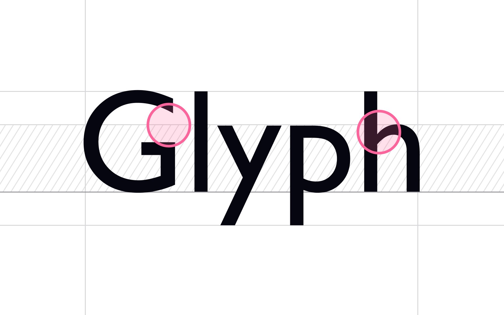
Grotesque
Over the 19th century, the style became more sleek, refined, and sophisticated. The neo-grotesques took these typefaces to a new level. Letterforms became more simplistic and lost irregular variations in line weight.
1957 was a big year for neo-grotesque sans serifs — the immortal Helvetica was released. Other typefaces of this category include MS Sans Serif, Arial, Bell Gothic, Bell Centennial, and Univers.
As the name indicates, geometric sans serifs have simple, modern, geometric forms. They appeared in the early 1920s and have become widely popular for headlines, logos, and packaging but were rarely seen for
You can recognize these letterforms by straight, monolinear lines, perfect circular "o" glyphs, geometric bowls of "a" and "p," and little or no stroke
Among geometric sans serifs, you can find Avenir, ITC Bauhaus, Futura, Montserrat, and Harmonia Sans.
Humanistic sans serifs have a calligraphic influence that they borrowed from Roman letterforms and early serif
Older typefaces like Gill Sans and Frutiger and the more recent Myriad, Trebuchet, and Calibri belong to this category.
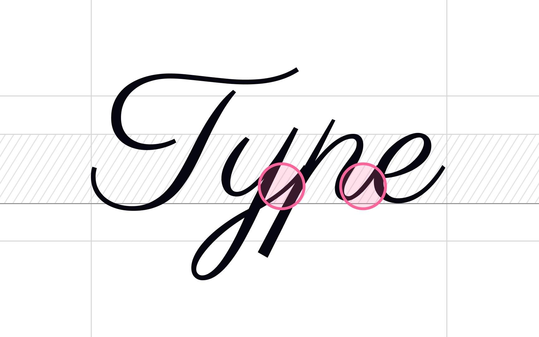
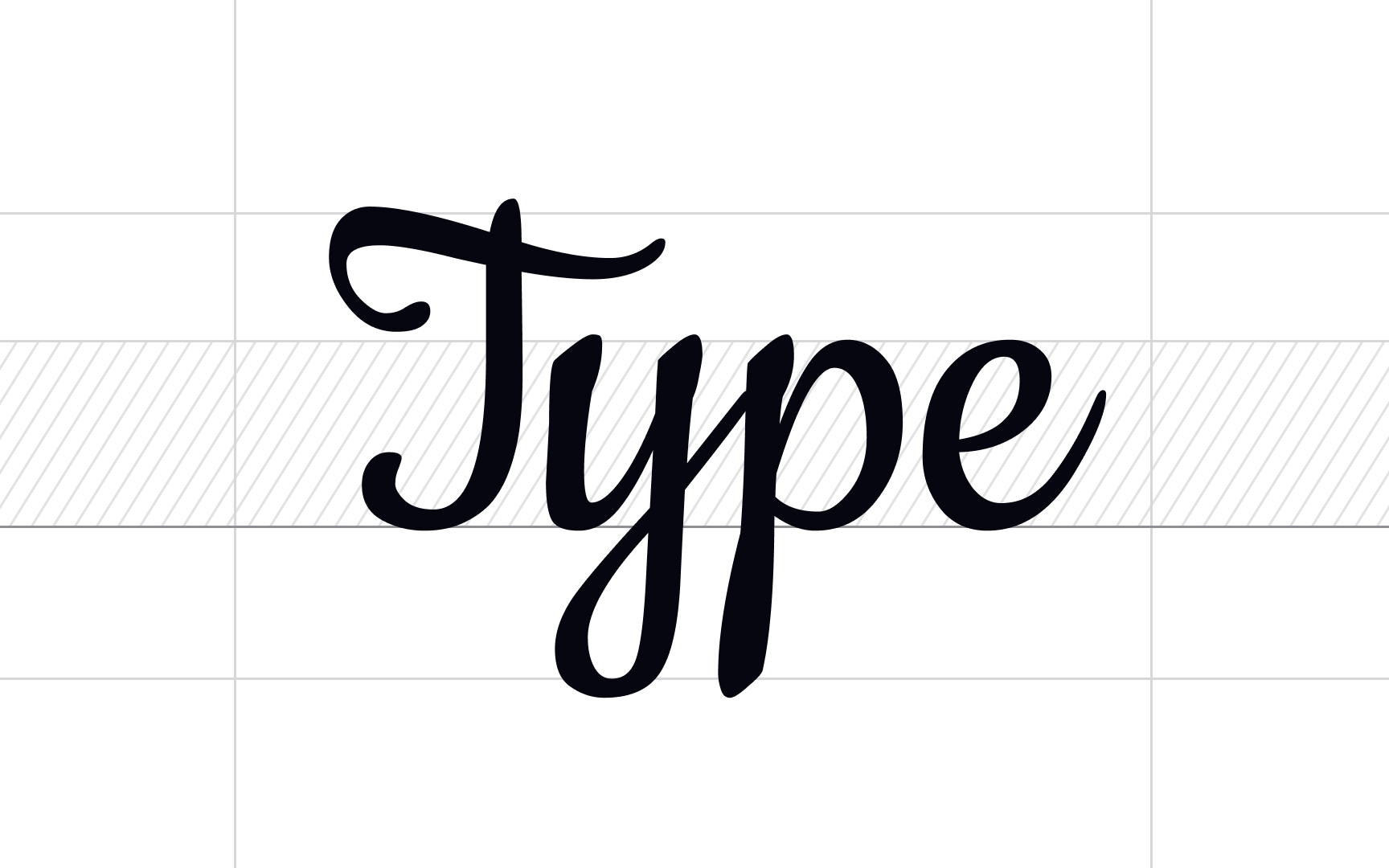
Scripts originate from handwriting or pointed pen calligraphy. Due to their elegant, refined look, scripts were commonly used for display purposes in trade printing, invitations, and diplomatic papers but rarely for
Scripts can be split into two categories: formal and casual scripts. Formal scripts are based on the letterforms of 17th and 18th-century handwriting masters such as George Bickham, George Shelley, and George Snell. The main
Casual script
Calligraphic scripts mimic calligraphy where a flat-tipped pen or brush is usually used. They may or may not have joined letters and occasionally include the drips, spots, blotches, and other imperfections common in hand-drawn letters.
Due to their special human touch, calligraphic
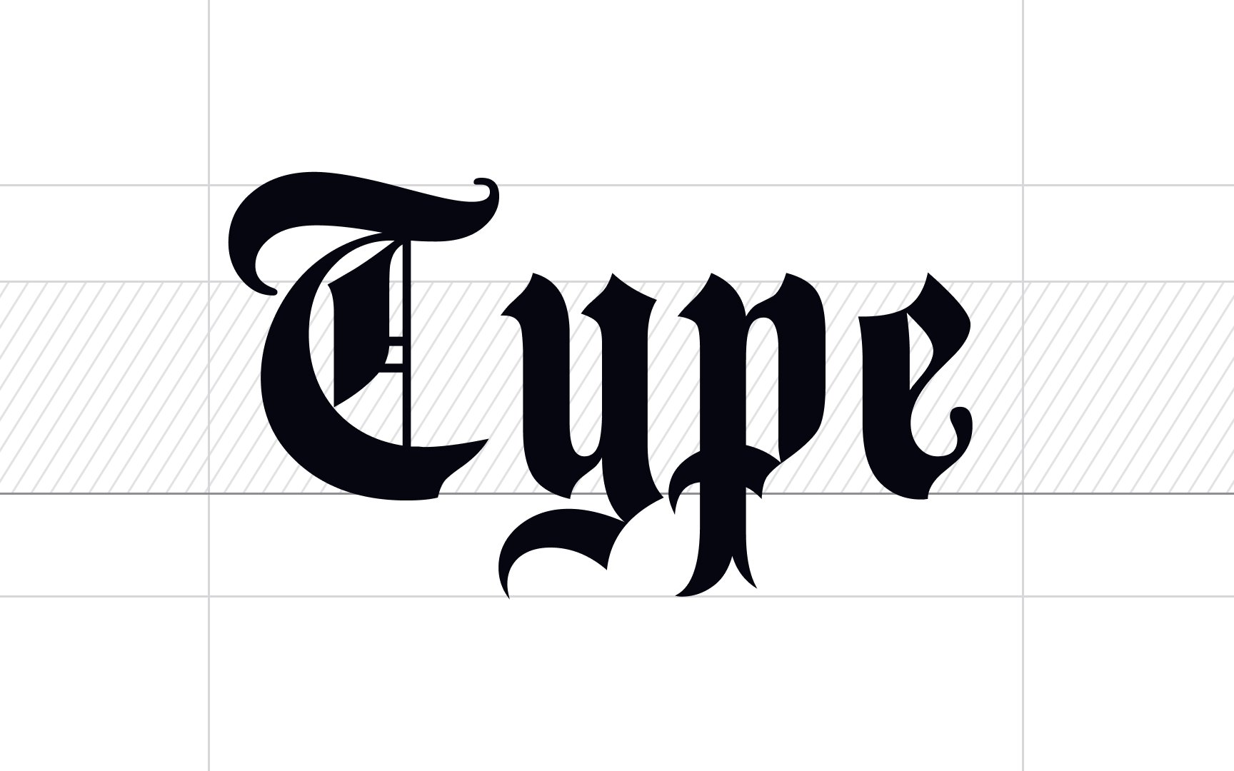
Blackletter scripts, also known as Gothic script, Gothic minuscule, or Textura, originated in the 12th century in Western Europe and became the base
With the development of printing, blackletters became less popular and remained only in Germany and German-speaking countries. Later on, German typographers created new sans serif typefaces that were far more legible and suitable for printing. In 1933, when Nazis came to power, they declared Blackletter scripts (Fraktur in particular) to be the people's font, and other typefaces were forbidden. Fraktur was used up until 1941 and then was replaced with more readable typefaces.[4]
The modern blackletter typefaces available that can add a medieval look to your designs include Textura, Agincourt, Cresci Rotunda, Schwabacher, Cursiva, and Bastarda.
Pro Tip: Blackletters are perfect for headlines, packaging, logos, posters, and signs.
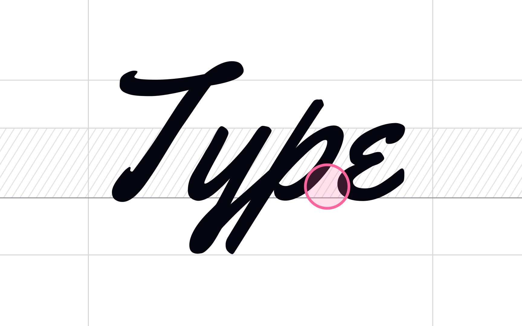
Casual scripts appear less traditional than formal scripts, carrying a more joyful attitude as though a friend has quickly jotted you a note. In
Typographers usually work with casual scripts for ads, brochures, and other

Decorative
In
One of the advantages of this type is that each letter occupies the same amount of horizontal space. For that reason, these typefaces are widely used in programming so that developers can easily spot mistakes in code. On the other hand, monospace typefaces take up more space than proportional typefaces, and long stretches of monospace text can tangle together visually and appear much harder to read.[5]
References
- The Evolution of Typography: A Brief History | PRINT Magazine
- The Return of the Old Style Roman Typeface | Creative Market Blog
- Proportional Vs. Monospace Fonts | Techwalla | Techwalla
Top contributors


Topics
From Course

Share


