Anachronisms
Anachronisms refer to chronological inconsistencies. In typography, it means using a typeface that visually belongs to a different historical period than the subject being represented.
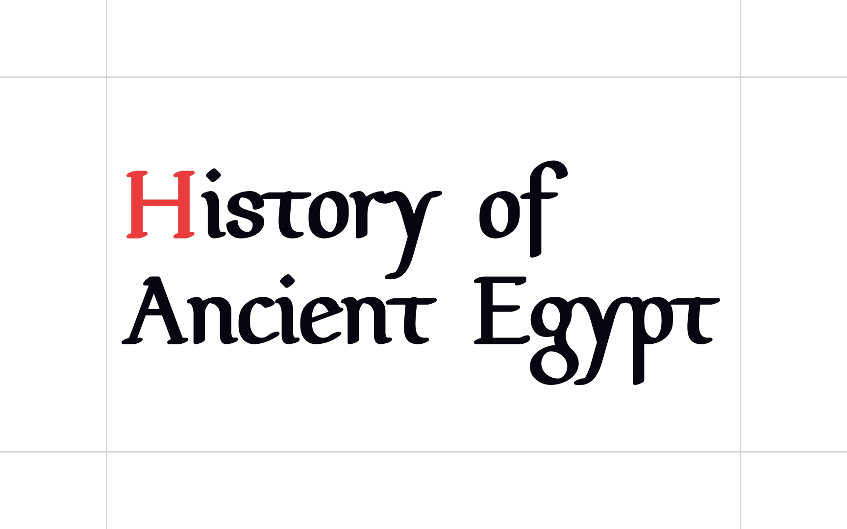
For instance, using a typeface inspired by Medieval Europe for a text about Ancient Egypt would feel anachronistic. Even though both are “old,” their cultural and visual references come from completely different eras. Fonts like Carolingian Minuscule or Pfeffer Mediæval evoke the Middle Ages, not ancient civilizations.
To avoid anachronisms, match your type choices to the visual culture or time period your content refers to. This is especially relevant when using decorative or historical typefaces instead of neutral sans-serifs or serifs.
Pro Tip: Keep in mind that you don't need to find a period-appropriate font for every topic — it can actually stir you into cliché territory. A great option is to use neutral typefaces instead, for example, Arno.
