Weight
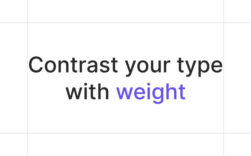
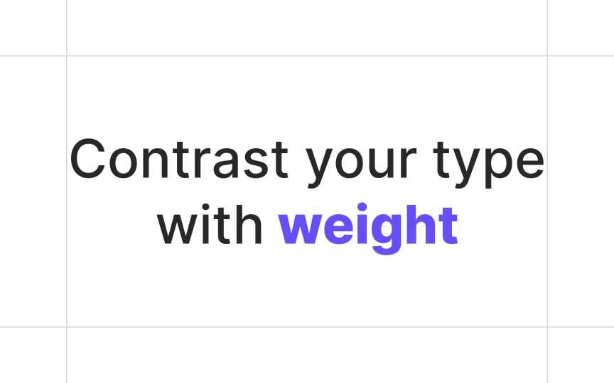
By making text bold — increasing its weight — you make it stand out among lighter and thinner type. Designers use heavier weights for headings, subheadings, keywords in the running text, or any type of text that requires special attention.
Weight can create a certain mood: heavy text appears more solid and impactful and is supposed to attract, alert, shock, or persuade. Use caution, though: too much weight can make type look too dramatic and even hurt text readability.


