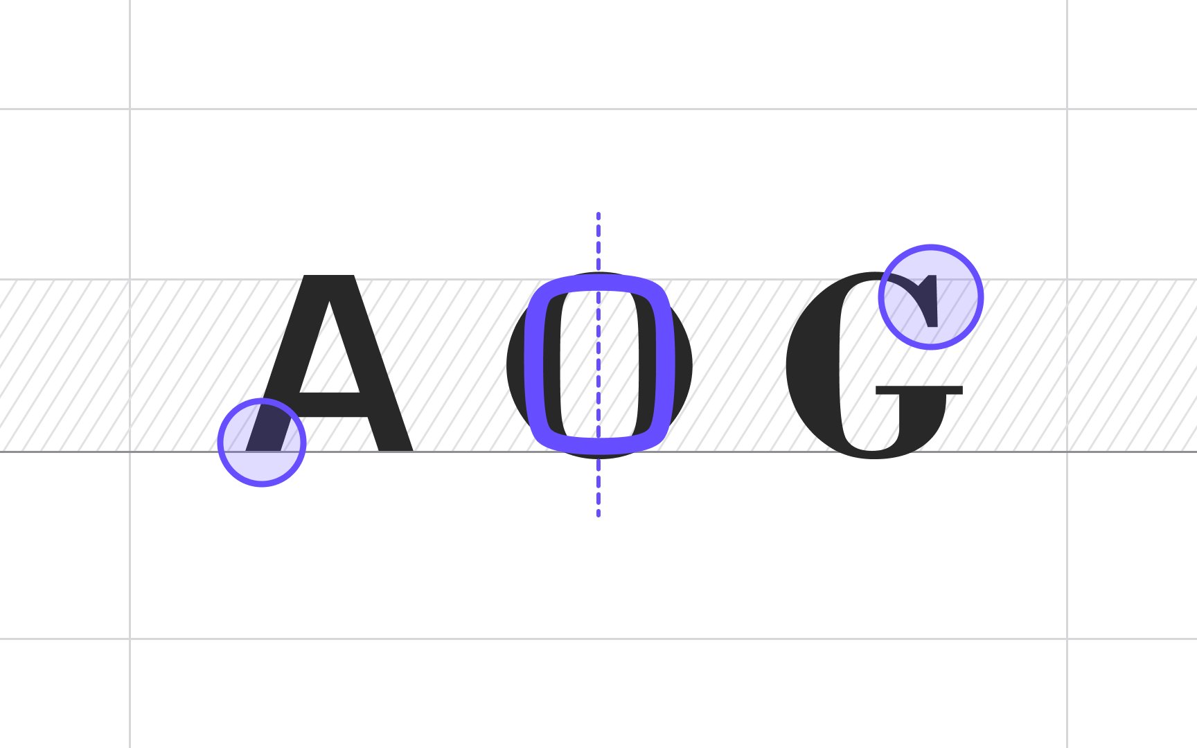
Similar letterform geometry
Surprisingly, even the most contrasting typefaces such as the geometric Eurostile and the classy Bodoni, may look remarkably harmonious together. Having the same strong vertical stress makes them an attractive couple.
The point to note here is that if you aim to combine opposite typefaces, make sure they have something common in their geometry, i.e., in terms of proportions, stress, stroke width, or letterform shapes (border-radius or angle).
