Mix serifs and sans serifs
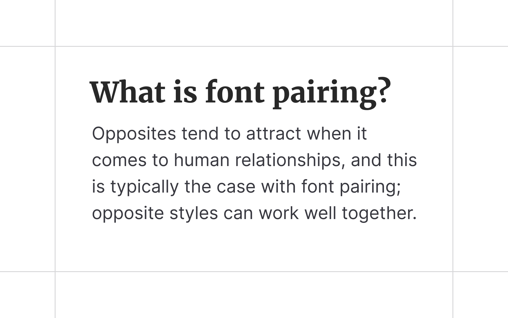
A combination of sans serifs and serifs is a safe bet if you're short on time or don't have experience in typography. The former is more legible on digital devices and is usually applied to the body text.
On the other hand, serifs feel like a better fit for the headlines and subheads where a pinch of creativity is allowed. This combination contains enough contrast, but other factors like mood, x-height, font-weight, size, and tracking should also be considered.