Matching x-heights
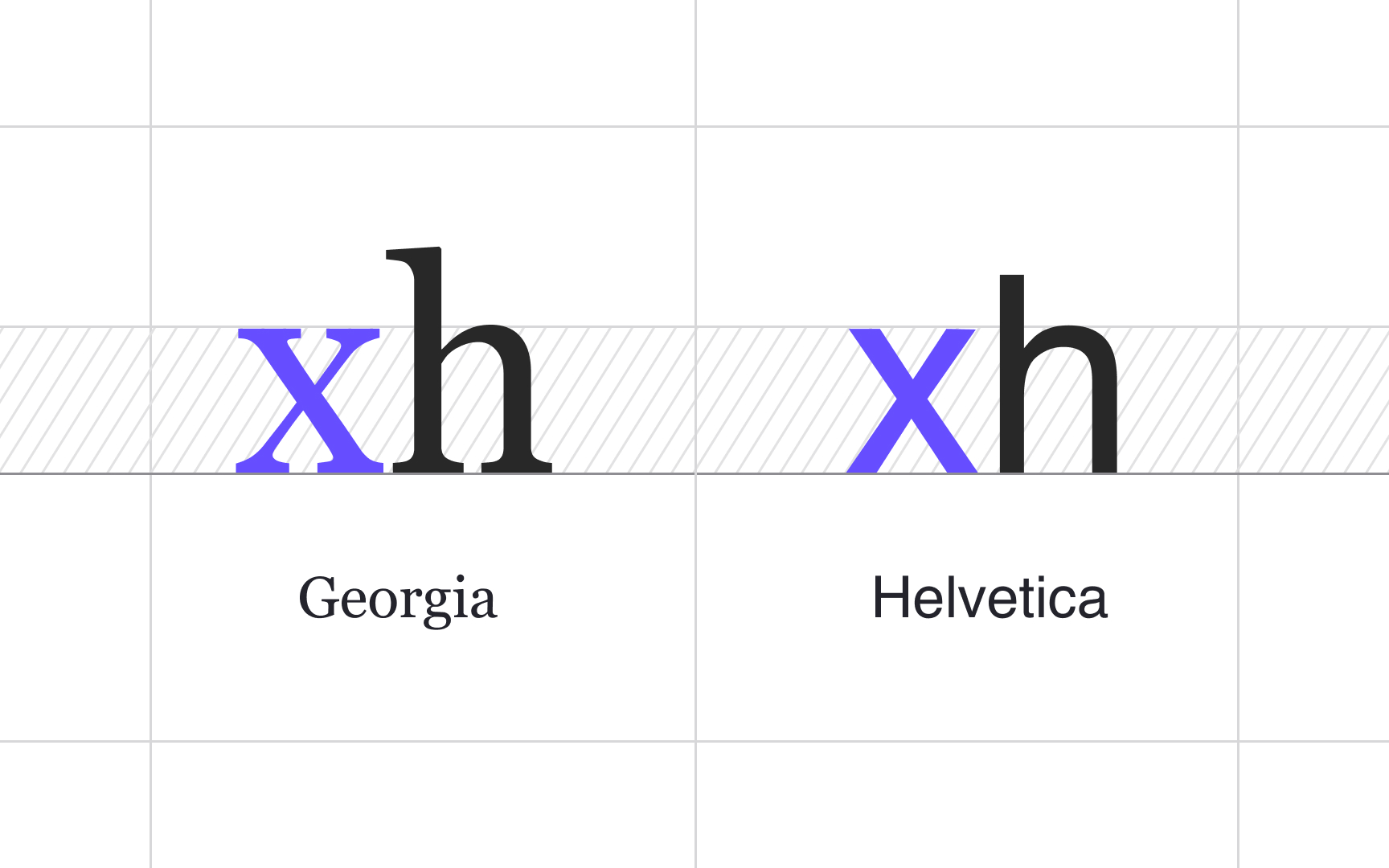
A rule of thumb in typography is to combine typefaces with at least one thing in common, such as the x-height. Typefaces whose lowercase letters have matching x-heights are more likely to get along, even if their overall appearance differs.
Conversely, it might be too hard for users to follow lines of text when the x-heights are too different. Matching x-heights ensure that your typefaces pleasantly contrast but do not conflict with each other.
